# Grid
The `Grid` component is provided as an alternative to the [List](https://developers.raycast.com/api-reference/list#list) component when the defining characteristic of an item is an image.
{% hint style="info" %}
Because its API tries to stick as closely to [List](https://developers.raycast.com/api-reference/list#list)'s as possible, changing a view from [List](https://developers.raycast.com/api-reference/list#list) to [Grid](#grid) should be as simple as:
* making sure you're using at least version 1.36.0 of the `@raycast/api` package
* updating your imports from `import { List } from '@raycast/api'` to `import { Grid } from '@raycast/api'`;
* removing the `isShowingDetail` prop from the top-level `List` component, along with all [List.Item](https://developers.raycast.com/api-reference/list#list.item)s' `detail` prop
* renaming all [List.Item](https://developers.raycast.com/api-reference/list#list.item)s' h`icon` prop to `content`
* removing all [List.Item](https://developers.raycast.com/api-reference/list#list.item)s' `accessories`, `accessoryIcon` and \`accessoryTitle props; [Grid.Item](#grid.item) does not *currently* support accessories
* finally, replacing all usages of `List` with `Grid`.
{% endhint %}

## Search Bar
The search bar allows users to interact quickly with grid items. By default, [Grid.Items](#grid.item) are displayed if the user's input can be (fuzzy) matched to the item's `title` or `keywords`.
### Custom filtering
Sometimes, you may not want to rely on Raycast's filtering, but use/implement your own. If that's the case, you can set the `Grid`'s `filtering` [prop](#props) to false, and the items displayed will be independent of the search bar's text.\
Note that `filtering` is also implicitly set to false if an `onSearchTextChange` listener is specified. If you want to specify a change listener and *still* take advantage of Raycast's built-in filtering, you can explicitly set `filtering` to true.
```typescript
import { useEffect, useState } from "react";
import { Grid } from "@raycast/api";
const items = [
{ content: "🙈", keywords: ["see-no-evil", "monkey"] },
{ content: "🥳", keywords: ["partying", "face"] },
];
export default function Command() {
const [searchText, setSearchText] = useState("");
const [filteredList, filterList] = useState(items);
useEffect(() => {
filterList(items.filter((item) => item.keywords.some((keyword) => keyword.includes(searchText))));
}, [searchText]);
return (
{filteredList.map((item) => (
))}
);
}
```
### Programmatically updating the search bar
Other times, you may want the content of the search bar to be updated by the extension, for example, you may store a list of the user's previous searches and, on the next visit, allow them to "continue" where they left off.
To do so, you can use the `searchText` [prop](#props).
```typescript
import { useState } from "react";
import { Action, ActionPanel, Grid } from "@raycast/api";
const items = [
{ content: "🙈", keywords: ["see-no-evil", "monkey"] },
{ content: "🥳", keywords: ["partying", "face"] },
];
export default function Command() {
const [searchText, setSearchText] = useState("");
return (
{items.map((item) => (
setSearchText(item.content)} />
}
/>
))}
);
}
```
### Dropdown
Some extensions may benefit from giving users a second filtering dimension. A media file management extension may allow users to view only videos or only images, an image-searching extension may allow switching ssearch engines, etc.
This is where the `searchBarAccessory` [prop](#props) is useful. Pass it a [Grid.Dropdown](#grid.dropdown) component, and it will be displayed on the right-side of the search bar. Invoke it either by using the global shortcut `⌘` `P` or by clicking on it.
### Pagination
{% hint style="info" %}
Pagination requires version 1.69.0 or higher of the `@raycast/api` package.
{% endhint %}
`Grid`s have built-in support for pagination. To opt in to pagination, you need to pass it a `pagination` prop, which is an object providing 3 pieces of information:
* `onLoadMore` - will be called by Raycast when the user reaches the end of the grid, either using the keyboard or the mouse. When it gets called, the extension is expected to perform an async operation which eventually can result in items being appended to the end of the grid.
* `hasMore` - indicates to Raycast whether it *should* call `onLoadMore` when the user reaches the end of the grid.
* `pageSize` - indicates how many placeholder items Raycast should add to the end of the grid when it calls `onLoadMore`. Once `onLoadMore` finishes executing, the placeholder items will be replaced by the newly-added grid items.
Note that extensions have access to a limited amount of memory. As your extension paginates, its memory usage will increase. Paginating extensively could lead to the extension eventually running out of memory and crashing. To protect against the extension crashing due to memory exhaustion, Raycast monitors the extension's memory usage and employs heuristics to determine whether it's safe to paginate further. If it's deemed unsafe to continue paginating, `onLoadMore` will not be triggered when the user scrolls to the bottom, regardless of the `hasMore` value. Additionally, during development, a warning will be printed in the terminal.
For convenience, most of the [hooks](https://developers.raycast.com/utilities/getting-started) that we provide have built-in pagination support. Here's an example of how to add pagination support to a simple command using [usePromise](https://developers.raycast.com/utilities/react-hooks/usepromise), and one "from scratch".
{% tabs %}
{% tab title="GridWithUsePromisePagination.tsx" %}
```typescript
import { setTimeout } from "node:timers/promises";
import { useState } from "react";
import { Grid } from "@raycast/api";
import { usePromise } from "@raycast/utils";
export default function Command() {
const [searchText, setSearchText] = useState("");
const { isLoading, data, pagination } = usePromise(
(searchText: string) => async (options: { page: number }) => {
await setTimeout(200);
const newData = Array.from({ length: 25 }, (_v, index) => ({ index, page: options.page, text: searchText }));
return { data: newData, hasMore: options.page < 10 };
},
[searchText]
);
return (
{data?.map((item) => (
))}
);
}
```
{% endtab %}
{% tab title="GridWithPagination.tsx" %}
```typescript
import { setTimeout } from "node:timers/promises";
import { useCallback, useEffect, useRef, useState } from "react";
import { Grid } from "@raycast/api";
type State = {
searchText: string;
isLoading: boolean;
hasMore: boolean;
data: {
index: number;
page: number;
text: string;
}[];
nextPage: number;
};
const pageSize = 20;
export default function Command() {
const [state, setState] = useState({ searchText: "", isLoading: true, hasMore: true, data: [], nextPage: 0 });
const cancelRef = useRef(null);
const loadNextPage = useCallback(async (searchText: string, nextPage: number, signal?: AbortSignal) => {
setState((previous) => ({ ...previous, isLoading: true }));
await setTimeout(200);
const newData = Array.from({ length: pageSize }, (_v, index) => ({
index,
page: nextPage,
text: searchText,
}));
if (signal?.aborted) {
return;
}
setState((previous) => ({
...previous,
data: [...previous.data, ...newData],
isLoading: false,
hasMore: nextPage < 10,
}));
}, []);
const onLoadMore = useCallback(() => {
setState((previous) => ({ ...previous, nextPage: previous.nextPage + 1 }));
}, []);
const onSearchTextChange = useCallback(
(searchText: string) => {
if (searchText === state.searchText) return;
setState((previous) => ({
...previous,
data: [],
nextPage: 0,
searchText,
}));
},
[state.searchText]
);
useEffect(() => {
cancelRef.current?.abort();
cancelRef.current = new AbortController();
loadNextPage(state.searchText, state.nextPage, cancelRef.current?.signal);
return () => {
cancelRef.current?.abort();
};
}, [loadNextPage, state.searchText, state.nextPage]);
return (
{state.data.map((item) => (
))}
);
}
```
{% endtab %}
{% endtabs %}
{% hint style="warning" %}
Pagination might not work properly if all grid items are rendered and visible at once, as `onLoadMore` won't be triggered. This typically happens when an API returns 10 results by default, all fitting within the Raycast window. To fix this, try displaying more items, like 20.
{% endhint %}
## Examples
{% tabs %}
{% tab title="Grid.tsx" %}
```jsx
import { Grid } from "@raycast/api";
export default function Command() {
return (
);
}
```
{% endtab %}
{% tab title="GridWithSections.tsx" %}
```typescript
import { Grid } from "@raycast/api";
export default function Command() {
return (
);
}
```
{% endtab %}
{% tab title="GridWithActions.tsx" %}
```typescript
import { ActionPanel, Action, Grid } from "@raycast/api";
export default function Command() {
return (
}
/>
);
}
```
{% endtab %}
{% tab title="GridWithEmptyView\.tsx" %}
```typescript
import { useEffect, useState } from "react";
import { Grid, Image } from "@raycast/api";
export default function CommandWithCustomEmptyView() {
const [state, setState] = useState<{
searchText: string;
items: { content: Image.ImageLike; title: string }[];
}>({ searchText: "", items: [] });
useEffect(() => {
console.log("Running effect after state.searchText changed. Current value:", JSON.stringify(state.searchText));
// perform an API call that eventually populates `items`.
}, [state.searchText]);
return (
setState((previous) => ({ ...previous, searchText: newValue }))}>
{state.searchText === "" && state.items.length === 0 ? (
) : (
state.items.map((item, index) => )
)}
);
}
```
{% endtab %}
{% endtabs %}
## API Reference
### Grid
Displays [Grid.Section](#grid.section)s or [Grid.Item](#grid.item)s.
The grid uses built-in filtering by indexing the title & keywords of its items.
#### Example
```typescript
import { Grid } from "@raycast/api";
const items = [
{ content: "🙈", keywords: ["see-no-evil", "monkey"] },
{ content: "🥳", keywords: ["partying", "face"] },
];
export default function Command() {
return (
{items.map((item) => (
))}
);
}
```
#### Props
| Prop | Description | Type | Default |
| -------------------- | --------------------------------------------------------------------------------------------------------------------------------------------------------------------------------------------------------------------------------------------------------------------------------------------------------------------------------------------------------------------------------------------------------------------------------------------------------------------------------------------------- | ---------------------------------------------------------------------------------------------------------- | ------- |
| actions | A reference to an ActionPanel. It will only be shown when there aren't any children. | `React.ReactNode` | - |
| aspectRatio | Aspect ratio for the Grid.Item elements. Defaults to 1. | `"1"` or `"3/2"` or `"2/3"` or `"4/3"` or `"3/4"` or `"16/9"` or `"9/16"` | - |
| children | Grid sections or items. If Grid.Item elements are specified, a default section is automatically created. | `React.ReactNode` | - |
| columns | Column count for the grid's sections. Minimum value is 1, maximum value is 8. | `number` | - |
| filtering | Toggles Raycast filtering. When `true`, Raycast will use the query in the search bar to filter the items. When `false`, the extension needs to take care of the filtering. You can further define how native filtering orders sections by setting an object with a `keepSectionOrder` property: When `true`, ensures that Raycast filtering maintains the section order as defined in the extension. When `false`, filtering may change the section order depending on the ranking values of items. | `boolean` or `{ keepSectionOrder: boolean }` | - |
| fit | Fit for the Grid.Item element content. Defaults to "contain" | [`Grid.Fit`](#grid.fit) | - |
| inset | Indicates how much space there should be between a Grid.Items' content and its borders. The absolute value depends on the value of the `itemSize` prop. | [`Grid.Inset`](#grid.inset) | - |
| isLoading | Indicates whether a loading bar should be shown or hidden below the search bar | `boolean` | - |
| navigationTitle | The main title for that view displayed in Raycast | `string` | - |
| onSearchTextChange | Callback triggered when the search bar text changes. | `(text: string) => void` | - |
| onSelectionChange | Callback triggered when the item selection in the grid changes. When the received id is `null`, it means that all items have been filtered out and that there are no item selected | `(id: string) => void` | - |
| pagination | Configuration for pagination | `{ hasMore: boolean; onLoadMore: () => void; pageSize: number }` | - |
| searchBarAccessory | Grid.Dropdown that will be shown in the right-hand-side of the search bar. | `ReactElement<`[`List.Dropdown.Props`](https://developers.raycast.com/api-reference/list#props)`, string>` | - |
| searchBarPlaceholder | Placeholder text that will be shown in the search bar. | `string` | - |
| searchText | The text that will be displayed in the search bar. | `string` | - |
| selectedItemId | Selects the item with the specified id. | `string` | - |
| throttle | Defines whether the `onSearchTextChange` handler will be triggered on every keyboard press or with a delay for throttling the events. Recommended to set to `true` when using custom filtering logic with asynchronous operations (e.g. network requests). | `boolean` | - |
### Grid.Dropdown
A dropdown menu that will be shown in the right-hand-side of the search bar.
#### Example
```typescript
import { Grid, Image } from "@raycast/api";
import { useState } from "react";
const types = [
{ id: 1, name: "Smileys", value: "smileys" },
{ id: 2, name: "Animals & Nature", value: "animals-and-nature" },
];
const items: { [key: string]: { content: Image.ImageLike; keywords: string[] }[] } = {
smileys: [{ content: "🥳", keywords: ["partying", "face"] }],
"animals-and-nature": [{ content: "🙈", keywords: ["see-no-evil", "monkey"] }],
};
export default function Command() {
const [type, setType] = useState("smileys");
return (
setType(newValue)}>
{types.map((type) => (
))}
}
>
{(items[type] || []).map((item) => (
))}
);
}
```
#### Props
| Prop | Description | Type | Default |
| ----------------------------------------- | --------------------------------------------------------------------------------------------------------------------------------------------------------------------------------------------------------------------------------------------------------------------------------------------------------------------------------------------------------------------------------------------------------------------------------------------------------------------------------------------------- | -------------------------------------------- | ------- |
| tooltip\* | Tooltip displayed when hovering the dropdown. | `string` | - |
| children | Dropdown sections or items. If Dropdown.Item elements are specified, a default section is automatically created. | `React.ReactNode` | - |
| defaultValue | The default value of the dropdown. Keep in mind that `defaultValue` will be configured once per component lifecycle. This means that if a user changes the value, `defaultValue` won't be configured on re-rendering. **If you're using `storeValue` and configured it as `true`** ***and***** a Dropdown.Item with the same value exists, then it will be selected.** **If you configure `value` at the same time as `defaultValue`, the `value` will have precedence over `defaultValue`.** | `string` | - |
| filtering | Toggles Raycast filtering. When `true`, Raycast will use the query in the search bar to filter the items. When `false`, the extension needs to take care of the filtering. You can further define how native filtering orders sections by setting an object with a `keepSectionOrder` property: When `true`, ensures that Raycast filtering maintains the section order as defined in the extension. When `false`, filtering may change the section order depending on the ranking values of items. | `boolean` or `{ keepSectionOrder: boolean }` | - |
| id | ID of the dropdown. | `string` | - |
| isLoading | Indicates whether a loading indicator should be shown or hidden next to the search bar | `boolean` | - |
| onChange | Callback triggered when the dropdown selection changes. | `(newValue: string) => void` | - |
| onSearchTextChange | Callback triggered when the search bar text changes. | `(text: string) => void` | - |
| placeholder | Placeholder text that will be shown in the dropdown search field. | `string` | - |
| storeValue | Indicates whether the value of the dropdown should be persisted after selection, and restored next time the dropdown is rendered. | `boolean` | - |
| throttle | Defines whether the `onSearchTextChange` handler will be triggered on every keyboard press or with a delay for throttling the events. Recommended to set to `true` when using custom filtering logic with asynchronous operations (e.g. network requests). | `boolean` | - |
| value | The currently value of the dropdown. | `string` | - |
### Grid.Dropdown.Item
A dropdown item in a [Grid.Dropdown](#grid.dropdown)
#### Example
```typescript
import { Grid } from "@raycast/api";
export default function Command() {
return (
}
>
);
}
```
#### Props
| Prop | Description | Type | Default |
| --------------------------------------- | ----------------------------------------------------------------------------------------------------------------------------------------------------------------------------- | -------------------------------------------------------------------------------------------------- | ------- |
| title\* | The title displayed for the item. | `string` | - |
| value\* | Value of the dropdown item. Make sure to assign each unique value for each item. | `string` | - |
| icon | An optional icon displayed for the item. | [`Image.ImageLike`](https://developers.raycast.com/api-reference/icons-and-images#image.imagelike) | - |
| keywords | An optional property used for providing additional indexable strings for search. When filtering the items in Raycast, the keywords will be searched in addition to the title. | `string[]` | - |
### Grid.Dropdown.Section
Visually separated group of dropdown items.
Use sections to group related menu items together.
#### Example
```typescript
import { Grid } from "@raycast/api";
export default function Command() {
return (
}
>
);
}
```
#### Props
| Prop | Description | Type | Default |
| -------- | --------------------------------- | ----------------- | ------- |
| children | The item elements of the section. | `React.ReactNode` | - |
| title | Title displayed above the section | `string` | - |
### Grid.EmptyView
A view to display when there aren't any items available. Use to greet users with a friendly message if the\
extension requires user input before it can show any items e.g. when searching for an image, a gif etc.
Raycast provides a default `EmptyView` that will be displayed if the Grid component either has no children,\
or if it has children, but none of them match the query in the search bar. This too can be overridden by passing an\
empty view alongside the other `Grid.Item`s.
Note that the `EmptyView` is *never* displayed if the `Grid`'s `isLoading` property is true and the search bar is empty.
#### Example
```typescript
import { useEffect, useState } from "react";
import { Grid, Image } from "@raycast/api";
export default function CommandWithCustomEmptyView() {
const [state, setState] = useState<{
searchText: string;
items: { content: Image.ImageLike; title: string }[];
}>({ searchText: "", items: [] });
useEffect(() => {
console.log("Running effect after state.searchText changed. Current value:", JSON.stringify(state.searchText));
// perform an API call that eventually populates `items`.
}, [state.searchText]);
return (
setState((previous) => ({ ...previous, searchText: newValue }))}>
{state.searchText === "" && state.items.length === 0 ? (
) : (
state.items.map((item, index) => )
)}
);
}
```
#### Props
| Prop | Description | Type | Default |
| ----------- | -------------------------------------------------------- | -------------------------------------------------------------------------------------------------- | ------- |
| actions | A reference to an ActionPanel. | `React.ReactNode` | - |
| description | An optional description for why the empty view is shown. | `string` | - |
| icon | An icon displayed in the center of the EmptyView. | [`Image.ImageLike`](https://developers.raycast.com/api-reference/icons-and-images#image.imagelike) | - |
| title | The main title displayed for the Empty View. | `string` | - |
### Grid.Item
A item in the [Grid](#grid).
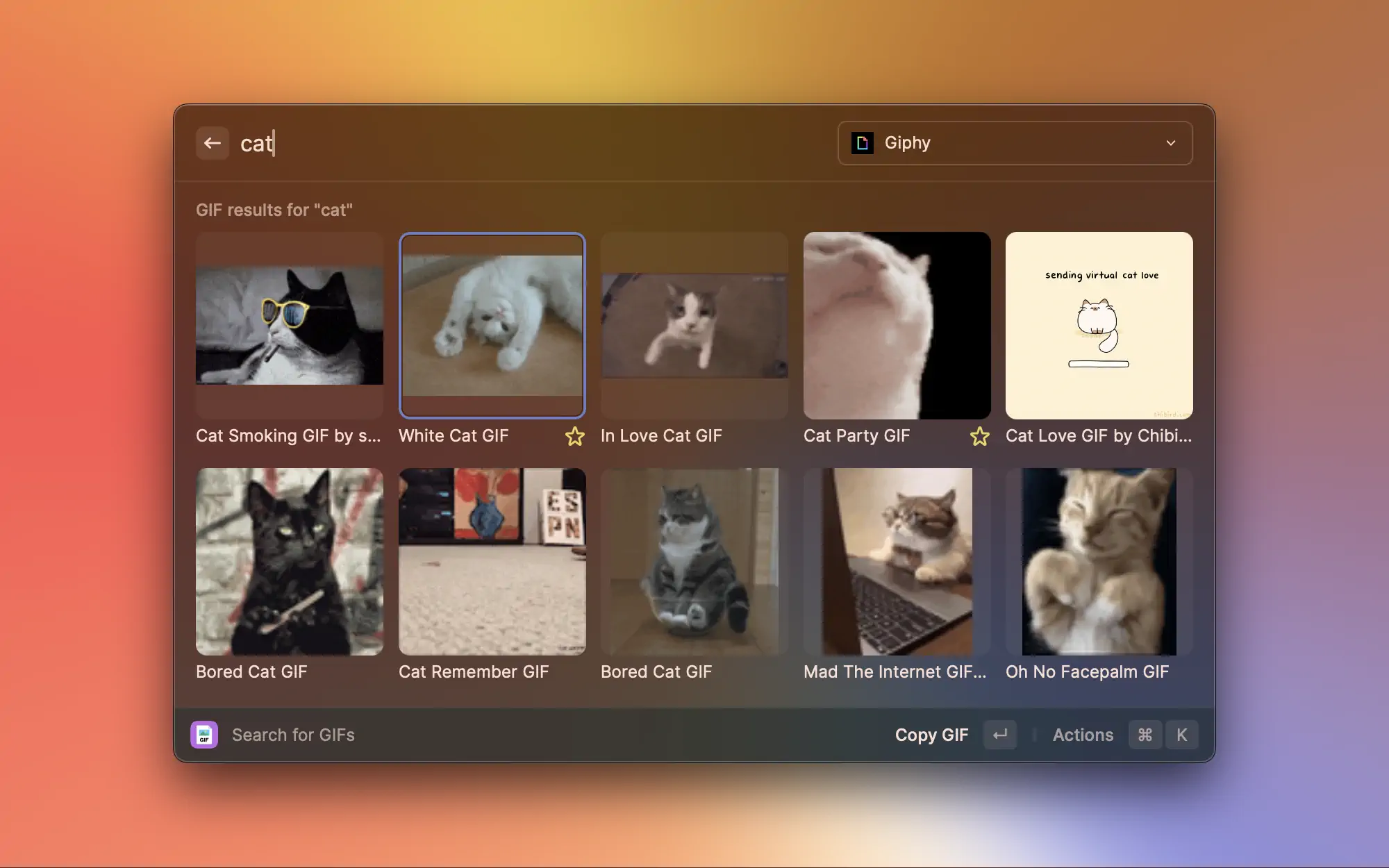
This is one of the foundational UI components of Raycast. A grid item represents a single entity. It can be an image, an emoji, a GIF etc. You most likely want to perform actions on this item, so make it clear\
to the user what this item is about.
#### Example
```typescript
import { Grid } from "@raycast/api";
export default function Command() {
return (
);
}
```
#### Props
| Prop | Description | Type | Default |
| ----------------------------------------- | --------------------------------------------------------------------------------------------------------------------------------------------------------------------------------------------------- | ----------------------------------------------------------------------------------------------------------------------------------------------------------------------------------------------------------------------------------------------------------------------------------------------- | ------- |
| content\* | An image or color, optionally with a tooltip, representing the content of the grid item. | [`Image.ImageLike`](https://developers.raycast.com/api-reference/icons-and-images#image.imagelike) or `{ color:` [`Color.ColorLike`](https://developers.raycast.com/api-reference/colors#color.colorlike) `}` or `{ tooltip: string; value: Image.ImageLike` or `{ color: Color.ColorLike; } }` | - |
| accessory | An optional Grid.Item.Accessory item displayed underneath a Grid.Item. | [`Grid.Item.Accessory`](#grid.item.accessory) | - |
| actions | An ActionPanel that will be updated for the selected grid item. | `React.ReactNode` | - |
| id | ID of the item. This string is passed to the `onSelectionChange` handler of the Grid when the item is selected. Make sure to assign each item a unique ID or a UUID will be auto generated. | `string` | - |
| keywords | An optional property used for providing additional indexable strings for search. When filtering the list in Raycast through the search bar, the keywords will be searched in addition to the title. | `string[]` | - |
| quickLook | Optional information to preview files with Quick Look. Toggle the preview ith Action.ToggleQuickLook. | `{ name?: string; path: "fs".PathLike }` | - |
| subtitle | An optional subtitle displayed below the title. | `string` | - |
| title | An optional title displayed below the content. | `string` | - |
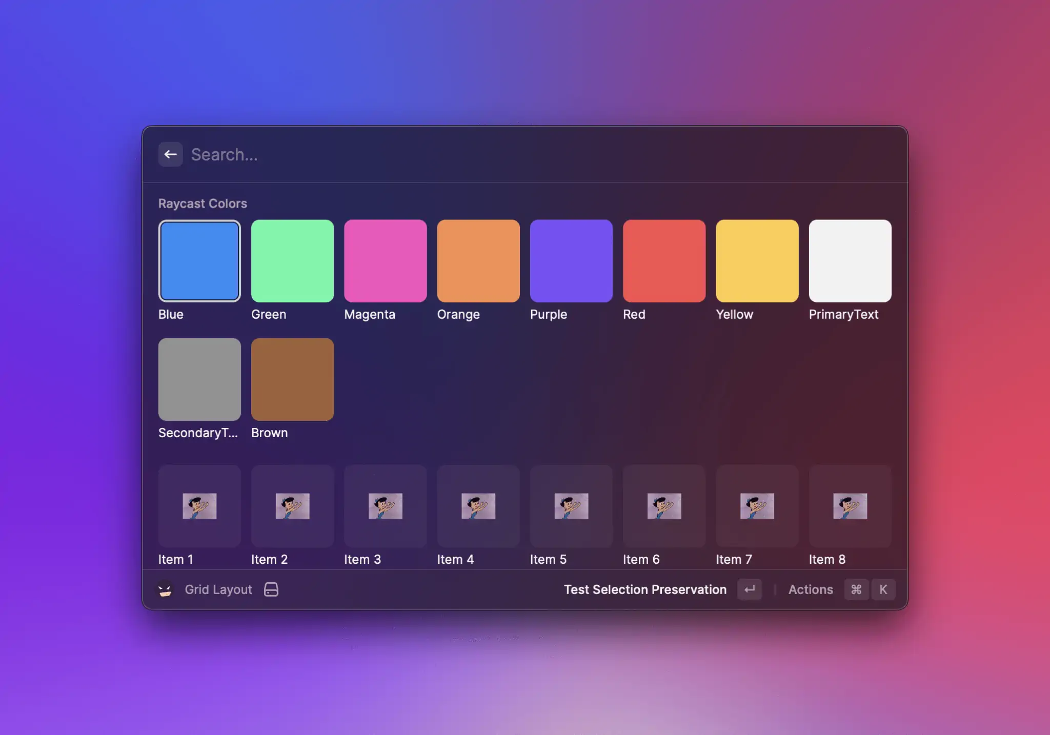
### Grid.Section
A group of related [Grid.Item](#grid.item).
Sections are a great way to structure your grid. For example, you can group photos taken in the same place or in the same day. This way, the user can quickly access what is most relevant.
Sections can specify their own `columns`, `fit`, `aspectRatio` and `inset` props, separate from what is defined on the main [Grid](#grid) component.
#### Example
{% tabs %}
{% tab title="GridWithSection.tsx" %}
```typescript
import { Grid } from "@raycast/api";
export default function Command() {
return (
);
}
```
{% endtab %}
{% tab title="GridWithStyledSection.tsx" %}
```typescript
import { Grid, Color } from "@raycast/api";
export default function Command() {
return (
{Object.entries(Color).map(([key, value]) => (
))}
);
}
```
{% endtab %}
{% endtabs %}
#### Props
| Prop | Description | Type | Default |
| ----------- | --------------------------------------------------------------------- | ------------------------------------------------------------------------- | ------- |
| aspectRatio | Aspect ratio for the Grid.Item elements. Defaults to 1. | `"1"` or `"3/2"` or `"2/3"` or `"4/3"` or `"3/4"` or `"16/9"` or `"9/16"` | - |
| children | The Grid.Item elements of the section. | `React.ReactNode` | - |
| columns | Column count for the section. Minimum value is 1, maximum value is 8. | `number` | - |
| fit | Fit for the Grid.Item element content. Defaults to "contain" | [`Grid.Fit`](#grid.fit) | - |
| inset | Inset for the Grid.Item element content. Defaults to "none". | [`Grid.Inset`](#grid.inset) | - |
| subtitle | An optional subtitle displayed next to the title of the section. | `string` | - |
| title | Title displayed above the section. | `string` | - |
## Types
### Grid.Item.Accessory
An interface describing an accessory view in a `Grid.Item`.
### Grid.Inset
An enum representing the amount of space there should be between a Grid Item's content and its borders. The absolute value depends on the value of [Grid](#grid)'s or [Grid.Section](#grid.section)'s `columns` prop.
#### Enumeration members
| Name | Description |
| ------ | ------------- |
| Small | Small insets |
| Medium | Medium insets |
| Large | Large insets |
### Grid.ItemSize (deprecated)
An enum representing the size of the Grid's child [Grid.Item](#grid.item)s.
#### Enumeration members
| Name | Description |
| ------ | --------------------- |
| Small | Fits 8 items per row. |
| Medium | Fits 5 items per row. |
| Large | Fits 3 items per row. |
### Grid.Fit
An enum representing how [Grid.Item](#grid.item)'s content should be fit.
#### Enumeration members
| Name | Description |
| ------- | ------------------------------------------------------------------------------------------------------------------------------- |
| Contain | The content will be contained within the grid cell, with vertical/horizontal bars if its aspect ratio differs from the cell's. |
| Fill | The content will be scaled proportionally so that it fill the entire cell; parts of the content could end up being cropped out. |