Visualizing Spatial Data – Show locations with a PushPin

After my last two posts (Creating a spatial report, Create an interactive report), I came across a feature I never saw before. Apparently if you add a point layer to your report, you get different layer-options in the list.

Starting with a single layer
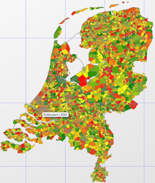
To start off easy, you could use the same steps I used to create my first report. This is a single layer report with a full map of (in this case) the Netherlands.

The next step is adding a few pushpins. How about visualizing the three biggest cities in the Netherlands: Amsterdam (790.000 people), Rotterdam (616.000) and Den Haag (The Hague, 502.000).

Creating a Point layer
Before creating a point layer, you need to determine what data you want to present to your users. In my case, I chose the center of each city. This might not be the actual center, but I tried to get as close to the center as I could.

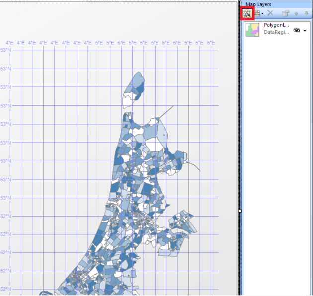
Now that you have your data, you can create the Point layer in your report. Start by double-clicking on your map control, and in the “Map Layers” window, click on “New layer wizard:

Now choose the bottom option “SQL Server spatial query”, and click next.

Choose the bottom option to add a new dataset to your report, and click next.

Click next to choose the datasource that’s already in your report, and click next.

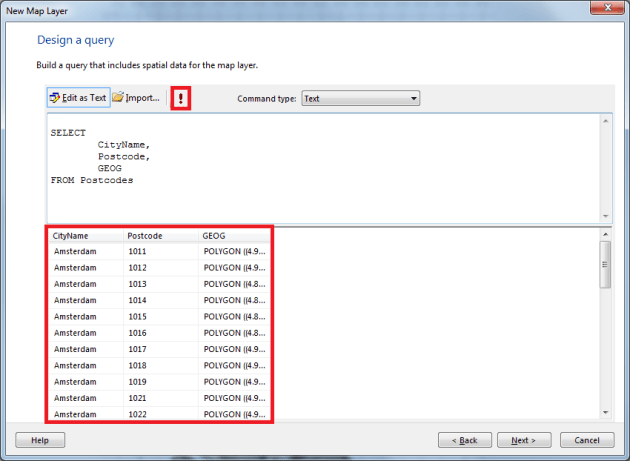
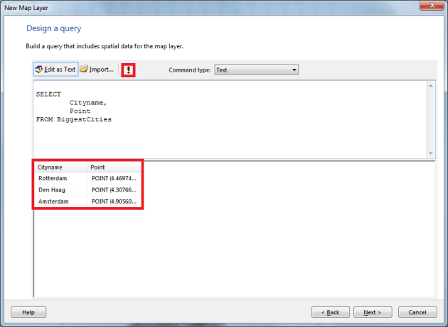
Now click on the option “Edit as Text” in the query designer:

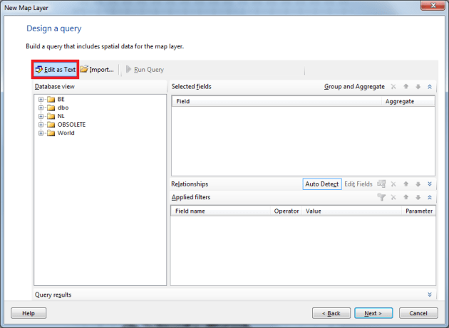
Type or paste your query in the editor, and press the Run button. Once you’ve done that, you’ll see the result in the bottom window:

In the next window, make sure you add a Point layer, and not a Polygon layer:

Now you will see the new layers I mentioned before:

For this report, choose the bottom one: Analytical Marker Map, and click next.

In the next window, select the dataset that contains your points, and click next.

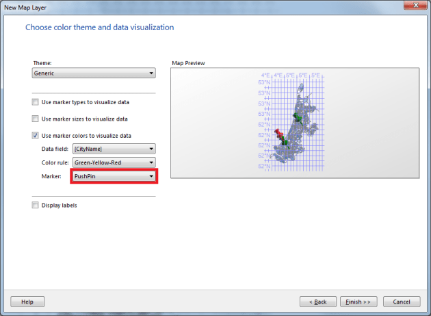
In the window with options, make sure you select the right type of marker (in this case PushPin):

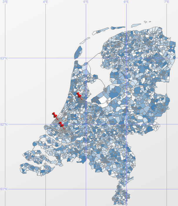
Once you’ve done that, click Finish. Now you see a double layer map with 3 PinPoint on your map:

Using a custom PinPoint
I can imagine that you might want to use your own PinPoint image on your report. This is possible, but remember this might screw up the readability of your report.

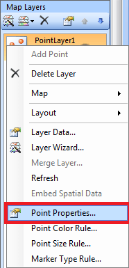
In the Map Layers menu, right click your point layer, and click Point Properties:

Now change your marker type from PinPoint to Image, and click Import:

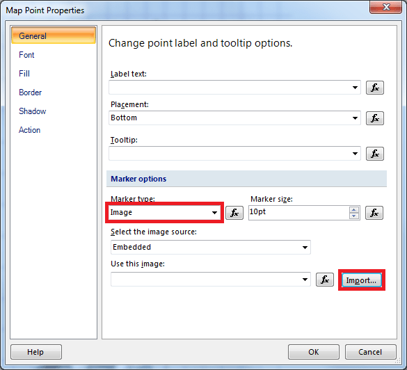
Now if you select an image, the name of your image will show in the “Use this image” text box. If you want to, change the “Marker size”, so your logo will appear larger on the map. Now if you click OK, and run the report, you’ll see something like this:

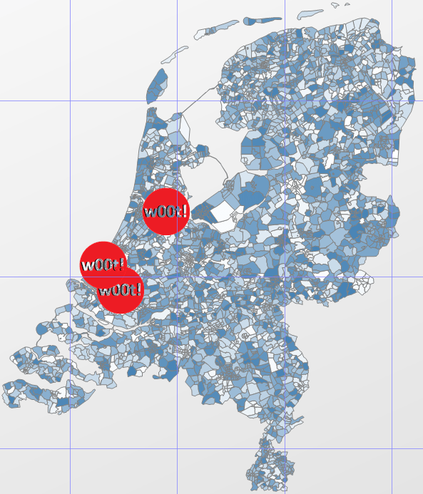
And if you can’t resist, you can download this EPIC marker right here 😉

Visualizing Spatial Data – Create an interactive report

In my previous blog post I showed you how to create a report containing spatial data. But what if you want to give your users a little bit more information. How about a mouse-over tooltip, of what they’re actually looking at? Or maybe even a click-through to another report or website? Let’s take a look at how to achieve this.

Report
I’m starting with the report that I created in my previous blog post. I’m not going to add data to the report, but instead change some options.

Mouseover tooltip
Because you’re working with a full map in your report, it might be hard to see what kind of location you’re looking at. So the easiest way to fix this, is to add labels to your map control. But if you have a lot of small polygons, you might end up with somethings that looks like this:

In the image above you see the province of South-Holland. In the red rectangle, you see the 2nd largest city of the Netherlands: Rotterdam. But this illustrates the issue, that if you have a lot of small polygons, you won’t be able to see the labels.

So a workaround for this, is to add a tooltip (a mouseover label) to your report. This will show the label you selected, if you (or the user of your report) can see what the polygon represents. So how can we do that?

Go to your Design window, and right-click on a polygon in your map control, and click on “Polygon Properties”:

In the next window, click on the “Fx” button next to the Tooltip textblock:

In this window, enter the following expression:

Now if you hover over your report, you’ll see the following tooltip:

 
Clickable polygons
If you want to spice things up even more, you could also add a click-event to your report. In my case, I wanted to add a click-event that showed the users the Wikipedia page of the city.

Start by right-clicking again on a polygon in your map control, and click “Polygon Properties”. Now go to the Action tab, and click the “Fx” button again:

Now fill in the following expression:

Now if you go to your report, you can click on a polygon and it will open up the Wikipedia page for that specific city.

Another option would be to open up a report via a click-event, to show your users more information from another report. Or maybe you want to redirect your users to a specific page on your intranet. Just imagine all the opportunities… 😉

Visualizing Spatial Data – Creating a spatial report

In the last few posts in the series, I showed you how to enrich your dataset with spatial data. Now you need to start thinking about how you want to visualize your data, so that (for example) your business analysts can start using the data. But how do you start with that?

For every report I create, I use Report Builder 3.0 myself. This tool is a bit smaller and more responsive than the Business Intelligence Development Studio (BIDS).

Create the basic report first
Starting to build your report starts with creating a blank report from the menu in Report Builder:

Once you’ve done that, you need to add a data source to your report:

Then add a map control to your report, by right-clicking on you report, and choose Map:

Double-click on the map control, and in the menu that appears on the right, choose “New layer wizard”:

Click the last option (SQL Server spatial query) and click next.

Now you’re asked if you would like to create a new dataset in you report. In this case, you can just click next.

The same counts for the next step, datasources. Just select the datasource you created earlier, and click next.

In the next menu, we can select the data we want to use. In this case, I just want to select a city name and a spatial object. You can write this query in your SQL Server Management Studio (SSMS), or in this window. I wrote it in SSMS, and I want to copy it to my report. If you want to do the same, you need to click the option “Edit as Text”:

Just paste your query into the editor, and press the run button. Report Builder will retrieve your data, and shows you the results below:

Click next, and select the options you like in the next few menus. I’ll stick with the basic options. I didn’t change anything in the first menu, and in the next chose “Basic Map”:

Click next, click Finish. There you go, you just created your very first Spatial Report! 🙂

What do you want to be when you grow up?

Last week I told you that I’m about to change jobs. Because the contract wasn’t signed yet, I could tell you what my next challenge was going to be. But now I’m glad I can tell you where I’m going to end up next: I’m going to become a DBA!

I’m so glad I can finally tell you the good news! I’m so excited to start my next challenge! From next week, I’ll be a Microsoft SQL Server DBA. And if all things work out in the first few months, the planning is that my job will also include Oracle, MySQL, and MongoDB later on.

But for now, my challenge is to become a DBA with expert knowledge of Microsoft SQL Server, and all the features that ship with it. As far as I know now, my planning for the upcoming year is to build a test environment for the SQL Server environment they have now, and a migration of the system to SQL Server 2012. That sounds like a hard work for my first year, but I’m really excited!

Until now, I only worked as a SQL Server developer with a few DBA tasks. The last years I started thinking about my future, and what I really wanted. The only thing I wanted to try out but never had the chance to, was becoming a DBA. And now I get a chance to prove myself as a fulltime DBA. This might end up getting my head blown off the first few months, but I’m excited to test my knowledge and skills, and to expand them.

Thinking about next week makes me both nervous and happy. Feeling happy because I can prove myself (and others) that I can actually do the things people told me I would never accomplish, and nervous because I’m stepping out of my comfort zone. But I’m totally convinced I get all the help that I need to succeed from my new colleagues, and my SQL Family.

Last year I experienced the commitment and dedication to help one another in the SQL Server community. That’s why they call it the SQL Family. Because it’s a hardworking community, that’s always willing to help you if you need them. They helped me out on several occasions, and I try to help them as much as I can. And with them on my side, the upcoming period is going to be a success! 🙂

Without pain, without sacrifice, we would have nothing…

The last few days flew by for me. After 2.5 years of working for my previous employer, I decided it was time for a new challenge. In the past period I’ve learned a lot, and had the opportunity to learn and research a lot of new things and techniques.

In 2010 I started working for the company, and began as a Data Warehouse (DWH) developer. Before my first day on the job, I had pretty much no experience with a DWH. That was quite a challenge, especially because there was no documentation at all. So I needed to find out everything myself, because there wasn’t a real DWH developer before I started there.

This also gave me a chance to dive into Reporting solutions. The company ran a Reporting Services machine with tons of Management-, Marketing-, Sales- and Development-reports. These reports varied from showing turnover information, to showing the IT department the (partial) morning check.

Eventually I ended up building reports, cubes, and developing and maintaining the DWH. This was my daily job for almost a year, next to helping out my team, consisting of about 10 to 15 .NET developers.

After about a year, management decided to let an external company develop our DWH. That gave me more time to focus on building reports, and doing more development work for our test- and production environments. That year I started with spatial data in SQL Server. This was one of the coolest things I got go do in the 2.5 years I spent there.

The hardest thing to give up wasn’t the company or the job, but it was the team. It was a pretty young team of developers, and most of the guys (and the one gal we had) were pretty awesome. There was always someone who could help you out, and the team members had no problems with working late to help a colleague out. The team was amazing!

But like I said, after more then 2 years, it was time for something new. While reading a blog post by SQLRockstar (Blog | @SQLRockstar), I read a beautiful quote that convinced me I made the right decision:

“Without pain, without sacrifice, we would have nothing”

This is a quote from the movie Fight Club. It tells us that nothing comes without sacrifice. You can’t achieve anything without taking risks, and sticking out your neck. This is what I’m about to do…

I can’t tell you yet what my next challenge will be, but I’m very excited to start my new job. I’m hoping to write a blog post next week, telling you more about that… 🙂

T-SQL Tuesday #39 – Can you shell what the PoSH is Cooking?

T-SQL Tuesday is a recurring blog party, that is started by Adam Machanic (Blog | @AdamMachanic). Each month a blog will host the party, and everyone that want’s to can write a blog about a specific subject.

This month the subject is “Can you shell what the PoSH is Cooking?”. If you want to read the opening post, please click the image below to go to the party-starter: Wayne Sheffield (Blog | @DBAWayne).


A few months ago I attended a session of Jeff Wouters (Blog | @JeffWouters) about PowerShell. He talked about how powerful PowerShell really is, and showed us some examples. This was my first encounter with the “commandline on steroids”. Back then I didn’t think I’d use that any time soon, but this is changing fast! The wide variety of possibilities that PowerShell offers made me curious, but I never found the time and use for it. Until last week…

A great number of things have changed the last few weeks, and that gave me the opportunity to play around with PowerShell. Starting with reading a tutorial and creating my first few trial scripts, it soon hit me that it isn’t that easy. But on the other side, if you succeed at writing a script, it’s very powerful!

PowerShell ISE
One of the very first things I tried after staring the PowerShell ISE (the “studio” in which you can write your scripts) was trying to find all objects in my database. The first thing you need to do is:

#Set the Execution-Policy to Unrestricted
Set-ExecutionPolicy Unrestricted

#Run the Import-Module below once, so you can use the SQLSERVER functionality
Import-Module SQLPS

This will allow you to access your SQL Server objects. After that, you can start with the easy stuff like:

dir SQLSERVER:\sql\localhost\SQL2012\databases\Sandbox\Tables

dir SQLSERVER:\sql\localhost\SQL2012\databases\Sandbox\Views

dir SQLSERVER:\sql\localhost\SQL2012\databases\Sandbox\StoredProcedures

dir SQLSERVER:sql\localhost\SQL2012\databases\Sandbox\Users

This is very basic, and real easy to find out how this works. From Powershell, the results will look like this:

And from the “PowerShell ISE”, it will look like this:

Another thing I tried is to automatically create a database on my local server:

[void] [System.Reflection.Assembly]::LoadWithPartialName("Microsoft.SqlServer.ConnectionInfo") 
[void] [System.Reflection.Assembly]::LoadWithPartialName("Microsoft.SqlServer.SMO") 

$serverInstance = "(local)\SQL2012"
$conn = New-Object -TypeName Microsoft.SqlServer.Management.Common.ServerConnection -ArgumentList $serverInstance 
$server = New-Object -TypeName Microsoft.SqlServer.Management.Smo.Server -ArgumentList $conn

$newdb = New-Object -TypeName Microsoft.SqlServer.Management.Smo.Database($server, "PowerShellToTheRescue")
$newdb.Create()

This script will create a new database called “PowerShellToTheRescue” on your local SQL Server. I assume it’s also possible to create tables in the database, but I haven’t found the time to test that.

PowerShell trough SQL Server Management Studio (SSMS)
Another option is to start PowerShell via a menu in SSMS. This means PowerShell is starting with the current database as default context. So then you don’t have to use the “Import-Module”, and you can start running your query right away. You can find this option by right-clicking your database, and choose “Start PowerShell”:

So, what are you saying?!
This months T-SQL Tuesday post isn’t that impressive, I know! But what I’m trying to say is that if you try PowerShell, you might find that it’s quite powerful and fun.

And thinking about it, I guess you can expect some more PowerShell posts from me in the next few weeks! 😉

Enriching your dataset – The SSIS way…

In my last post I talked about the technical options you have to enrich your dataset with spatial data. After writing that post, I decided to try and build the option like mentioned by Donabel Santos (Blog | @sqlbelle). Once I got that working, I tried to extend it a little, so it would fetch and store the data that I wanted. And like I mentioned to Koen Verbeeck (Blog | @Ko_Ver), it’s also easy to build for someone with rusty SSIS-skills (like me).

Creating the resources
In order to start with the SSIS solution, you’ll first need to create a source and a destination table for your data. I’ve created a GIS_Test and a GIS_Results table, with a few samples for you. You can download the file here.

Creating a new SSIS project
Once you’ve created the database resources, start Visual Studio, and Create a new SSIS project. You can find this under “Business Intelligence” -> “Integration Services”, like shown below:

Once you’ve created your project, add a new “OLE DB Connection” to your SSIS Package, by right-clicking in the “Connection Managers” at the bottom of your screen:

In the window that shows up, choose a connection you used earlier, of click “New…” to make a new one. Fill in your SQL Server information, and click “OK”.

Adding components
In order to actually do something with data, you need to add a “Data Flow” into your SSIS package. You can do this by manually dragging one into your “Control Flow”, or you can just the “Data Flow” tab, and click the message “No Data Flow tasks have been added to this package. Click here to add a new Data Flow task.”, and SSIS will add one for you:

Now drag in a “Source Assistant” into your “Data Flow”. If the screen below shows, click the OLE DB Connection you made earlier, and click “OK”:

Now double-click the “OLE DB Source”, and select the source table you’ve created earlier:

Drag in a “Script Component” and click “Transformation” on the next screen:

Now connect both components, by clicking on the “OLE DB Source” component, and drag the green arrow on the “Script Component”:

Double-click on the “Script Component” and choose “Input Columns”. Now select all columns (except the ID column), and set the “Usage Type” to “ReadWrite”, and click “OK”:

Drag in a “Destination Assistent”, and choose the OLE DB Connection you’ve created earlier. Now connect the “Script Component” to the “Destination Assistent” by dragging the green arrow like before.

Open the “OLE DB Destination” and choose the GIS_Results table as destination:

Now click on “Mapping” to auto-map your columns. Check them if the auto-mapping actually worked!

Start the coding!
With a completed package, now let’s start coding! Double-click the “Script Component” and click “Edit Script…”. A new Visual Studio window will open, where you can edit the script that will fetch your data from the Google Geocoding API.

First of all, add a reference to the System.Web namespace:

Add a new class named “Geocoding.cs”, and overwrite the content with the code from this Geocoding.cs

Go to the main.cs file, and copy the method called “CreateURL” from this stripped version of main.cs.

Add the code from the downloaded “Input0_ProcessInputRow” to your own “Input0_ProcessInputRow” method.

Go back to your original Visual Studio with the SSIS package, and press “OK” on the open “Script Component” window. This will close the Visual Studio with the actual script, and stores it in your SSIS package.

Can I finally run it now?!
Yes! Yes, you can! And if you run the SSIS package, you’ll see that it saves the records into the GIS_Results table. It adds the complete URL that was used to fetch data from the Geocoding API, so you can debug it in case of errors. Also, I’ve added a Geography object, so it’s easy for you to visualize the data retrieved from the API. And the last column I’ve added is the status code returned by the API, so it’s easy to spot weird results.

A word of thanks…
And as a final remark, I’d like to thank Donabel Santos for letting me use her post as a guideline, and her code as a basis for my version.

Downloads
I’ve also made the project available for download. You can download the full solution here

Enriching your dataset – What are your technical options?

In my previous post I tried to explain how to enrich your dataset, so you can start using spatial data. You’ve seen that there are free options, or you can buy a bunch of files with the information you need.

This time I’ll try to explain the technical option you have. The options all contain the Google Geocoding API, because this is free, and it’s fairly accurate. But this will also work for the files you buy from (for example) GfK GeoMarketing, which I did business with once.

Write your own application
One of the easiest an quickest options for me was to write an application to fetch my data from the Google API. I’m not a die-hard programmer, but I know my way around C# as far as I need to. So with a little help from my colleagues, I managed to write a Windows Forms application that calls the Geocoding API. The results of the API call are either just shown on screen (in a GridView), or exported to Excel (using LinqToExcel and ExcelExporter).

Another option I intend to build in, is the export from and to a SQL Server database. But because this is a project I work on in my own time, this could take a couple of weeks.

CLR
One of the other options I’ve found, is a CLR that calls the API. The CLR you write, is basically a .NET application that you load into SQL Server. It’s more complicated than that, but to keep this story moving on, I’ll leave it at that.

One of the many downsides of using a CLR, is your local DBA. Every DBA I’ve encountered in my life told me: “Don’t use a CLR, EVER!!! Because that’s the biggest security hole you can open up on a SQL Server”. To be completely honest, I’m not that familiar with CLR’s, but I guess it isn’t as easy as that. There might be some pros and cons regarding that…

SSIS Package
In my quest to find all possible options, I found this great article by Donabel Santos (Blog | @sqlbelle). In her article she describes how you can create an SSIS package that fetches a Lat/Long for every record in the dataset you use as input.

Talking about this with Koen Verbeeck (Blog | @Ko_Ver) on Twitter made me realize that for normal businesses, this might be the best option. In every company I know, there’s always a server running SQL Server Integration Services that you can use to execute such a package.

So, what’s your choice?
Looking at the options above, I’m guessing the option you choose depends on the company you work for. I guess that smaller companies would choose the SSIS package over building a tool. But if your company has a development department with a bunch of software developers, writing your own tool might be a better option. In that case writing your own tool gives you more flexibility, because not only your DBA can debug an error in an SSIS package, but every developer can debug the tool they’ve written.

If you’ve got some .NET/C# knowledge, and you have the time to dive into CLR’s, that might be your best option. CLR’s are loaded into SQL Server, and are (as far as I can tell) blazing fast. So if you’re looking for performance, and don’t want external tools or packages to fetch your data, go for it!

Starting with Spatial Data – Enriching your dataset

The biggest issue when you start working with spatial data, is asking yourself the question: “What do I want to visualize?”. Do you want to visualize the areas your clients come from? Or do you want to calculate in which areas your new potential clients live? The next hurdle to take, is thinking about how to enrich the data you have now.

The easy way out
Almost every company has a accessible database with client information. The easy way out is to download a free spatial data set (like described in an earlier post), and visualize your data by joining your data set on the downloaded data set, based on country-, province-, or city name. This way, you don’t alter your data, but you’re still able to visualize your data.

Enriching your data
The way to go (in my opinion), is to permanently enrich your data. In that case, you’re more flexible in visualizing your data. Another advantage is that you can always group your data in the same way as mentioned above. If you want to group it by country, province or city, you can still do it. But remember: you can always group your data, but mining your data is difficult without accurate coordinates. And there is a free option for enriching your data, if you don’t want to spend a lot of money and time on it.

Last year, I spend a lot of time working with spatial data. One of the biggest brainteasers was how to enrich our data set, without actually disrupting the normal running processes. You don’t want to change your underlying data set, and then find out you need to rewrite all your software.

No seriously, it’s free…
One of the options I thought of, was converting a postal code, or zip code for my American friends (Seriously USA?! Do you have a different word for EVERYTHING?! :)). The conversion can’t be done by number crunching, but needs to be done by looking it up. One of the options is to look up every postal code by hand. But if you have a few million addresses in your database, that’s not really an option.

One of the options I came across was the free Google Geocoding API. This allows you to translate a postal code into a Latitude and Longitude. And these coordinates can be plotted on a map.

And if you have a Latitude and Longitude, you can use Reverse Geocoding to translate your coordinates into a postal code.

A quick example of this, is a tool I’ve written. It translates a postal code into Lat/Long:

Or translates a Lat/Long into postal code, using the Reverse GeoCoding:

I know this isn’t a pretty tool yet, but I’m still working on it. Until now, it was only a trial to see if the Google API returns the data I need. This tool is also still based on the 2.0 API, which is deprecated since March 8, 2010. It will still work until March 8, 2013, but I need to rebuild it soon.

The next step of course, is to expand the tool to allow the user to translate a whole list of postal codes, all at once. You don’t want to copy-paste the millions of postal codes by hand into the tool, and copy-paste the result back into an Excel workbook or SQL Server table.

But since I’m not a .NET developer, this could take a while. If you’re a developer, and interested in expanding and developing the postal code finder, contact me. Then we can make it a publicly available tool.

Conclusion
Looking at all of this, you’ll see that it’s possible to enrich your data for free, and without a lot of work. Okay, you still need to figure out if your postal code information is correct. Or let the API respond back with the message “G_GEO_UNKNOWN_ADDRESS”, which tells you that the address might be incorrect. Another limit is the number of API calls: 15.000 calls per day. But then again, it’s free, and you can’t have it all…

Geometry vs Geography

In the last few months I often received the question: “What datatype do I need to use? Geometry or Geography?”. The answer I gave them, is the most used answer in the IT world: “It depends…”. Because the answer isn’t as easy as you might think…

 
Storage
The storage of both Geometry and Geography is the same. Even though they’re functionality is different, the system datatypes are the same:

SELECT *
FROM sys.types
WHERE system_type_id = 240

The content you will find in a Geometry or Geography column is binary. But by using a number of different methods, you can easily convert this to readable text.

 
Performance
Looking at performance, it could be an easy choice: Geometry will win this. The basic polygons aren’t that different. The extended methods on the other hand, do make a big difference! This is a whole different world, so I’ll write an article about this in the upcoming weeks.

Bob Beauchemin (Blog | @bobbeauch) also gave a session about this, and he had some great examples to illustrate this. You might want to watch his Spatial Data sessions!

 
Functionality
If you’re looking for the biggest difference between the two datatypes, you’ll see it’s the functionality. A Geometry object is just a 2D, flat polygon. This means, it doesn’t matter if you take a country on top of the earth (for example Canada, which is “curved”), or a country close to the Equator (for example Brazil, which is “flat”).

A Geography object on the other hand, is a 3D (or even 4D) polygon, that has the same curve as the shape of the earth. That means that the difference between 2 point isn’t calculated in a straight line, but it’s need to consider the curvature of the earth.

A great example of this concept, is shown by Morten Nielsen (Blog | @dotMorten) on his blog. He made a tool (Shape2Sql, downloadable from his his blog), that can be used to import shape files into SQL Server.

He explains the difference between Geometry and Geography with 2 pictures, where he draws a straight line between Europe and the USA:


Geometry


Geography

As you can see, the straight line is actually a straight line if you use Geometry (planar system). But if you use Geography (spherical system), the line isn’t straight but curved. This could become an issue if you want to know the distance between Berlin and Los Angeles, and you use Geometry data to calculate this. If you use that to calculate the amount of fuel for your plane, you might end up swimming the last part of your journey!

Popping The big question
The big question you need to ask yourself is: “want do I want to do with this?”. If you want to use it just for visualization purposed, you might want to stick with Geometry data. It’s accurate, fast, and doesn’t require difficult calculations. But if you need to calculate distances across the globe, or data that represents the earth, then Geography is the way to go.

Design a site like this with WordPress.com
Get started