
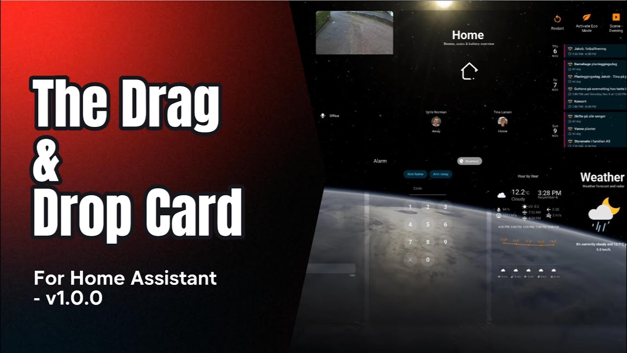
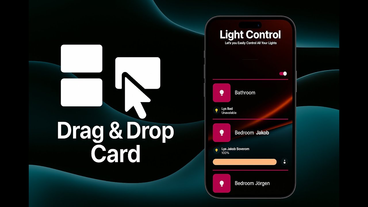
A freeform drag / resize / snap-to-grid canvas for Lovelace cards.
Arrange any Lovelace cards visually, save the layout (auto-save or manual), export/import full designs, and quickly prototype dashboards with device-size presets.
⚠️ License & Terms
This project is proprietary and governed by EULA.md.
Third-party notices are listed in THIRD_PARTY_NOTICES.md.
- Drag & resize any Lovelace card on a free-positioned canvas.
- Snap-to-grid editing (configurable grid size, live snapping).
- Auto-save (configurable debounce) or manual “Apply layout”.
- Export / Import designs as JSON (positions, sizes, z-order, options).
- Device size presets (phones, tablets, desktops) + flexible container sizing.
- Multiple tabs per canvas (top or left tab bar, per-layout last-tab memory).
- Optional card auto-resize:
- In
dynamicmode, cards always auto-scale. - In other modes you can opt in/out via
auto_resize_cards.
- In
- Rich backgrounds:
- Static image
- Particle background
- YouTube video background
- Or plain (
none)
- Screen saver mode to dim/blank the canvas after inactivity.
- Batch select & group actions (selection marquee, multi-select).
- Long-press or double-click to enter Edit mode; Esc to exit.
- Toolbar shortcuts (Add, Reload, Diagnostics, Import/Export, Apply, Exit).
- Optional hidden HA header/sidebar for “full app” dashboards.
- Card-mod compatible: preserves and applies
card_modon the main card. - No external CDNs: bundles
interactjsandjs-yaml.
- Add this repository as a Custom Repository in HACS. Select "Dashboard" As type.
- Search for "Drag and Drop Card" in HACS
- Click the download button. ⬇️
- The card is now available as a custom card in the Native Home Assistant Card Selector when adding new cards to a dashboard.
- Copy
drag-and-drop-card.jsto/config/www/drag-and-drop-card.js. - Add a Lovelace resource:
url: /local/drag-and-drop-card.js
type: module
After adding a new resource, clear browser cache or hard-reload to ensure the module loads.
To make changes persistent when you add / edit / remove cards within the drag-and-drop card, you must install the backend integration:
Without this, a simple browser refresh or Home Assistant restart can wipe your configuration.
Add a Drag & Drop Card to your dashboard using YAML:
type: custom:drag-and-drop-card
storage_key: livingroom_layout         # unique key per canvas
grid: 20                               # pixel grid size (default editor stub)
drag_live_snap: true                   # snap while dragging/resizing
auto_save: true                        # auto-save after edits
auto_save_debounce: 800                # ms debounce
container_size_mode: auto              # auto | dynamic | fixed_custom | preset
container_background: transparent      # canvas background
card_background: var(--ha-card-background, var(--card-background-color))
disable_overlap: false                 # prevent overlapping when true
background_mode: none                  # none | image | particles | youtube
debug: false                           # verbose console logs
Now:
- Long-press on blank canvas (≈1s) or double-click an empty area to enter Edit Mode.
- Use the toolbar to Add cards, Import/Export, Apply, or Exit edit mode.
- Ctrl/Cmd + S applies (saves) the layout while in edit mode.
- Esc exits edit mode.
You can define multiple tabs inside a single Drag & Drop card. Each tab has its own layout.
type: custom:drag-and-drop-card
storage_key: multi_tab_example
tabs:
  - id: home
    label: Home
    icon: mdi:home
    label_mode: both     # icon | label | both
  - id: media
    label: Media
    icon: mdi:television
    label_mode: icon
default_tab: home
hide_tabs_when_single: true- The card remembers the last active tab per
storage_key. - When there is only one tab and
hide_tabs_when_single: true, the tab bar is hidden.
Background behavior is controlled by background_mode:
none(default): no special background.image: usesbackground_image.particles: usesbackground_particles.youtube: usesbackground_youtube.
type: custom:drag-and-drop-card
storage_key: fancy_bg
background_mode: image
background_image:
  src: /media/your/folder/background.png  # or any HA-accessible URL
  size: cover                             # cover | contain | 100% 100% | …
  position: center center                 # CSS background-position
  repeat: false                           # true | false | 'repeat'
  opacity: 0.85                           # 0–1
  attachment: scroll                      # scroll | fixed
filter: blur(4px) brightness(0.8) # CSS filter() chainbackground_mode: particles
background_particles:
preset: default # implementation-specific; see docs/updates if provided
# Additional particle config may be supported in future versions.background_mode: youtube
background_youtube:
video_id: dQw4w9WgXcQ # YouTube video id
mute: true
loop: true
start: 0
end: 0 # 0 = entire video
size: cover # cover | contain | fill
attachment: fixed # fixed | scrollExact options for particles and YouTube are implementation-oriented; the above gives the general structure used by the card.
Optional screen saver that activates after inactivity:
screen_saver_enabled: true
screen_saver_delay: 300000   # milliseconds (e.g. 300000 = 5 minutes)
When enabled, the card will enter a “screen saver” state after the delay. The exact visual behavior may evolve, but the intent is to avoid burn-in and reduce visual noise when idle.
Below is a summary of the main configuration options. Many have reasonable defaults and only need to be set when you want custom behavior.
| Key | Type | Default | Description |
|---|---|---|---|
storage_key |
string | auto | Unique ID for storing this canvas’ layout. If omitted, one is generated. |
grid |
number | 10 |
Grid size in px used for snapping and guides. New cards created via the stub start at 20. |
drag_live_snap |
boolean | false |
Snap while dragging/resizing (live feedback). |
auto_save |
boolean | true |
Automatically save changes. |
auto_save_debounce |
number | 800 |
Debounce window (ms) for auto-save. |
container_size_mode |
string | dynamic |
dynamic (natural size, always auto-resize), auto (fit container), fixed_custom, or preset. |
container_fixed_width |
number | null |
Fixed width (px) when fixed_custom. |
container_fixed_height |
number | null |
Fixed height (px) when fixed_custom. |
container_preset |
string | fhd / fullhd |
Device/display preset key (see below) when preset. |
container_preset_orientation |
string | auto |
auto | portrait | landscape. |
container_background |
string | transparent |
Canvas background (e.g. color/gradient). |
card_background |
string | var(--ha-card-background, var(--card-background-color)) |
Default background for wrapped cards. |
disable_overlap |
boolean | false |
If true, prevents overlapping during edit (experimental - NOT RECCOMENDED WHEN USING TABS!). |
animate_cards |
boolean | false |
If true, cards animate in when switching tabs or loading. |
background_mode |
string | none |
none | image | particles | youtube. |
background_image |
object | none | Image background settings when background_mode: image. |
background_particles |
object | none | Particle background settings when background_mode: particles. |
background_youtube |
object | none | YouTube background settings when background_mode: youtube. |
screen_saver_enabled |
boolean | false |
Enable screen saver mode. |
screen_saver_delay |
number | 300000 |
Screen saver delay in ms (fallback to 5 minutes if invalid). |
tabs |
array | [] |
Tab definitions (see Tabs section). |
default_tab |
string | first tab id / 'default' |
Default tab id when the card loads. |
hide_tabs_when_single |
boolean | true |
Hide tab bar when there is only one tab. |
card_shadow |
boolean | false |
Apply a drop shadow to card wrappers. |
hide_HA_Header |
boolean | false |
Hide the Home Assistant top header while in this card. |
hide_HA_Sidebar |
boolean | false |
Hide the Home Assistant sidebar while in this card. |
edit_mode_pin |
string | '' |
Optional PIN required to enter edit mode (via supported UI). |
debug |
boolean | false |
Extra logging to the console. |
card_mod |
object | none | Card-mod config for the main card. |
cards |
array | none | Initial child cards (see below). |
- Phones:
iphone-14-pro,iphone-14-pro-max,iphone-se-2,pixel-7,galaxy-s8,galaxy-s20-ultra - Tablets:
ipad-9-7,ipad-11-pro,ipad-12-9-pro,surface-go-3 - Desktops:
hd,wxga-plus,fhd,qhd,ultrawide-uwqhd,uhd-4k
You can switch size mode at any time; the canvas will re-render accordingly.
Use the Add button in edit mode to pick from standard Lovelace cards or drag across an area to add a card directly to the grid.
Each added card is wrapped in a draggable/resizable container that participates in snapping and layout persistence.
- Layouts are saved per
storage_key. - Primary storage uses Home Assistant’s backend integration when available; otherwise falls back to
localStorage(ddc_local_<storage_key>) in the browser. - When backend becomes available, local layouts are migrated automatically.
- Auto-save is enabled by default; you can also use the Apply button or Ctrl/Cmd + S in edit mode for manual saves.
- Export produces a JSON file with version, options, and cards.
- Import reads JSON, applies
options(includingcard_mod, tab definitions, etc.), rebuilds the canvas, and keeps yourstorage_keyintact.
- Enter Edit: Long-press on blank canvas (~1s) or double-click an empty area.
- Exit Edit: Press Esc or use the Exit button.
- Apply: Ctrl/Cmd + S in edit mode or click Apply.
- Multi-select: Drag a selection marquee; use Shift/Ctrl/Cmd to extend selection.
- Toolbar:
- Add
- Reload
- Diagnostics
- Export / Import
- Apply layout (only needed when auto-save is off)
- Exit edit
The card supports card-mod on the outer drag-and-drop card.
Example to tweak grid color:
type: custom:drag-and-drop-card
storage_key: fancy_layout
card_mod:
  style: |
    :host {
      --ddc-grid-color: rgba(255, 255, 255, 0.15);
    }
Example to make the container fully transparent while keeping inner cards untouched:
card_mod:
  style: |
    :host {
      --ha-card-background: transparent;
      border-radius: 18px;
      overflow: hidden;
    }

    .ddc-root,
    .card-container,
    .layout,
    .pane,
    .rightGrid,
    .section,
    .toolbar,
    .mdc-card,
    .card,
    .card *[class~="card"],
    .mini,
    .bd {
      background: transparent !important;
      box-shadow: none !important;
    }
Note: Only the main card supports
card_moddirectly. Inner cards should be styled via their owncard_modconfigs.
This card can import designs from HADS:
- Module doesn’t load: Confirm resource URL & type. Hard-reload browser.
- Cards snap oddly: Adjust
gridor disabledisable_overlap. - Overlaps happen: Use
disable_overlap: true(experimental). - Layout didn’t persist: Ensure Apply or
auto_saveare used; checkstorage_keyand backend integration. - Imported design looks wrong: Check version & that the referenced cards exist in your system.
Add screenshots or GIFs here.
- Read EULA.md and THIRD_PARTY_NOTICES.md.
- Open issues for bugs/requests.
- PRs: keep style, no CDN deps, test with card-mod.
© 2025 SMARTI AS — All rights reserved.
Use is governed by EULA.md.
See THIRD_PARTY_NOTICES.md.
The bundle logs the version in the browser console:
drag-and-drop-card vX.Y.Z
A couple of bugs are already known:
- Card-mod support inside nested cards is still limited and may not behave as expected.
- …probably more 🙂