Boston, Massachusetts — February 16, 2026 — Graphable today announced the promotions of Andrea Johnson to Vice President of Analytics & Decision Intelligence and Michael Porter to Vice President of Information Engineering Services & Solutions, reinforcing the company’s commitment to delivering fully integrated, business-first data and decision intelligence solutions.
Both leaders have been promoted from within, reflecting Graphable’s philosophy of building long-term capability by investing in and elevating its own talent.
Andrea Johnson
Vice President of Analytics & Decision Intelligence
Andrea leads Graphable’s analytics and decision intelligence strategy, transforming complex data into executive-ready insight and measurable business outcomes. She ensures analytics is not treated as reporting, but as a core decision-making capability aligned to operational and strategic impact.

Michael Porter
Vice President of Information Engineering Services & Solutions
Michael leads Graphable’s engineering services and client delivery organization, translating complex business challenges into scalable, graph-powered data architectures. He ensures every technical foundation is built to enable analytics, AI, and confident executive decision-making.

One Integrated Operating Model
These promotions formalize Graphable’s integrated operating model — where engineering and analytics are aligned from day one.
Michael builds the scalable data and context aware graph foundations.
Andrea ensures those foundations deliver clarity, insight, and confident decisions.
Together, they represent the two pillars of Graphable’s mission: turning complex, connected data into confident executive action.
CEO Commentary
“Our clients don’t hire Graphable for disconnected tools or siloed expertise,” said John Walsh, CEO of Graphable.
“They hire us because we integrate engineering rigor with analytics clarity with the technologies that make sense for their business. Michael ensures we build scalable, graph-powered foundations. Andrea ensures those foundations translate into executive insight and measurable outcomes. Together, they represent the operating model that defines Graphable.”
“Just as important, both of these leaders were developed from within. That matters. It reflects the culture we are building — one centered on accountability, technical excellence, and real business impact.”
About Graphable
Graphable helps organizations move from raw data to context-ready decision intelligence. Through its integrated engineering and analytics operating model, Graphable enables enterprises to transform complex data environments into scalable architecture, trusted insight, and measurable business outcomes.
For more information, visit www.graphable.ai.

United Services, Inc. Completes Acquisition of Graphable; John Walsh Named CEO
Acquisition Positions Graphable for Expanded Offerings and Accelerated Growth in 2026
Indianapolis, IN — December 15, 2025 — United Services, Inc. today announced the successful acquisition of Graphable, a leading data, analytics, and graph-technology consulting, implementation, and operations firm (www.graphable.ai). The transaction was completed in early October.
Graphable helps organizations transform complex, fragmented data into context-aware, AI-ready intelligence. This connected data foundation allows organizations to understand not just what happened, but why it happened, what is likely to happen next, and what actions to take.
Graphable designs and implements integrated data ecosystems that support:
- Complex, multi-dimensional visualization of data and relationships
- Real-time and historical insight across systems, sources, and silos
- AI and machine-learning readiness, ensuring data is structured, governed, and contextualized for advanced models and intelligent agents
The acquisition enables the company to broaden its service portfolio, invest in new capabilities, and deliver greater value to early stage, mid-market, enterprise and public-sector clients beginning in 2026.

“Graphable has built a strong reputation for solving complex data and analytics challenges,” said John Walsh, CEO of Graphable. “Our team is excited to build on that foundation by expanding Graphable’s offerings, strengthening its go-to-market strategy, and helping organizations turn data into measurable business outcomes at scale.”
Joe Leadingham, President of United Services, Inc., added:
“This acquisition creates an opportunity to take Graphable to the next level. With John stepping into the CEO role, we are aligning deep technical expertise with proven executive leadership to support long-term growth and innovation.”
Walsh brings decades of executive leadership experience across technology, data, and enterprise services, including roles as CEO, COO, CTO, and board member / advisor to high-growth and transformation-focused organizations. His appointment signals Graphable’s commitment to disciplined growth, innovation, and customer impact.
Further announcements regarding new offerings and capabilities will be shared in early 2026.
About Graphable
Graphable is a data and analytics consulting firm specializing in graph technology, advanced analytics, and modern data architectures. The company helps organizations convert raw data into insights that drive smarter decisions, operational efficiency, and competitive advantage.
Learn more at www.graphable.ai.
Media Contact
Jenna Leadingham
(812) 203-5355
]]>You’re managing day-to-day operations, serving your customers, and trying to grow—all while navigating an overwhelming sea of data. You know your numbers hold valuable insights, but figuring out where to start? That’s the hard part.
What if you could turn that data into a tool that helps you make better decisions, understand your customers, and grow with confidence? That’s where data analytics comes in—not as another task to juggle, but as a game-changer for your business.
As the business world grows more data-driven, small businesses like yours can no longer afford to rely on guesswork.
In this article we’ll uncover why tapping into your data isn’t just helpful—it’s necessary to stay competitive. We’ll also explain why data analytics consulting is your best pathway to get there.
The Growing Need for Data Analytics in Small Businesses
Every small business owner wants to make wiser decisions, streamline operations, and gain a competitive edge. But the secret to achieving all of this lies in a resource you already have: your data.
When analyzed effectively, data reveals patterns and insights that can drive better strategies, improve efficiency, and ultimately help your business grow.
Imagine having the ability to anticipate customer needs, spot inefficiencies before they become costly, and make decisions based on facts, not guesswork.
That’s what data analytics can do for your business—it’s your roadmap to working more efficiently and scaling strategically.
Common Challenges of Small Business Data Analytics
Why do so many small businesses struggle to leverage their data? Many find themselves overwhelmed by obstacles like these:
- Tight budgets and limited staff make effective data tracking a daunting task.
- Confusion over priorities leads to wasted effort on metrics that don’t drive results.
- Siloed systems fail to provide a unified view of the business.
If any of this sounds familiar, you’re not alone. These challenges hold countless businesses back from reaching their full potential, but they don’t have to.
Transformative Potential for Small Business Analytics
Data analytics has the power to bridge these gaps and transform how your business operates. Unifying your customer relationship management (CRM), financial platforms, and inventory tracking on a single dashboard provides the big-picture insights you need to take control of your business. With the right tools, you can:
- Spot inefficiencies like outdated inventory or underperforming employees.
- Take quick, informed action to optimize your operations and cut unnecessary costs.
- Set clear, measurable goals that align with your long-term vision.
The right data analytics strategy doesn’t just help you stay afloat; it positions your business for sustained success and growth.
The Risk of Going at It Alone
Small business owners are no strangers to rolling up their sleeves and solving problems themselves, but navigating data analytics without support can turn into a minefield of unnecessary expenses and mistakes. Here’s what’s at stake when businesses attempt to manage data analytics without professional support:
1. Costly Missteps
Implementing a data analytics strategy without a clear understanding of tools and systems can result in:
- Wasted Money: Investing in software that’s overly complex, unnecessary, or incompatible with your business needs depletes valuable resources.
- Unexpected Expenses: Retrofitting systems that weren’t designed to work together can quickly drive up costs.
- Lost Time: Managing disconnected systems and troubleshooting dashboards takes valuable time you could be using to focus on your business.
To make matters worse, piecing together data from various sources and creating a clear, unified view of your business can feel impossbily complex.
2. Inaccurate or Fragmented Data
Without a consultant to guide the implementation and management of their data strategy, small businesses risk:
- Inconsistent Reporting: Employees may input data incorrectly, or systems may not sync properly, leading to inaccurate insights.
- Data Silos: When tools like CRMs, financial software, and inventory tracking systems aren’t integrated, key insights remain scattered and unusable.
- Poor Decision-Making: Decisions based on incomplete or inaccurate data can hurt your bottom line and limit growth opportunities.
So what if you have the right tools and the right data? Small businesses often continue to struggle. Why? Good data is worthless if you don’t know what to do with it.
3. Missed Insights
True data analytics isn’t just about numbers—it’s about uncovering long-term insights that propel your business forward. Without leveraging expertise, small businesses often:
- Fail to Identify Key Trends: Hidden patterns in customer behavior or operational inefficiencies remain undiscovered.
- Focus on the Wrong Metrics: Focusing on key performance indicators (KPIs) that don’t align with your long-term vision can result in wasted resources and overlooked growth opportunities.
- Sabotage Their Own Scalability: When tools aren’t designed with growth in mind, scaling up becomes an expensive challenge.
The bottom line is this: partnering with a data analytics consultant allows small business owners to bypass common pitfalls and focus on achieving their goals.
The Benefit of Data Analytics Consulting for Small Business
Small business owners rarely have a dedicated technical expert to handle data analytics, and when they do, that person often wears several hats. A data analytics consultant can free your team up to focus on their strengths. Consultants provide:
- Deep insight into data interpretation to uncover growth opportunities.
- Integration of multiple data sources into a single, accessible system.
- Strategies for organizing and leveraging data to achieve long-term success.
While any data analytics consultant can help navigate challenges, choosing the right partner—one who understands your unique goals and delivers tailored, impactful solutions—can make all the difference.

Why Choose Graphable as Your Small Business Data Analytics Consultant
With a proven track record and a client-first approach, Graphable provides data analytics consulting for small businesses across industries.
Here’s what sets us apart:
Expert Guidance Tailored to Your Needs
We work closely with small business owners to define clear goals, identify key performance indicators (KPIs), and focus on the metrics that matter most. Our hands-on approach ensures that every solution aligns with your unique business objectives. We even offer pre-engagement options to identify the best solutions before implementation, ensuring time and cost efficiency.
Customizable, Flexible Solutions
We understand that no two businesses are alike, which is why our consultants adapt to the unique needs of each and every business we serve. Our team at Graphable helps small businesses of all types–from construction companies to small medical clinics and restaurants–streamline their operations and uncover new opportunities through the:
- Seamless integration of tools and data sources, creating systems accessible to everyone who needs them.
- Automation of complex reporting processes, saving time and reducing the risk of human error.
- Construction of scalable systems tailored to specific goals.
Client-First Strategy for Maximum Impact
We aren’t tied to specific software vendors, so our small business analytics consultants can rightly prioritize your business’s needs. This vendor-agnostic approach ensures:
- You receive cost-effective solutions without unnecessary upselling, saving you money in the long run.
- Your tools and systems are optimized according to your budget to deliver the best possible results for your business.
Choosing Graphable means partnering with a team that shares your commitment to success. From seamless implementation to ongoing support, our turnkey analytics team transforms the way small businesses use data, enabling owners to focus on growth, efficiency, and long-term success.
Running a business is hard, but, with Graphable’s data analytics consulting for small businesses, you can face the future with clarity and confidence.
]]>More and more data storage, processing and visualization tools are available almost everyday. Which tools your company uses drives what an efficient data architecture is for your business.
Domo is a full back-to-front BI solution, able to store, process, and visualize data all in one platform.
When utilizing Domo and the consumption model pricing, the question then arises of where do I process my data? Do we bring all the raw data into Domo to have as much granularity as possible but use more Domo credits? Or do we pre-process the data, bringing in just clean, report ready data to reduce credits?
Processing data before loading it into Domo reduces credit consumption and in turn, saves costs. However, are there other costs you’re not considering with that approach? Are you losing value from your data that could cost your company a lot more than the extra credits would have?
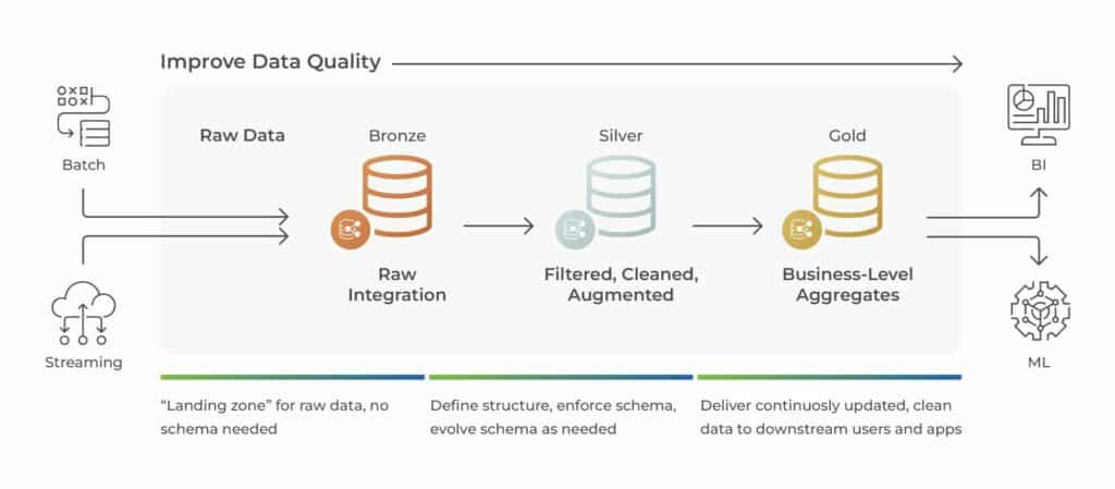
With Domo, the best data architecture for your company finds the balance between not losing any value from your data, and not creating a complex, unmanageable workflow. A helpful way to think about this is with the medallion architecture, a data design pattern Databricks coined.
In this blog, we’ll talk through the medallion architecture approach and how it can guide your data architecture in Domo.
What is a Medallion Architecture?
In a medallion architecture pattern, you look at three layers of processing data, with the goal of incrementally improving the quality of data as it flows through each layer.
The bronze layer is the raw data integration; data is stored without processing or transformation.
The silver layer is filtered, cleaned, and augmented data; tables are transformed into a more usable format. Note that silver layer data should not be aggregated, it should output clean, augmented, granular data.
The gold layer data is refined to meet business and analytics requirements. The main step to gold layer data is often aggregation, but it can include additional transformation such as specific filtering and or calculated fields.
A medallion architecture is a simple data model that guides how and where data should be transformed. It outlines a logical progression of data cleanliness and report preparation. For your business, you can think through what data sources you have and what tools you use, such as Domo, Databricks, Power BI, etc. and use the medallion architecture as a framework to build your optimal data workflow.
Optimizing Domo Credits and the Medallion Architecture
For legacy Domo contracts, you typically had a number of connectors, rows of data storage, and a number of user license. Within those limits, you could connect and build anything. In the medallion architecture framework, most businesses brought in bronze layer data into Domo. Starting with the raw data, they did all of their clean up and transformation in Domo. This method enabled data savvy teams to access their data and reports all in one system. It also can lead to more ETL maintenance and potentially redundant dataflows. Companies often didn’t have a clear data plan when they starting building ETLs, sometimes leading to the Domo data warehouse ballooning without tangible reports on the front end.
In Domo’s consumption model pricing, you’ll want to be deliberate about your data architecture. With the medallion architecture in mind, think about what layer of data it makes sense to bring into Domo: bronze, silver, or gold.
Need help optimizing your domo consumption usage? Connect with a Domo consultant today.
When finding the balance between Domo credit consumption and not losing value from your data, often the answer will be to bring in silver layer data. Connecting data that is already clean with demographic data joined in will reduce dataflows while not losing value from your data.
Silver layer data allows companies the option of having teams be self service with their analytics, or having an analytics team built reports for each department. Many report requests can be built right off of silver layer data, handling any aggregation and additional filtering in Analyzer and with beast modes. Building cards off silver layer data allows users to drill into the details they need, and reduces the need for an additional dataflow.
There are, of course, many use cases when it is still valuable to bring in bronze layer data to Domo. For most marking use cases, unless the workflow is already setup, it does not make sense to pipe the data from the various marketing sources into another system first, to then bring it into Domo. You risk losing too much value from your data and not having full control to filter and drill into the data end users need.
Bringing the bronze layer marketing data into Domo enables your teams to get the most from the data. With both sales and marketing teams often utilizing the marketing data, the bronze layer data allows each department to transform and build reports with the data as needed.
Alternatively, some businesses have data warehouse or existing workflows that could suggest connecting gold layer data to Domo. For example, if your sales team utilizes Salesforce, you could choose to bring in prebuilt reports from Salesforce instead of raw objects and fields. With this architecture, cards would be built directly off the report datasets in Domo, and should validate to Salesforce.
Conclusion
In the consumption credit structure, your data architecture should be deliberate and governance should be at the forefront of your Domo use. However, the credit structure should not dissuade you from bringing your valuable data into Domo. With the medallion architecture in mind, you can be deliberate and thoughtful about the best data workflow for your business, getting the most value from both your data and your investment in Domo.
If you’re not sure where to start, here is a few ways to optimize your Domo consumption model.
As premium Domo partner, we are strategically positioned to assess your unique use case and help ensure the optimal data workflow. Contact our team today to discuss your Domo project and how to best structure your data!
]]>Whether you’re a data engineer, business analyst, data scientist, or technology decision-maker – understanding the nuances between the two platforms is crucial in order to maximize the potential of your business’s data strategy.
Looking for a cost effective, comprehensive, and turnkey Analytics solution? Check out our Analytics Team as a Service.
Understanding Databricks and Snowflake
To get started, let’s address the most basic questions “What is Databricks?” and “What is Snowflake?“
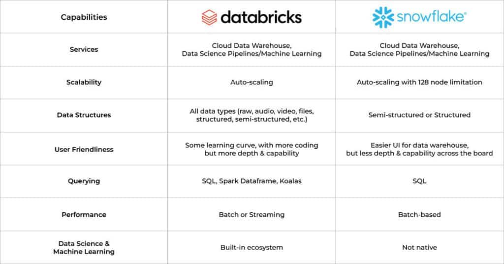
Databricks offers advanced data engineering and data science workflows while also being the industry leading data lakehouse. It can process data up to 12X faster than competitors, handle advanced machine learning and generative AI models, and combines the data warehouse / data lake, data pipelines, data catalogs all into a single platform while continuing to enable advanced governance capabilities.

Snowflake is a cloud-based data warehousing platform that enables the storage, processing, and exploration of data. Snowflake is a data warehouse that is primarily focused on business intelligence, primarily offering the capability of store and query data at scale, though more recently they have begun to offer data science on the cloud, by far the more difficult market to break into.
What is the difference between Snowflake and Databricks?
While Snowflake and Databricks have a lot of overlap when it comes to storing and querying data at scale, there are some critical differences that are worth understanding.
Unlike competitors, the Databricks architecture started with data engineering and data science at the core – incorporating industry leading capabilities such as the Apache Spark framework for big data workloads, MLflow for end-to-end machine learning lifecycles, and Time Travel for model reproducibility.
With these capabilities already established, Databricks has successfully expanded cloud data warehousing, including its “lakehouse” approach, leveraging its storage framework based on the open source Delta Lake project. This enables Databricks to seamlessly interoperate across many disparate data processing engines while avoiding vendor lock-in.
Snowflake’s founders, on the other hand, aimed to harness the power of the cloud to create a centralized data warehouse storage solution for businesses. Their goal was to enable storing and accessing data at scale in a cloud-native environment. They have since expanded their offerings to incorporate tooling for data engineering and data science, largely through third party integrations, and historically lacking the depth offered by Databricks- though that is changing over time.
Databricks vs Snowflake: Capabilities Comparison
Consider the below chart when trying to better understand the capabilities of Databricks vs. Snowflake:
Databricks vs Snowflake: How are they Competitors?
When discussing modern data platforms, Databricks vs Snowflake often comes up in conversation. Though they appear similar due to the ability to store and access data, understanding whether they are direct competitors requires delving into their core functionalities and target use cases.
Databricks – The Unified Analytics Platform
Databricks positions itself as a unified data and analytics platform, built on top of Apache Spark. It’s designed for massive-scale data engineering and collaborative data science in the cloud data lake. Databricks excels in machine learning workflows and real-time analytics thanks to its ability to handle streaming data efficiently. It provides a collaborative environment for data scientists, engineers, and business analysts to work together on complex data tasks.
However, Databricks has been slowly and successfully evolving their business to where now they are directly competing with Snowflake. It just so happens that moving from AI / Analytics and data pipeline workloads as their speciality to offering cloud data warehousing is a lot easier than trying to move in the other direction, which is what Snowflake has been trying to do.
With Databricks significant investment in the open source Delta Lake project- and as its largest contributor- they successfully tackled the significant challenge of seamless interoperability across various data processing engines, eliminating the issue of vendor lock-in. Then in mid- 2024 they also acquired Tabular, a commercial implementation of a competing open source storage framework called Iceberg. Like Databricks with Delta Lake, Tabular is the creator of, and largest contributor to, Iceberg. This only solidifies Databricks’ position in the cloud data warehouse space, making it tougher on Snowflake who is using Iceberg as the foundation of the recently announced Polaris Catalog, which they promptly released as an open source project, in a very obvious move to combat Databricks’ influence.
Snowflake – The Cloud Data warehouse
Snowflake is a cloud-based data warehousing solution, with additional capabilities being added all the time. Its strengths lie in its ability to store and retrieve vast amounts of data quickly and efficiently, making it ideal for business intelligence and reporting, which is typically accomplished through partnerships with the likes of Sigma Computing and Salesforce Tableau.
As mentioned earlier, as Databricks has begun to take more and more cloud data warehouse market share from Snowflake, Snowflake has conversely been moving more into the AI / Analytics and data pipeline space by quickly acquiring companies such as Neeva, Streamlit and Applica in the last few years, to try to catch up to Databricks. Technically speaking, this is a much more difficult hill to climb for Snowflake than it is for Databricks to move into the cloud data warehouse space.
Snowflake is also attempting to shore up their cloud data warehouse position by creating the Polaris Catalog, a direct open source alternative to Delta Lake and Iceberg. Though Polaris is built on Iceberg, Snowflake released it as a separate open source project now.
Overlap & Distinction
There is now a lot of overlap in capabilities, particularly in the area of big data processing and storage. Databricks has been more focused on advanced analytics and handling complex data processing tasks, often involving data science or machine learning. Databricks is pursuing the standard cloud data warehouse agenda with customers more and more, but they come from the data science engineering heritage. Snowflake, conversely, is optimized for storing and analyzing structured data, with a strong focus on ease of use and scalability in data warehousing.
How can you choose between Snowflake and Databricks?
Choosing between Databricks and Snowflake requires a deep understanding of both the current and future needs of the business. In some scenarios, Databricks’ wider range of capabilities gives them the upper hand. In other scenarios, Snowflake’s ease of use can be a deciding factor.
In some organizations, it may even make sense to use both in complementary roles – with data science and data engineering teams leveraging Databricks alongside analytics and business intelligence teams working in Snowflake to democratize data across the business. However, with the databricks snowflake wars as they are now being called, it will not likely be that way much longer.
Conclusion
In conclusion, both Databricks and Snowflake are powerful platforms within many companies’ data stacks. Choosing between the two, or even commingling each system’s strengths, can be a daunting task, even moreso now with the companies competing head-to-head on most agendas in the “snowflake databricks wars”.
If you’re looking for support in making a decision regarding snowflake vs databricks, or need help implementing or optimizing them within your organization, contact us at Graphable. With our deep expertise across applications, data analytics consulting, data engineering, and artificial intelligence – we’re happy to help your team along their data strategy journey.
Related Articles
- What is Databricks? For data warehousing, data engineering, and data science
- Databricks Architecture – A Clear and Concise Explanation
- What is Databricks Dolly 2.0 LLM?
- What is Databricks Unity Catalog?
- Databricks SQL Warehouse: Unlock the Power of 4 Proven Strategies
- AI consulting guidebook
- AI in Drug Discovery – Harnessing the Power of LLMs
Business intelligence initiatives are not an end unto themselves – they exist to align the resources and budgets of an organization toward its goals. However, optimization may be an elusive goal for many organizations – because optimization requires unique skillsets and a broad perspective.
It is difficult to build excellence for an entire organization on a shaky foundation – an analytics effort with questionable ROI. The longer this problem persists, the worse the problem becomes. Business intelligence initiatives, which may have once delivered focus and goal alignment, can themselves become part of the problem. Inaccurate KPIs result – leading to distrust of metrics and lack of clarity. Meanwhile, data and BI costs can balloon, and turnover at key positions may exacerbate the problem.
In light of these challenges, we have developed an Analytics Team as a Service (ATaaS) offering to address key pain points for clients in a value-conscious but robust manner.
ATaaS provides our clients with a team of Graphable experts – each deeply skilled, but with various skill sets – to bring the right expert to the specific client need.
The ATaaS offering allows for planned BI budgeting with the ability to throttle the personnel allocation component – for example, the first year of an analytics platform implementation may require 2 full time employees (FTEs), but years 2 through 5 may only require half of an FTE to maintain and grow the initiative.
Here are 6 of the pain points we’ve experienced alongside clients that the ATaaS offering has been specifically designed to address:
1. Strategy – Questionable ROI on BI initiatives
Many BI initiatives do not have a demonstrable ROI to validate the resources poured into them. When the costs of the BI platform, personnel costs, the extended cost of implementing and maintaining that platform, implementing governance and the costs of storing and processing data are taken into account, do they provide the organization demonstrable ROI?
Further, some organizations have aging BI initiatives. While the initial BI implementation may have been robust and in full alignment in terms of cost and budget, over time, because of changing processes, accumulating data, champion departure and/or a multitude of other factors, it is no longer optimized as it once was. Graphable has found that BI initiatives require purposeful maintenance to retain their focus and value to the organization.
Graphable’s ATaaS works with companies to align all of their costs and efforts with one goal in mind – optimization – so that the resources allocated to the BI initiative achieve maximum positive impact for the organization. For our ATaaS clients, this commitment is demonstrated in an initial audit, with subsequent quarterly business reviews (QBR), in which BI spend is reported and analyzed for efficiency, bringing both rigor and rhythm to the BI effort. These efforts are key to regaining and maintaining optimization.
2. Personnel – lack of cross-domain experience
We’ve also experienced a dearth of business alignment in the BI space. Let’s be fair – there are many people who know how to manipulate data and get to an answer – but how many of them know how to connect it to the “Why?” How many of them understand the needs of the finance department, the operations department, and the marketing department all at once, and how all of those KPIs matter to executives as they roll up through the organization? To be honest, many analytics professionals have a hyper-focus on technology but do not or cannot consistently focus on the “Why” behind the key organizational KPIs.
Graphable’s ATaaS team hires analytics consultants from a variety of backgrounds who gain deep experience implementing and optimizing business intelligence initiatives across an entire organization. Simultaneously, the entire team has been intentionally formed with areas of specific specialty that they can bring to bear at the right time for any client. Graphable’s team has worked with over 300 clients in various verticals over the past 6 years, building deep experience in the sector.
3. Ballooning costs – maintaining ROI in a changing environment
Data costs are changing as I write – it can be tough for companies to keep up – leading to rapidly growing costs. The shift to cloud offerings (SaaS Analytics) and the changing cost structures of analytics tools (i.e. many providers are shifting to consumption models), along with the certain increase of stored data over time makes it imperative for organizations to optimize their data architecture and governance.
It is vitally important to the optimization of a BI effort to account for the growing costs of data and understand the impact of a data architecture to the bottom line. For example, is it necessary to copy all of your data into a BI SaaS platform? Can it remain in its native storage, and the Analytics platform extract what is needed without copying multiple datasets? Is Snowflake or Databricks the right place for my data? If a copy of the data is needed, how many datasets are needed? Can datasets be optimized so that the amount of data is kept to a minimum and ETL used to extract data to present data effectively to the visualization layer?
Graphable’s ATaaS team has an eye for optimizing the data stack for value and long-term cost planning – and has a wide variety of experience and well-positioned partners to ensure organizations continue to align spend to ROI in the midst of change. Graphable partners with Domo, Databricks, and other offerings to optimize client data architecture. Check out Sarah’s blog on best practices when it comes to optimizing Domo’s consumption model pricing.
4. Strategy – lack of holistic approach
Graphable has noticed that often BI efforts are siloed within an organization. This puts the cost center of the BI effort on one department or division of the organization, and the ROI can be hard to return to that cost center. Simultaneously, the data sources can go beyond the boundaries of that department.

Graphable’s ATaaS team helps to drive towards a more holistic approach to BI – optimally with the costs shared across the organization, with a broad approach to architecture, governance, and dataset design. A holistic perspective can have a massive impact on the ROI of the entire initiative, because data duplication and redundant effort can be significantly reduced with a holistic data strategy.
5. Personnel – turnover of team members
Graphable has worked with many organizations to train a BI individual or team. Training clients’ employees is an effort our team has always enjoyed and also excelled at – but we have seen many of those newly trained team members depart the organization at some of our clients within only a year or two of hire. An organization that has budget for 1-3 team members on a BI team is vulnerable to the turnover and limitations of those employees. It can also be limited to the skill sets that those team members have.
We have seen well-conceived and promising BI initiatives struggle to remain relevant after a key analytics team member (champion) departs the organization, taking along with them many months of training and organizational knowledge.
Graphable ATaaS is provided via team construct and helps to mitigate the challenges presented by team member turnover due to our robust documentation and alignment strategies.
6. Strategy – square peg, round hole
Graphable has often experienced a misalignment between what analytics platforms offer as opposed to what their client really needs. Take for instance, finance analytics. Often a vendor will want to showcase slick software features – but everyone knows deep down that the finance department will always use Excel to some degree – so why do we continue to pretend like that will somehow change?
Graphable’s ATaaS has a laser focus on value – NOT primarily on making a specific tool the ONLY tool an organization uses. This means that we will work to provide the right tool or process in the holistic BI effort, not try to change what the client’s employees do well if it does not make sense. Analytics, well implemented and optimized, will amplify the excellent work of a client’s team members, not force them to change processes unnecessarily. Check out David Zimny’s unique take on business intelligence and accounting analytics.
Through our Analytics Team as a Service (ATaaS) offering, Graphable has compelling answers to these very common business intelligence challenges. Since 2018, our experienced team has supported over 300 clients to optimize the initiatives of our clients in surfacing value from their data.
]]>With access to all Domo features, you can test out numerous solutions and workflows with your data. As you determine the best configuration, you’ll want to keep in mind how many credits it will consume.
If the action is valuable, such as bringing your siloed data together in a dataflow, it makes sense to consume the credits. However, if the action does not produce value, such as refreshing data hourly when it only changes daily, then you’ll want to take another look at the configuration.
Here’s how you can manage your consumption without unnecessarily burning through credits or micromanaging your teams.
If still new to the consumption model, read our post to get an overview of how the consumption model works or is different from your old contract.
Key Strategies for Credit Conservation
Rethink Your ETL Routines
ETL processes are fundamental in data workflows. If they are not optimized, they could consume an extensive amount of credits.
Traditional setups might have ETL tasks running every 15 minutes or even hourly, which often isn’t necessary. Is your data really changing that often? Probably not.
By reevaluating the frequency and scheduling ETLs to run when the input dataset updates, only during business hours and not on weekends, you can significantly reduce credit usage. This adjustment aligns processing times with actual data utilization peaks, ensuring that credits are spent only when it adds value.
Beyond how they update, adjusting how ETLs are built can reduce credit consumption. With each output table consuming a credit, are there ways to reduce the number of output tables you need?
When different team analytics are siloed, you may end up with two similar datasets, such as an opportunity dataset for the sales team and a leads-to-opportunities dataset for the marketing team.
Could these datasets be adjusted so the teams use the same dataset? They cannot always be combined, as different levels of granularity sometimes need to be different datasets. But you’ll want to take a look through this to optimize for your credit consumption.
Need help optimizing your domo consumption usage? Connect with a Domo consultant today.
Smart Transformations with Views
Domo’s Views offer a more credit-efficient method for data transformation compared to traditional ETL tasks. By using Views when possible, organizations can perform necessary data manipulations at a lower cost. This method not only saves credits but also enhances the agility of data operations, allowing for quicker adjustments and less resource-intensive transformations.
Keep an Eye on Your Usage
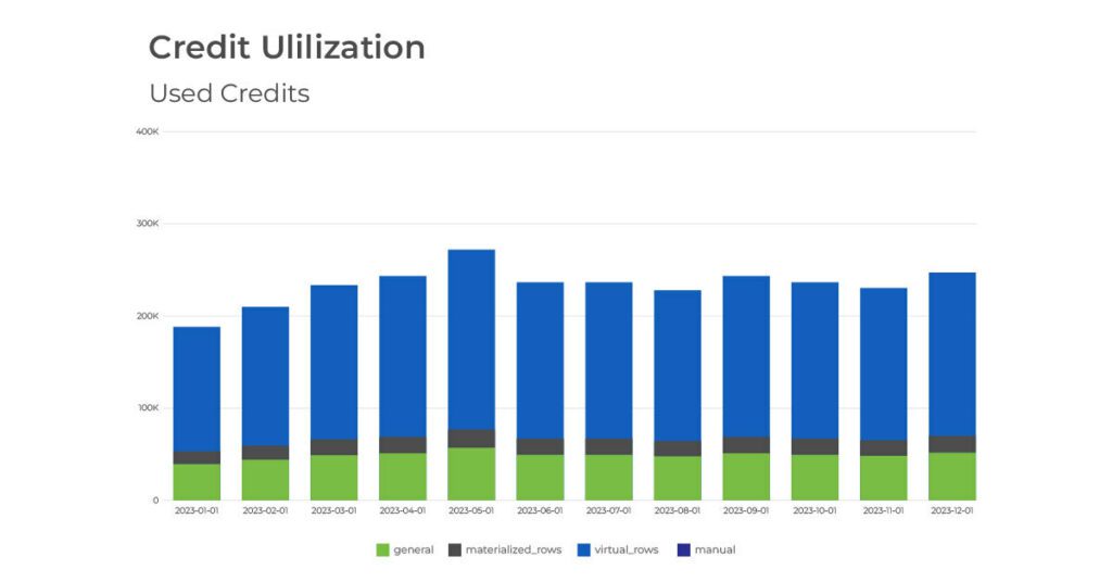
Continuous monitoring of credit usage through tools like the ‘Used Credits DomoStats Report’ and the ‘Credit Utilization’ dashboard is essential. These tools help organizations track credit consumption and identify high-usage areas, providing insights that can drive more informed decision-making about where to cut costs or optimize processes.
Beyond the out of the box tools, it can be helpful to build additional tables to call out datasets with the most rows, run the most frequently, and have the most cards built off them. Knowing which datasets are used the most can ensure that the largest credit consumers are producing the most value.
Check out our article for help on optimizing Domo credit usage with the medallion model.
Tighten Up Data Governance
Implementing strict data governance policies can prevent unnecessary credit usage. By defining clear guidelines on who can perform certain operations and setting limits on how often these operations can be executed, companies can avoid wasteful spending of credits.
Explore Domo Features
Domo’s consumption model pricing all focuses on consuming and processing data. An easy way to ensure you’re getting the most value for your Domo investment is to utilize all features available to you, at no additional credit cost.
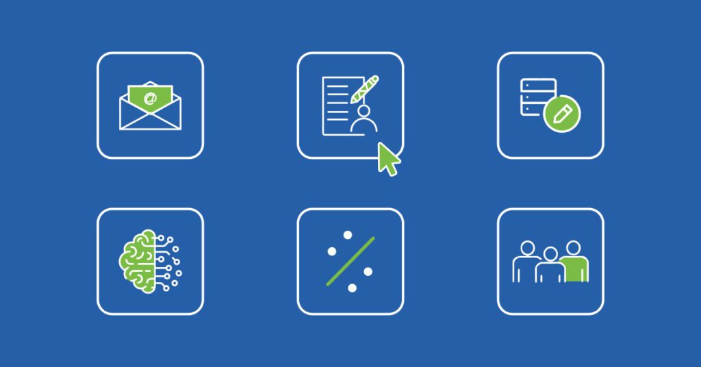
Domo tools that previously were an additional cost on your contract, often at least $10k a piece, are now all unlocked for your use. The most common of these tools we see client’s utilizing are:
Conclusion
By optimizing how and when data processes are executed, leveraging more efficient tools like Views, training so that your team has a better understanding around credit usage, and utilizing all Domo tools available, you can optimize your current setup and ensure to get the most value from your Domo investment.
For assistance optimizing your Domo instance for credit consumption or a guide in exploring other Domo features, talk to a Graphable Domo consultant!
Need help unleashing the full power of your data? Learn more about our Data Analytics Consulting services.
]]>Organizational analytics isn’t just a trend—it’s a game-changer. According to Gartner, 58% of organizations find their performance management systems inadequate.
Imagine reallocating your team’s energy from manual data crunching to strategic execution. With automated KPI reporting, you can. Discover seven compelling reasons to upgrade your organizational analytics now and gain a competitive edge.
Here are 7 reasons why it’s important for your business to recommit to organizational analytics.
Looking for a cost effective, comprehensive, and turnkey Analytics solution? Check out our Analytics Team as a Service.

1. Dialed in KPI’s
Every organization has “north-star” KPI’s. In recent years, many companies and organizations have put significant effort into identifying and clarifying their core KPI’s, which has led to a more wide-spread focus on a holistic organizational analytics focus.
Operating frameworks like EOS are commonly used by leaders to run and evaluate their organizations. These operating frameworks require the reporting and tracking of KPIs – not just lagging indicators like the Profit and Loss Statement, but leading indicators such as leads generated or the effectiveness of a digital marketing campaign.
2. Competitive Advantage
Organizations that streamline the reporting of KPIs through automation have an edge in their competitive landscape. The research is clear – teams that effectively implement KPIs through digital transformation have a significant advantage over their competition and can simply track and report on their follow-on efficiency and short-term objectives.
For example, a manager or executive can be automatically notified when product numbers are dipping below daily targets or the sales pipeline is shrinking, allowing them to take more timely actions to reverse the negative trend.
3. Data is Available
Failing to leverage available data is flying blind – when clarity is well within reach. A few years ago, the availability of data from core systems was spotty. That is no longer the case in today’s connected society – virtually every platform can export data – and if it doesn’t, its users are most likely seeking a new solution.
While many of these core systems have “cookie-cutter” KPIs built in, these are not normally optimized to the exact metrics needed for a particular organization. Often they simply don’t produce data in the right format – i.e. “day-over-day” or “month-over-month” – allowing for data trend lines – or they require the output and combination of data from multiple systems (historically, often done in Excel) to produce a usable metric. This is where modern analytics platforms truly shine.
4. Data is Democratized
KPIs can easily be viewed anywhere and anytime. Not only is data available from accounting, marketing, and ERP systems for transformation and presentation in analytics tools, the business intelligence tools themselves allow for the data to be securely, accurately, and professionally viewed in mobile applications and web browsers.
Managers and executives on a business flight or on the golf course no longer need VPN access to their network in order to access critical information driven by organizational analytics. At the fundamental level, modern analytics platforms simply empower organizational leaders to make data-driven decisions rapidly, track progress, and align their teams around common, visually-presented goals.
5. Analytics Platforms are Competitive
Analytics tools are more ubiquitous and competitive than ever. PowerBI, Domo, and Tableau, to name a few analytics tools, are not only available, but economical.
PowerBI comes prepackaged with many versions of Office 365. Domo now has a “Trial” version. Tableau is available for free exploration as “Tableau Public”.
In the last few years, the market for analytics platforms has become both saturated and commoditized. This means that those implementing organizational analytics now can get advanced analytics platforms at competitive prices.

6. Analytics Platforms are Capable
Analytics tools are more capable than ever. Analytics tools are optimized to bring in data from many disparate systems, combine and process the data, and present that data in a single dashboard. Domo has over a thousand pre-built connectors. If the connector doesn’t exist, it can almost certainly be economically built.
Modern analytics platforms also allow for one click filtering to relevant data and the ability to drill down into detailed data very quickly. When you add to those features the ability to collaborate with team members – inside your organization, or consultants and contractors – outside your organization, it becomes very clear that analytics platforms are capable as never before.
7. Analytics Platforms are Flexible
Analytics platforms can be customized. You can build your visualizations from scratch or you can utilize pre-built apps. Graphable has often found that organizations want to customize their reporting – because dialing in KPI’s is what analytics reporting is all about.
For instance, Graphable has found that often finance teams want specific customizations vs. a cookie-cutter application because each organization needs to look at financial data a different way. Check out David Zimny’s unique look at accounting analytics.
Organizational Analytics that aren’t optimized are perpetuating what they are meant to correct
Data transformation and the purposeful automation of KPI reporting can have a massive impact on an organization’s bottom line and the achievement of its goals. For teams still manually generating their reporting, the time and energy spent can and should be reallocated to executing on the results of automated reporting.
Every organization should consider implementing automated reporting or optimizing their current analytics reporting setup in order most effectively utilize the energies they invest in their organizational analytics.
Graphable’s data analytics consulting team has been implementing and optimizing analytics platforms for over 6 years and is structured to assist an organization where they are at to implement and achieve value from automated analytics.
]]>Either way, it’s important to understand what the Domo consumption model is – and useful to hear it from a knowledgeable third party. In this blog, we’ll dive into what the consumption model is, how it is different from previous Domo pricing model, and what it means for your organization if you are already a Domo customer.
Looking for a cost effective, comprehensive, and turnkey Analytics solution? Check out our Analytics Team as a Service.
1. What is the Domo Consumption Model?
There are many ways to price a Software as a Service (SaaS) product. Monthly fee, yearly fee, user based, usage based, company size, available discounts and more. Domo’s consumption model bases the price off how much your organization uses Domo, a method many software companies are migrating too these days.
They calculate how much you use the platform by how much the data center is moving data around: bringing it into Domo, transforming it, and pushing it out of Domo. As a pricing structure, this makes sense, since Domo pays its host server, AWS, based on data storage and compute power. So, Domo can more easily forecast margins, profit, and revenue if they price Domo in a similar structure.
2. How is it different from previous contract structure?
If you are already a Domo customer and not on the consumption model, Domo will want to ultimately update your contract to this structure, either at your next renewal or sooner. During the conversations with Domo, its critical to understand how the consumption model is different than your current contract.
Legacy Domo contracts are mostly based on number of users, number of connectors, and number of data rows stored. The smallest Domo contract was typically 5 users, 5 connectors, and about 1 million rows of data. As you increased users, connectors, and data rows, the price per each scaled as well. Basic Domo contracts got you just the basic Domo platform of connecting data, transforms in MagicETL or SQL, and cards and dashboards for front end reporting.
Additional features such as apps, write back connectors, graph data science tools, Domo Everywhere, and more, were an additional cost; either added on mid contract or baked into your original price. Depending on your contract size and when you signed on, you may have negotiated a discount on some portion of your contract.
Domo consumption model contracts are based on a credit system. In your contract, you purchase a number of Domo credits, good for a year. As your business uses Domo, certain actions in Domo are charged a credit or two. The items in Domo that utilize credits are pulling data into Domo, transforming data, storing data, and pushing data out of Domo.
To estimate how many credits your business will use, Domo uses a calculator that takes in the following factors.
- Number of raw data tables pulled in
- The frequency data tables will be updated (Hourly, Daily, Monthly, etc.)
- How much transformation the data needs (Low, Average, High)
- The hours during the day the data is “live” (During working hours, 24 hours a day, etc.)
- If data will update on weekends or just during the week
- The approximate rows of data storage (in millions).
The calculator outputs an estimated credits used per year. As the number of credits purchased increase, your cost per credit decreases.
With the consumption model, the great thing is, it is very easy to start with a certain number of credits, and as your company utilizes Domo, you get a better understanding of how and where your credits are being used, and you can adjust your contract with Domo later on if needed.
One great aspect of this Domo pricing structure is that the entire platform is unlocked. There is no additional cost for apps, data science, Domo Everywhere, and more. Since all features are unlocked, you are able to try out all different tools in Domo for different solutions and workflows in your business, without worrying about pricing negotiations.
When moving to the Domo consumption model, it could seem like you are paying more for the same amount. However, with all features of the platform available, you are really getting much more. You will want to spend some time with your major domo, or a consulting partner, looking at Domo tools such as embed, workflows, APIs, app studio, data science, writebacks, etc. that your company could utilize to get even more value from the platform.
Two other great aspects of this pricing structure are that the number of users and number of end reports are not a factor in your price. All customers have unlimited users and unlimited dashboards and reports – a huge advantage for many companies.
Check out our article for tips on optimizing Domo credit usage with the medallion model.
3. What migrating to consumption model means for your organization
When moving to the consumption model, companies often don’t know where to start. Initially, it is hard to picture what organizational changes you need to make to get the most from Domo. A consulting partner can be a great resource to walk you through this process.
To start, since the Domo consumption model is usage based, you’ll likely need to restructure part of how your data is being processed in Domo. No longer limited by the number of connectors you use, a great first question is “Are there other data sources we can bring into Domo?” With both new data connection and existing ones, you’ll want to optimize how they are connected, bringing in as many tables as you need, but not many more than you need.
When transforming the data, it is important to have clean database structure hygiene. You’ll want to ensure your end reporting tables are as broad as possible, to power many reports with filtering on the card level; instead of having many filtered tables that are similar, each powering a few reports.
Though data row storage is not a large use of credits in the consumption model, it is something to keep in mind. When possible, using Views is beneficial, since storing data in views consumes less credits than materialized datasets.
Lastly, a main consumer of credits is how often dataflows run to update data. Businesses should optimize the dataflow workflow schedule to update data as often as the data changes, but not more frequently than is necessary.
Conclusion
The Domo consumption model allows companies to get the full value of the Domo platform, with less barriers. With a shift in mindset to how your company approaches Domo, you can achieve maximum value from your Domo spend.
Partnering with Domo Consultant at Graphable can help your company optimize your credit usage right from the start, and ensure your users are educated on how to get the most from Domo.
]]>Traditional methods of detecting and investigating financial crimes which are primarily based on heuristics have historically often struggled to take advantage of the underlying structure of relationships involved in money laundering schemes, leaving a large portion of existing data in financial institutions untapped. However, with the emergence of graph technology, institutions that adopt this methodology have the tools to not just detect the nature of money laundering, but its underlying structure. This blog explores the role of graph technology in detecting and investigating money laundering schemes, offering insights into its effectiveness and potential impact.
Understanding Money Laundering
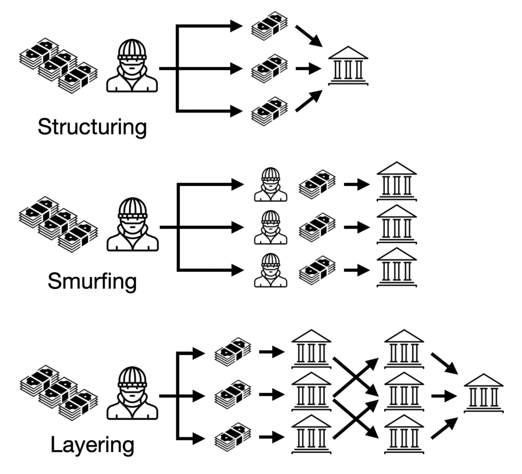
Money laundering is a critical component of various financial crimes, enabling criminals to conceal the proceeds of illegal activities. As long as it has existed, combating money laundering has existed as a cat & mouse game between regulators like the Financial Crimes Enforcement Network (FinCEN), along with teams from financial institutions and the criminals who are constantly working to find new ways to obfuscate the origins and destinations of their funds. Techniques such as smurfing, structuring, and layering are commonly employed to obscure the source and destination of illicit funds. Detecting money laundering using traditional methods is challenging due to the complexity and volume of financial transactions involved, highlighting the need for innovative approaches.
Graph Database Technology: An Overview
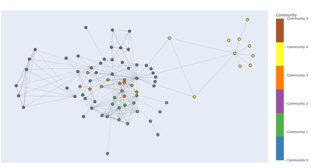
Graph database technology, rooted in graph theory, offers a versatile framework for representing and analyzing complex relationships in data. Unlike traditional relational databases, graph databases excel at capturing the interconnected nature of financial transactions, making them ideal for detecting and investigating money laundering activities. Key concepts in graph theory, such as contextual neighborhoods, centrality measures, and community detection, play a crucial role in uncovering suspicious patterns and connections within financial datasets, particularly when analyzing connections between many accounts.
The use of such graph databases also allows organizations to bring together otherwise siloed datasets into one cohesive data store. This heterogeneous knowledge graph can then provide a context-rich environment that can add unique value to detection, investigation, and processing.
By wielding both an in-depth knowledge of these graph theory concepts, as well as intimate domain knowledge, one can combine the two to create a potent combination of skills to uncover complex networks of criminal activity
Leveraging AML (Anti Money Laundering) Graph Technology
Building an AML knowledge graph is a multifaceted process that involves bringing together many layers of financial transactions, accounts, demographic information, and relationships between them. At its core lies the identification of key entities and their interconnections within the financial ecosystem. These entities encompass various elements such as accounts, transactions, and individuals, each playing a crucial role in understanding the flow of funds and detecting illicit activities.
The utility of a financial crime knowledge graph is further enhanced by the application of graph algorithms. These algorithms, ranging from centrality measures to community detection and clustering techniques, empower analysts to identify anomalies and discern patterns indicative of money laundering. Centrality measures, for instance, highlight pivotal nodes within the graph, potentially pointing to key players in illicit schemes. Community detection algorithms aid in identifying clusters of related entities, shedding light on complex networks of collusion. Clustering techniques, on the other hand, group together entities exhibiting similar characteristics, facilitating targeted investigations into potentially nefarious activities.
Moreover, the integration of graph machine learning techniques introduces a predictive dimension to the analysis. By leveraging the wealth of interconnected data within the graph, machine learning models can uncover nuanced relationships and behaviors, providing predictive insights into potential instances of money laundering. These techniques enable analysts to stay ahead of evolving tactics employed by financial criminals, preemptively identifying and thwarting illicit activities.
Building a financial crime knowledge graph is a complex process that draws upon a wide range of tools and methodologies. By harnessing the power of connections between data and advanced analytical techniques, analysts can effectively detect and combat money laundering to safeguard the integrity of the financial system.
Conclusion
In conclusion, AML graph database technology offers a powerful approach to detecting and investigating money laundering schemes, leveraging its ability to uncover complex relationships and patterns within vast datasets. As financial crimes continue to evolve, embracing AML graph database technology is crucial for financial institutions to stay ahead of emerging threats and safeguard the integrity of the global financial system.
This blog calls for a concerted effort among financial institutions to embrace graph technology in their anti-money laundering efforts, highlighting its potential to drive meaningful change and combat financial crime effectively.
]]>As someone from an accounting background, I’m increasingly struck by how much easier this could make every single position I’ve held. There is only one disappointing part – I see so many accounting teams not using any.
Managing and leveraging big data will be the future of Finance and Accounting operations, but they appear slow to adopt an analytics solution compared with Marketing or Sales. There are multiple reasons for this, but I believe there is one primary cause. The way analytics solutions have been presented to Finance and Accounting leaders leaves them feeling that their work and processes are not fully understood.
I’m a Data Analyst, but I’m also a Certified Management Accountant (CMA). Here is what accounting teams actually need, and how we should change our accounting analytics approach accordingly:
1. Prioritize tracking and interaction before Data Science and AI
As accounting professionals, we must completely understand and have tight control over the flow of our data. Allowing machine learning and LLMs into our process of analysis could represent a relinquishing of that control to an automated process that we cannot easily audit. If we cannot explain our process in very simple terms for management, investors and auditors, the process is not acceptable.
Instead, provide straightforward visuals of our most important metrics and KPIs. We spend many hours monitoring, investigating and explaining variances. From the 10,000 foot view, allow us to drill down or link directly to the line item detail represented by each of the figures, and quickly sort and filter from there to find the main drivers of that top-level account or calculation.
During audits, we get dozens of requests from the auditors to retrieve exact details on invoices, purchases, payments, payroll, assets, and almost every other piece of the financial operation that you can think of. Building simple tools that let us filter to a list of five exact invoices or purchase orders by ID number and date speeds up our handling of these items significantly.

2. Automate the recurring manual tasks first
Accounting professionals don’t just move numbers around. They oversee the process by which those records are collected, handled, and presented based on a strict set of rules. Most will be familiar with GAAP or FASB standards.
The issue with building automation based on these standards is that the rules are based on the story of the transaction. For example, imagine all the expenses that may go into selling a property. Which are attributable to a specific sale so that we can use them to offset the gain? You could scope the time and cash investment for an automated solution involving custom ID codes for specific events like property sales, tags for the relevant expenses, a reporting method, retraining of staff, and a budget for maintenance. Accounting analytics can do that.
But I could also have a Staff Accountant take five minutes and pick them out of the expense line items because he knows the story that the data doesn’t. There are a myriad of detailed issues like these that are not well-suited to automation.
Instead, automate our routine analysis, reporting, and internal audits so the Staff Accountant has time to think. It is shockingly common practice for accounting staff to download several reports from an ERP system, copy the contents into a MS Excel template, adjust the template to fit the new data in several ways, review the report, identify anything unexpected, investigate and explain, prepare a journal entry, then share that report internally by attaching it to an e-mail as a PDF. The entire process takes days if there are several reports to complete, and there always are. This causes major lag in our reporting after we close the books each month. We are always under pressure to shorten this reporting window.
3. Optimize visuals to fit a financial view
Many times, I have seen demo examples of Financial Dashboards and apps and said aloud “No accountant was part of developing this”. The dashboard will use fifteen different colors and we find cash balances, sales, accounts payable, expense management, and stock data in a single pile of visuals. None of them have drilldowns or links to the journal entries that support the graphs. Analytics platforms offer hundreds of different visual charts, but style doesn’t count for much in Finance or Accounting. Flashy dashboards are impressive but miss the clarity and consistency we prefer.
Visuals displaying a single value, tables, gauges, line charts and bar charts are often deep enough for our use case. Management will not be pleased if I report on income with a Sunburst chart.
If possible, provide an easy way to replicate the format of an income statement or balance sheet, correctly indented and subtotaled. Notice that a real-world example of an Actual vs Budget sheet done in Excel could have eight columns in the final visual, not just two, and provide the flexibility to keep many columns readable in your platform. Do not put cash forecasts, detailed expense history, budgeted profit, fixed assets and head count all in one dashboard as a one-stop-shop. Separate these logically and give me easy access to the detail starting from the summary figures.
4. Provide clear governance controls that we can demonstrate for audit
Control of the data does not only include how it is processed, but also who has access to it. It is still a common hazard that reports are shared via e-mail and can reach the wrong audience due to a typo or simply adding the wrong Brandon in the “To:” line. If we print anything containing sensitive information, we have to make sure no one from another department is standing near the printer before clicking Print. Control over access is a constant issue.
We need clear controls that allow only qualified people to view certain information. We should have control over who has permission to share the content as well, and all access should be instantly revokable. Providing these settings in an easily readable format gives us a quick win during audit, when we can share the details and move to the next request. Provide a log of who accessed what information at what time so we can review history and demonstrate this during audit as well.
Let users in management view the content any time, but not be able to break anything. As a bonus, allow only our Finance and Accounting staff to view the content for unclosed months until we check a box that confirms others are allowed to see it. Now instead of e-mailing seven reports separately as e-mail attachments, we can send one e-mail stating “June is closed and ready for viewing”. Accounting analytics platforms make this very easy.
5. Find ways to increase the speed of information
When a KPI is trending in the wrong direction, we want to know before it’s caught in the month-end close or other reporting process. I have seen small, mass-sold products with standard price below the standard cost. I have seen costs on a six-figure project go thirty percent above projected revenue and never get flagged until the project was entirely complete. Machines in workshops broke down but accountants who could quantify the financial damage in lost production didn’t learn of it for three weeks until we saw efficiency dip during monthly reporting. Nothing alerted us until month end close. Things like this happen and we need to detect them sooner.
For every KPI and metric that we visualize, provide a method of alerting the relevant accounting staff immediately when they fall outside of variance limits rather than after the month ends, and allow us to edit those limits as needed. Let the alert come straight to our e-mail and phone via text message so the Controller can forward it to a Staff Accountant or Analyst and ask them to investigate right away, not at the end of the month or quarter when the damage is done.
Embracing accounting analytics is a crucial move for financial success
As accountants, our jobs often revolve around explaining the story behind the numbers. GAAP and FASB rules apply based on these stories which aren’t effectively captured in rows in columns. Let us handle those things.
We can do this much more effectively if we let an accounting analytics tool handle the automated collection of data, visualizing it, protecting it and sharing it safely. While data science and AI are making headlines, they are different tools than analytics and don’t replace the straightforward utility of an analytics platform.
Data services that understand and speak toward the financial environment and offer simple implementation of these tools will be the ones that succeed in winning the opinion of those leaders. More importantly, the Finance and Accounting departments that successfully deploy a data analytics solution will be the ones who free up resources to accomplish greater things for their companies.
Accounting analytics done-for-you at a fraction of the cost
In conclusion, as CFOs look to the future of their organizations, the adoption of robust accounting analytics is essential. By choosing an affordable, turnkey solution like Graphable’s Analytics Team as a Service, you can not only enhance your accounting analytics but also streamline data analytics across your entire organization. For a fraction of the cost of 1-2 full-time employees, you gain access to a wide and deep skillset that can transform your financial operations and drive strategic decision-making. Don’t let your team fall behind—embrace the power of analytics today and set your organization on a path to success.
See also our article on the importance of organizational analytics to gain a competitive edge.
]]>What is prompt engineering?
What is prompt engineering? It is the process of designing and developing prompts for AI language models (for example using OpenAI‘s ChatPGT service). The goal is to create prompts that will produce high-quality, relevant, and coherent responses from the AI. This involves carefully considering the structure and wording of the prompt, as well as the specific data and context that the model has been trained on. Effective prompt engineering can help AI models better understand user input and generate more accurate and helpful responses. By providing precise and structured instructions, prompt engineering enables us to guide these models in generating accurate and contextually appropriate outputs.
Use Delimiters to Avoid Prompt Injection
Delimiters play a vital role in prompt engineering by ensuring that the instructions provided are interpreted correctly and not mistaken for part of the generated content. By enclosing prompts within distinct markers such as “Prompt:” or “User Input:”, we create a clear separation between the instructions and the model’s response. This practice prevents prompt injection and maintains the integrity of the desired output. Delimiters are an essential aspect of prompt engineering that aids in effective communication with LLMs.
Ask for an Output Format
To further enhance the quality and usability of the generated results, it is beneficial to request a specific output format. By clearly defining the desired format, such as bullet points or lists, we guide the model to structure the output accordingly. This approach improves content consumption and comprehension, making it easier for users to understand and utilize the generated content. Prompt engineering empowers us to obtain outputs in the desired format, ensuring the information is presented effectively.
Ask the Model to Check if Conditions are Satisfied
Prompt engineering allows us to incorporate condition checks within the instructions provided to LLMs. By explicitly instructing the model to verify if specific conditions are satisfied, we can ensure that the generated outputs align with our requirements. For example, when generating recommendations, we can prompt the model to consider user preferences or constraints, tailoring the response accordingly. This aspect of prompt engineering adds an extra layer of control and accuracy to the generated content, ensuring its relevance and usefulness.
Use Few-Shot Prompting
Few-shot prompting is a powerful technique that enhances the adaptability and generalization capabilities of LLMs. Instead of relying solely on extensive pre-training, few-shot prompting enables us to fine-tune the model with a limited number of relevant examples specific to the desired task. This approach enables the model to learn from a smaller set of data and extrapolate patterns to generate coherent responses. Few-shot prompting is a valuable tool in the prompt engineer’s arsenal, harnessing the potential of LLMs with minimal training data.
Specify Steps to Complete a Task
For complex tasks, specifying the steps required to complete the task can significantly improve the performance of LLMs. By providing clear and structured instructions, we guide the model to follow a logical flow, ensuring that the task is completed accurately. This step-wise approach facilitates error identification and correction during the generation process. Prompt engineering empowers us to provide the necessary guidance for LLMs to accomplish complex tasks successfully.
Applications of LLM Prompt Engineering
Below are a handful of examples representing some of the most common use cases for prompt engineering.
Summarization
LLMs excel in generating accurate and concise summaries, and prompt engineering plays a crucial role in achieving this. By providing a clear prompt that instructs the model to condense information while retaining key details, we can obtain high-quality summaries across various domains such as news articles, research papers, or product descriptions. Prompt engineering enhances the summarization capabilities of LLMs, enabling them to produce more coherent and informative summaries.
Inference
Inference tasks require LLMs to reason and draw logical conclusions based on provided information. Prompt engineering allows us to guide LLMs in providing insightful and contextually appropriate answers. By structuring prompts that steer the model towards logical deductions, we can leverage LLMs for accurate inference in various domains. Prompt engineering empowers LLMs to make informed and reasoned responses, facilitating effective decision-making.
Transformations
LLMs can be used for various text transformations, including translation, paraphrasing, or rephrasing. Prompt engineering allows us to specify the desired transformation and guide the model to generate content that meets our specific requirements. This technique proves valuable in scenarios where human intervention may not be feasible or efficient. LLM prompt engineering empowers the model to perform transformations effectively, providing a useful tool for text manipulation.
ChatBot Development
Prompt engineering forms the backbone of ChatBot development powered by LLMs. By structuring user prompts and incorporating system-specific instructions, we can create conversational agents that generate relevant and coherent responses. LLM-based ChatBots can simulate human-like conversations, providing personalized interactions and automating customer support systems. Prompt engineering in LLMs drives the conversational capabilities of ChatBots, enabling them to deliver meaningful and contextually appropriate responses.
Conclusion
Prompt engineering plays a vital role in working with Large Language Models (LLMs). By using delimiters, specifying output formats, incorporating condition checks, employing few-shot prompting, and specifying task completion steps, we unlock the full potential of LLMs. Furthermore, we explored some examples of the diverse use cases for LLM prompt engineering in summarization, inference, transformations, and ChatBot development.
The art of prompt engineering, including AI prompt engineering, in LLMs empowers us to generate accurate, contextually appropriate, and meaningful outputs, revolutionizing the way we interact with AI systems. As the field of AI continues to evolve, prompt engineering will remain a fundamental skill for prompt engineers, enabling us to extract the true potential of LLMs and shape the future of AI prompt engineering.
Read Related LLM Articles:
- AI in Drug Discovery – Harnessing the Power of LLMs
- AI consulting guidebook
- What is ChatGPT? A Complete Explanation
- Domo custom apps using Domo DDX Bricks with the assistance of ChatPGT
- Resolution for various ChatGPT errors, including ChatGPT Internal Server Error
- Understanding Large Language Models (LLMs)
- What are Graph Algorithms?
- What is Neo4j Graph Data Science?
- What is ChatGPT? A Complete Explanation
- ChatGPT for Analytics: Getting Access & 6 Valuable Use Cases
- What is Prompt Engineering? Unlock the value of LLMs
- LLM Pipelines / Graph Data Science Pipelines / Data Science Pipeline Steps
- Using a Named Entity Recognition LLM in a Biomechanics Use Case
- What is Databricks? For data warehousing, data engineering, and data science
- Databricks Architecture – A Clear and Concise Explanation