To achieve these goals, it can be of great help to define targets on a local level, highlighting the role of each country or even city in limiting emissions. This is precisely the goal of the CO₂ Budget assessment tool in the Climate Action Navigator: showing how much CO₂ a city has already emitted since the Paris Agreement and how much it is still allowed to emit before exceeding a certain climate warming target.
Some more context is useful to interpret these budgets: to better understand where we stand now, we first look at the emissions trend for several German cities in the last decades. Then we calculate the still remaining CO₂ budgets and estimate future trends.
Urban Emission Trends in Germany Since 1990
A longer-term perspective on CO₂ emissions reveals substantial progress in Germany. Germany’s total greenhouse gas emissions peaked in 1979 at 1.35 billion tonnes and declined to 660 million tonnes in 2024: a reduction of over 50 percent over 45 years.
The same downward trend is visible at the urban level. Since 1990, emissions have decreased in all German cities for which the CO₂ Budget assessment tool provides data. In Hamburg, for instance, emissions declined from 12 tonnes per capita in 1990 to 7 tonnes per capita in 2022. Comparable reductions are observed in other cities we analyzed: Berlin, Bonn, and Heidelberg.
These figures demonstrate that structural emission reductions are achievable and have already been realized across multiple decades.

Remaining CO₂ Budgets: How much can our cities still emit?
Despite historical reductions, the remaining CO₂ budgets are very limited. A CO₂ budget shows how much CO₂ a particular city can still emit while doing its part to limit global warming.
For example, Hamburg’s reported and projected emissions indicate that its emission budget to stay within 1.5 degree warming has already been exceeded, its 1.7 degree budget is nearly exhausted and that its 2 degree budget is also at risk if emission reductions do not accelerate.
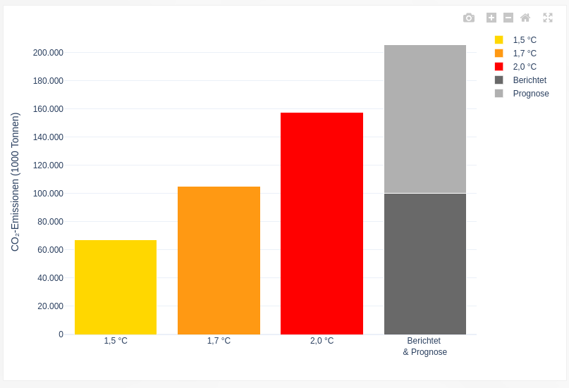
The grey bar in the figure above shows the reported and projected emissions of Hamburg, assuming that the city will follow a linear emission reduction path from now on to reach zero emissions in 2040. The reported emissions are dark grey and the projected emissions are light grey. It is clear that Hamburg has almost used up its CO₂ budget for the 1.7 °C target and will probably exceed the budget for 2 °C warming if no additional emission reduction measures are implemented.
On the Climate Action Navigator, you can also estimate the remaining CO₂ budgets for several other German cities (Berlin, Bonn, Heidelberg, and Karlsruhe), and the results are often similar. All these cities have already exceeded their budget for limiting warming to 1.5 or 1.7 degrees Celsius or are projected to do so soon. Even compliance with the 2-degree target requires accelerated mitigation.

Where do we go from here?
Germany has already reduced its greenhouse gas emissions by half compared to their historical peak in 1979. All analyzed cities have significantly lowered emissions since 1990. These achievements are the result of technological advancements, policy intervention, and societal changes.
At the same time, the fact that most cities are close to consuming all their remaining CO₂ budgets shows that stronger climate action is urgently needed. To comply with the Paris Agreement goals, emission cuts must continue and, in many cases, accelerate.
The emissions reductions we already achieved demonstrate that transformative change is possible. The task now is to build on this progress and ensure that future emission trajectories align with the remaining carbon budget.
The Climate Action Navigator provides a data-driven basis to pinpoint emission reduction potential. Quantifying remaining CO₂ budgets and visualizing emission pathways supports transparent assessment and informed decision-making.
]]>Below is a growing collection of HeiGIT datasets that support humanitarian action, infrastructure planning, and climate research. All datasets are open and free to use. The collection features the Climate Action Indicators dataset (Climate Action Navigator), Accessibility Indicators dataset (OpenAccessLens), Risk Assessment Indicators dataset, Planet Road Surface Data, and Road Surface Data from OpenStreetMap and Mapillary. These resources provide open geospatial data to support analysis, planning, and decision-making across different fields.
- Climate Action Indicators
Climate Action Navigator (CAN) helps communities identify priority areas for climate action by transforming open geodata into clear, data-driven insights. Previously, these insights were accessible only through CAN’s assessment tools and visualizations.
The Climate Action Indicators dataset collection currently includes indicators covering:
- Walkability (hiWalk)
- Bikeability (hiBike)
- Residential heating emissions
- Land use / land cover change emissions
These indicators cover different aspects of local climate planning and action. The mobility indicators show how well neighborhoods support low-carbon transport like walking and cycling. The emissions indicators highlight where residential heating or land-use changes add to greenhouse gas emissions.
Providing these indicators as datasets expands their application beyond visualization. They can be integrated into GIS workflows, comparative analyses across cities or regions, and long-term monitoring, supporting public administrations and advocacy groups in establishing baselines, prioritizing interventions, and tracking progress. This dataset is available for download here.

- Accessibility Indicators
Access to healthcare and education is fundamental for resilience and social inclusion. HeiGIT’s Accessibility Indicators dataset, visualized through the OpenAccessLens platform, offers global estimates of spatial access to healthcare and education.
The dataset integrates travel-time isochrones from openrouteservice, based on OpenStreetMap road data, combined with WorldPop population data at 100-meter resolution. By intersecting accessibility with population distribution, it estimates the number of people within each interval. Results are aggregated by country and, where possible, also by administrative units.
The Accessibility Indicators dataset includes:
- Healthcare access measured in travel-time intervals (10–120 minutes to hospital services)
- Education access is measured in distance intervals (5–50 kilometers to schools)
Available through the Humanitarian Data Exchange (HDX). This dataset supports humanitarian assessments, public health research, and planning, especially for comparing access among regions.

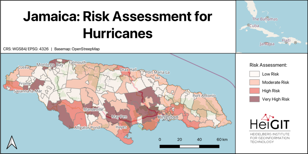
- Risk Assessment Indicators Dataset
Risk assessments are essential for anticipatory action and disaster preparedness. Yet, gathering consistent indicators for exposure, vulnerability, and coping capacity can take a lot of work. To support practitioners, HeiGIT’s Risk Assessment Indicators dataset provides a structured, easy-to-use baseline.
The dataset brings together indicators at administrative level 2, making it easier to compare regions. Its standard format supports risk assessments for different hazards and works with HeiGIT’s Risk Assessment QGIS Plugin.
The dataset includes the following:
- Baseline indicators for vulnerability
- Baseline indicators for coping capacity
- Hazard-specific exposure indicators, such as flood and cyclone exposure, where data is available
The dataset makes it easier to calculate risk assessments, allowing practitioners to focus on weighting indicators, incorporating local knowledge, and interpreting results.

- PlanetScope Road Surface Data
Many global transport datasets lack complete road surface information, which is essential for routing, logistics, and infrastructure planning. To address this, HeiGIT released the Planet Road Surface Data, a satellite-derived dataset based on PlanetScope imagery from 2020 and 2024.
The dataset uses satellite images with a resolution of 3 to 4 meters and machine learning methods to study about 9.2 million kilometers of the global arterial road network. It covers arterial roads classified in OSM as motorway, trunk, primary, and secondary, including their link classes. This approach provides a consistent view of important road surface features.
The dataset includes the following information:
- Road surface type (paved / unpaved)
- Road width
- Changes in road surface, for example, roads that changed from unpaved to paved between 2020 and 2024
- A Humanitarian Passability Score, which combines information about surface type and road width.
The Humanitarian Passability Score helps to assess the accessibility of road networks for logistics and emergency planning. This dataset is freely available on the Humanitarian Data Exchange (HDX) and is intended to be updated annually. Besides routing, it can also be used to track infrastructure development and changes in road surfaces over time.
- Road Surface Data from OpenStreetMap and Mapillary
HeiGIT developed a road surface dataset using OpenStreetMap road geometries and Mapillary street-level imagery. The dataset applies machine learning to predict whether road segments are paved or unpaved.
While OpenStreetMap (OSM) is a fundamental data source for road information worldwide, surface data remains scarce in many regions. By using street-level imagery to infer surface type, the dataset expands the availability of road surface information beyond existing OSM tags.
The dataset provides:
- Predicted road surface type (paved / unpaved)
- Expanded coverage of surface information where OSM surface tags are missing
The dataset supports transportation analysis, routing, and infrastructure planning. Improving the availability of surface information enhances assessments of road reliability, safety, and accessibility, particularly in regions where unpaved roads can limit mobility. The dataset is available here. For more information on the dataset, read here.

These datasets demonstrate how open geoinformation translates directly into better decisions. A humanitarian logistics coordinator can use the Planet Road Surface Data and Passability Score to identify viable supply routes into flood-affected areas. A municipal planner can draw on the Climate Action Indicators to target cycling infrastructure investments where bikeability is lowest. A public health agency can use the Accessibility Indicators to pinpoint communities more than 60 minutes from the nearest hospital. Humanitarian workers can load the Risk Assessment Indicators directly into QGIS to build anticipatory action protocols, without spending weeks compiling baseline data.
As our dataset collection grows, we remain committed to open science principles. We ensure that geographic knowledge is generated, shared, and applied to achieve positive societal and environmental outcomes.
]]>To make these inequalities visible, researchers at HeiGIT have developed OpenAccessLens, an open dataset platform that visualizes physical access to education and healthcare services worldwide. It shows how far people are from the nearest schools and hospitals, expressed in travel time or distance.
Making global disparities visible
Despite progress in recent decades, physical access to education and healthcare remains uneven across the world. National averages often conceal substantial geographic differences, let alone variations in age accessibility. In many parts of the world, children may never attend school or patients may struggle to get medical care because essential services are too far away.
In countries facing structural challenges and repeated climate-related disasters, every additional kilometer can become a serious barrier to school attendance. In Pakistan, for example, accessibility data shows that fewer than 40 percent of schools are located within a five-kilometer reach, pointing to pronounced spatial disparities in access.

A similar picture emerges for healthcare. Rural areas in low- and middle-income countries often lack timely access to medical service. In Germany, reaching a hospital within 30 minutes is almost guaranteed nationwide, where as in Sierra Leone, only around 60% of the population can reach hospital care within the same timeframe.
From data to decisions
By translating spatial accessibility data into differentiated indicators, the platform supports decision-makers, researchers, and practitioners with an evidence base. It shows where access gaps exist and how many people are affected, supporting targeted decisions. For education planning, the data can highlight districts where large numbers of school-age children live beyond reasonable travel distances to the nearest school. In healthcare, identifying areas with limited accessibility can help local authorities plan mobile clinics or other interventions.
“Building on our earlier collaboration with UNICEF, the platform supports more equitable planning and helps monitor progress toward Sustainable Development Goals 3 and 4,” says data scientist Marcel Maurer from HeiGIT.
The reliability of these insights depends on the quality of the underlying data. OpenAccessLens combines travel-time and distance-based accessibility measures with WorldPop population data, and is created using open-source tools, primarily openrouteservice and OpenStreetMap. As an open dataset, its quality and relevance can continuously improve through community contributions.
The full OpenAccessLens dataset is freely available and can be downloaded as country-level data via the Humanitarian Data Exchange (HDX), operated by the United Nations Office for the Coordination of Humanitarian Affairs (OCHA).
This work was supported by the Klaus Tschira Stiftung, whose funding enables HeiGIT to advance open geospatial technology for climate action and humanitarian aid.
Contact person for the dataset:
Marcel Maurer
Email: [email protected]
Reliable geodata is essential for humanitarian logistics, disaster response, and infrastructure planning. Yet critical information such as road surface conditions or infrastructure accessibility is incomplete or missing in many regions of the world.
To gather the needed information, we often need a real-life, eye-level perspective. This is why street-level imagery, combined with deep learning methods, bears a great potential to close these gaps.
GeoAI research based on street-level imagery is dependent on the availability of imagery, with platforms such as Mapillary and Panoramax playing a key role in offering open, freely accessible street-level images. At the same time, we always need more low-barrier methods to collect and process new imagery in order to truly include data from all over the world.
Once we have the imagery, the next step is to develop automated pipelines that transform images into structured, georeferenced data products. Many promising methods complement street-level, satellite and Unmanned Aerial Vehicle (UAV) data to best capture infrastructure characteristics, giving DL models a comprehensive perspective.
From road classification to waste management and inclusive sidewalks
Our work with street-level imagery began with a central question: how can deep learning help fill persistent gaps in the world map?
In 2024, HeiGIT released a global road surface dataset that distinguished paved and unpaved roads using state-of-the-art deep learning models trained on crowdsourced imagery. While only about one third of roads in OpenStreetMap contain road surface information, our dataset expanded global coverage to 36.7 million kilometers. A new data release last year further improved consistency and achieved 89.2% classification accuracy across 9.2 million kilometers of major roads. The updated for dataset can be used for routing, accessibility analysis, and logistics planning and is openly available via the Humanitarian Data Exchange.
This work demonstrated how image classification can systematically enhance the availability of geographic data worldwide. So we kept expanding our work in DL image classification, increasingly adopting multimodal approaches that combine street-level, aerial, and satellite imagery with other environmental data, to strengthen the robustness of the models.
With a pilot project in Dar es Salaam, we applied computer vision techniques to high-resolution street-level imagery to detect waste accumulations along the streets, supporting evidence-based decision-making in flood-prone areas. In parallel, we have also used street-level images to identify environmental features important to older adults and to design a routing system tailored to their needs. Moreover, we have been exploring how street-level images can be used to estimate the width of sidewalks, which is critical for inclusive walkability assessments. This research led to the HeiMeterStick prototype.
A weather-adaptive routing service for all road conditions
Building on our road surface dataset and previous experience in DL image classification, we have started working on the next big thing: the AI Logistic Awareness System (AILAS), a weather-adaptive routing system for regions with predominantly unpaved roads. The project addresses a critical challenge in humanitarian logistics: road passability can change within hours due to rainfall, yet up-to-date information on current road surface conditions is rarely available in remote areas.

AILAS integrates street-level imagery, deep learning classification, and environmental data within a probabilistic framework. The project goal is to support humanitarian logistics planners with reliable information on the state of roads: thanks to road surface classification combined with rainfall forecasts and soil moisture data, the system predicts how the passability of roads is likely to change in different weather conditions. These changing passability scores are to be integrated into openrouteservice for routing. This enables logistics planners to e. g. to predict that driving along a given route will likely take longer or might even be impossible after a heavy rainfall, helping them plan routes more efficiently.
How we build a street-level imagery collection
The first key challenge of the AILAS project, much before we start fine-tuning machine learning models, is collecting enough street-level imagery of roads in several weather conditions to be able to train the models, as such imagery is not widely available yet. A core principle of the AILAS project is its partner-oriented data collection approach.
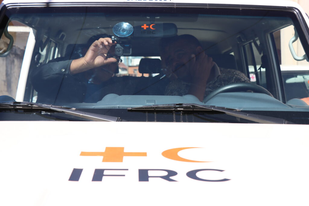
The project’s pilot region is Madagascar, where we collaborate closely with the Croix-Rouge Malagasy to define needs, incorporate local practitioners´ know-how, and collect the imagery. Together with our partners, we designed a workflow that minimizes technical barriers for imagery collection. Two field teams of Croix-Rouge Malagasy have been equipped with action cameras mounted on their emergency vehicles. The drivers learn how to work with the cameras with a simple multilingual tutorial via the IFRC GIS Training Platform. They can configure the cameras in a few seconds, without other previous knowledge, by simply scanning a QR code. With this method, field teams have already captured more than 20,000 street-level images throughout Madagascar.
The collected imagery is then uploaded to a private Panoramax instance, ensuring free and transparent usage. The crowdsourced platform Panoramax is the natural solution to store and process the collected street-level imagery, as it is a free, fully open source platform with a federated architecture in which anyone can host an instance and freely optimize the pipelines to show objects, e. g. adding annotations that are relevant for humanitarian and logistics purposes. Moreover, faces and license plates are automatically blurred after the upload to Panoramax and the platform offers complete control over data storage and access policies, ensuring high privacy and data protection.
An overview of the technical architecture we developed, including a code snippet, can be found in this blog article.
Next steps
All these efforts demonstrate the potential of street-level imagery and deep learning methods to provide missing geodata where it is most urgently needed. From global road surface datasets to weather-adaptive routing and accessibility metrics, eye-level images can be a game changer in DL-based research.
This is why we are working with our partners to further expand imagery collection, refine multimodal classification models, and publish more open-access datasets with insights on street-level infrastructure that can be useful to disaster management practitioners, logistics experts, urban planners, and researchers alike.
]]>It’s very easy to take many things around us for granted, especially when you live in a big city. Particularly, the web of infrastructure that keeps people connected quickly fades into the background during our daily activities. Of course, public transport, sidewalks, bike lanes, and many other amenities that make our lives easier didn’t appear out of thin air. We are simply used to them, so we don’t focus much on their features.
I frequently catch myself on some kind of organic autopilot when travelling to familiar locations. You probably know the feeling when you leave your home and teleport to your office, barely registering what happened on the path you have been walking on continuously for a couple of years. Normal stuff you would say.
That’s true, but only when you are healthy enough to treat the components and the dimension of your path as a facilitation, not an obstacle. Older adults, young children, and people with disabilities may have different perspectives. Even though it’s just as simple as having to deal with a too-narrow sidewalk to travel to school safely, the grocery store, or the pharmacy.
Fortunately, my primary work goal is to understand diverse spatial perspectives and explore how they can be expressed through machine learning. During one of the iterations of HeiGITs’ marketplace (you can read more about how we work in our blog), I learned more about daily routines and obstacles, and perhaps began building something that could, at least to some extent, help equalise opportunities.
Grab some coffee and let me tell you how I built the one-shot surface estimator — code name HeiMeterStick.

The goal
Before diving into the underlying technology, let’s first describe the idea and the task. Assume we want to calculate the best possible path for a pedestrian with specific sidewalk width requirements to avoid places where movement is difficult or impossible. Anyone who has pushed a ridiculously heavy stroller with a toddler inside understands it immediately. To accomplish this, we would need not only to determine the sidewalk dimensions but also to delineate the sidewalk using available data sources.
Look at the images below. One is an ortophoto of my hometown Łódź. The other is a street-level image from Mapillary. You can see how one can precisely measure a sidewalk using standard GIS practices. The task could also be fully automated by applying well-known deep learning techniques, such as semantic segmentation. The problem is that not all locations worldwide have high-resolution remote-sensing imagery available, making the proposed solution difficult to apply.


Fortunately, street-view imagery is becoming increasingly accessible. I wrote a blog post about how Panoramax and Mapillary are improving citizen science by providing unrestricted, free-of-charge access to valuable eye-level imagery. As you will see in a minute, data accessibility comes at the cost of the solution’s complexity. Measuring objects from single-shot imagery is not easy.
Context has been set — now let’s define the technical goals:
- Build a computer vision tool that measures horizontal surfaces (sidewalks, floors, etc.) in street-view imagery from sources such as mobile phones, Mapillary or Panoramax. The minimum viable product (MVP) is to estimate surface clearance (width), but the architecture should support extending to other measurements. No constraints on data modalities or algorithms — whatever gets results fastest. Prioritise open-source, state-of-the-art models that run on a single development laptop without high-performance computing (HPC) resources. Fail fast on anything that’s computationally expensive or overly complex during the proof-of-concept (PoC) phase.
- Provide both a CLI and a UI so you can demo visually without diving into technical details. The implementation should be as general as possible to allow easy extension to new measurements or surface types. Keep the code clean and modular — this is about rapid prototyping with quality foundations, not a rushed mess. Experiment with multiple approaches, learn from what doesn’t work, and enjoy the process.
The method
Going from a single image to estimating an arbitrary surface width is a multistep process that combines computer vision, geospatial analysis, and machine learning techniques. All the ingredients already exist and are the state-of-the-art result of research carried out by many recognised institutes and companies. My humble task was to mix them.

Phase I – Image Preprocessing and Feature Extraction
A. Image loading and normalisation — load the input image and convert to RGB format to ensure consistent colour channels for downstream models. I prefer using Pillow for such tasks because it integrates seamlessly into complex data processing pipelines.
B. Monocular depth estimation — apply a deep learning depth estimator (DepthAnything) to generate a dense metric depth map. It predicts, in meters, the distance from the camera to each pixel in the image, thereby recovering the 3D structure from a single 2D photo. The quality of this step is crucial because it directly affects the estimate of dimensions.

C. Camera calibration and perspective fields — extract from EXIF metadata, if not available, estimate using GeoCalib the camera intrinsic parameters (focal length, principal point) and extrinsic parameters (camera orientation, tilt angle). This step is essential for accurate deprojection from 2D pixel coordinates to 3D world coordinates. Moreover, GeoCalib performs well on distorted and cropped images.

D. Object detection and semantic segmentation — run a prompt-driven vision model (SAM3) to identify and segment objects matching the provided text prompts, e.g., sidewalk, pedestrian path, or walkway. Each detected object is assigned to a binary mask indicating which pixels belong to it, along with a confidence score. Using text prompts is useful because it allows the model to adapt to different spatial contexts by adjusting the prompt or making it more specific.

E. Resolve geospatial coordinates — attempt to extract GPS coordinates from EXIF metadata if the image comes from geotagged sources like Mapillary or Panoramax. This allows the measurements to be georeferenced and integrated into spatial databases or routing applications.
Phase II: 3D Point Cloud Reconstruction
Classified point cloud generation — this is where 2D becomes 3D. For each pixel in the image:
- Use the depth map to get the distance from the camera.
- Use the calibration metadata to deproject the pixel’s 2D coordinates into 3D space.
- Label the point with its object class from the segmentation masks.
The result is a 3D point cloud where every point knows its spatial position (X-width, Y-height, Z-depth) and which object it belongs to (CLS). This effectively creates a sparse 3D reconstruction of the scene from which we can extract only interesting surfaces.
Phase III: Individual Surface Measurement
A. Point cloud sectioning — extract only the subset of 3D points that belong to the analysed surface, filtered by a class index. This isolates the specific object to be measured from the rest of the scene. Here we also heavily postprocess the point cloud by simplifying it and removing outlying points.
B. Spatial projection and geometric analysis — Project the 3D points onto the XZ plane (ground plane, assuming Y is vertical). Then compute some helpful geometries and distances:
- Alphashape: The concave hull that contains all projected points, representing the outer boundary of the surface. Here, we use our own heuristic algorithm rather than the classical AlphaShape library to accelerate the process.
- Corridor polygon: A simplified, walkable representation of the surface area. Created by simple polygon operations.
- Centerline: A path running through the middle of the surface, representing the optimal walking trajectory.
- Perpendicular distances: At multiple points along the centerline, measure the perpendicular distance to the hull boundaries on both sides. These distances represent the local width of the surface.

C. Statistical clearance metrics — From the array of perpendicular distance measurements:
- Mean clearance: Average width of the surface, with an Isolation Forestoutlier removal using the contamination parameter (default 5% of extreme values filtered out). This makes the estimation more robust to segmentation errors.
- Standard deviation: Quantifies width variability — low values indicate consistent width, high values suggest bottlenecks or irregular shapes.
D. Quality assessment — Evaluate measurement reliability based on geometric properties. The quality score helps filter unreliable measurements or flag surfaces that need manual review. This considers factors like:
- How well-defined the hull is (sparse vs. dense point coverage).
- How straight or curved the centerline is (complex paths may have less reliable measurements).
- Aspect ratio of the surface (very elongated or irregular shapes may be problematic).
- Point cloud density and distribution.
E. Final Output — Each detected surface is associated with a data collection that includes the segmentation mask, 3D point cloud, geometric shapes (hull, corridor, centerline), and the key measurement: clearance_mean ± clearance_std in meters, representing the estimated width and its uncertainty.


Trial run
What would spatial analysis be like if it weren’t for trying to run the algorithm over a larger area? Let’s try it with the centre of Łódź.
In the image below, you can see the HeiMeterStick pipeline run on 80k images acquired from Mapillary. The output has some anomalies, but overall it’s very promising.

What’s next
The measurement pipeline is still being refined and tested across larger geographical areas. The goal is to build a comprehensive dataset of surface measurements across different countries and conditions. It could significantly contribute to our initiatives in climate action (CAN) and the SilverWays project. It’s a long road ahead, but we’ll see where it takes us.
If you’re working on applications for humanitarian response, have a use case where crowdsourced geospatial intelligence could make a difference, or just want to see more results, we’d like to hear about it! Our team at HeiGIT(Heidelberg Institute for Geoinformation Technology) collaborates with NGOs and humanitarian organisations to develop and deploy these technologies in operational contexts. Contact [email protected] to discuss potential collaborations or technical implementations.
]]>The National Unit for Disaster Risk Management commissioned (UNGRD) the Risk Knowledge Sub-Directorate to lead a nationwide Community Maps Project (“Mapas Comunitarios”). Such an effort aims at strengthening local capacities and processes for socialization, analysis, and risk reduction at the territorial level.

The project has high national relevance and promotes participatory mapping to integrate technical knowledge with local knowledge, while recognizing the environment, existing hazards, available resources, and safe routes in the event of emergencies. This approach places communities at the center of risk analysis, ensuring that local perspectives directly inform disaster risk management processes.
The project has generated more than 270 community maps, prioritizing different risk scenarios based on community input, and has involved 4,092 people across 147 municipalities in Colombia. These maps reflect a wide range of locally identified risks and priorities across urban and rural contexts.
The mapping process was part of the activities organized by the national government, in coordination with the prioritized municipalities, which facilitated the participation of community leaders, representatives of organizations and local governments, and members of local risk management committees. This coordination aligned community-generated information with institutional planning and decision making.

In Cali, Colombia, the mapping exercises were conducted in two areas with ongoing risk management processes: Pance and Comuna 18. Project facilitators guided the development of maps using the Sketch Map Tool, which was specifically adapted for these urban areas where smaller scales are required. The activities directly contributed to the development of community-based risk management plans while promoting the equitable participation of women, young people, and ethnic groups to ensure inclusion and diverse perspectives.
The maps produced by the communities were digitized using Sketch Map Tool and analysed using other Geographic Information System (GIS) tools, such as MapHub, which allows information, text, areas and colors to be added, making them easier for communities to use. The analysis enabled the identification of spatial patterns of threat and vulnerability, the prioritization of areas for intervention, and the strengthening of municipal planning instruments. This process also supported dialogue between communities and authorities around local risks and ongoing initiatives.
The project succeeded in generating up-to-date and relevant information for communities and authorities in two areas of the city of Cali. The activities help consolidate a network of communities with strengthened risk management capacities, generating updated, validated community maps in a participatory manner. The information generated with the communities was digitized and integrated into the territorial planning processes known as “Municipal Disaster Risk Management Plans (PMGRD)” and “Community Risk Management Plans.” As a result, community knowledge became recognized as an input to formal risk management frameworks.

Among the main impacts are:
- Active participation of over 60 people from Pance and Comuna 18 in Cali, as well as delegates from the local government and other entities of the local risk management system.
- The appropriation of local knowledge as a source of information for risk management.
- A stronger, more active connection has been established between communities and local institutions, fostering ongoing collaboration in risk management.
- The strengthening of resilience and community response capacity in emergencies.
- The process also enabled direct interaction between residents and local authorities on risk-related concerns and planned interventions.
Key takeaways and significant lessons learned from the process include:
- Active community participation is essential to ensure the accuracy and legitimacy of the maps.
- Digital tools such as the Sketch Map Tool must be accompanied by training and awareness-raising processes to ensure their appropriate use.
- It is essential to establish mechanisms for updating and maintaining maps to ensure their validity over time.
- To ensure an up-to-date base map, the strategy should include OpenStreetMap mapping and updating activities. This additional effort not only improves map quality but also enables communities to develop data management skills. Facilitators can help communicate limitations and manage potential frustrations during these activities.
- The mapping activities revealed the participants’ preference for representing objects directly using symbolic stickers rather than abstract lines or areas. To accommodate this, a critical success factor was the pre-validation of these materials.
- Testing various icon sizes and stickers to fine-tune the methodology ensures the preferred mapping style is seamlessly detected by the SMT.
- Overall, the experience highlighted the importance of combining technical tools with strong facilitation and continuous community engagement.
The full case study is available in English and Spanish.
To learn more about how the Sketch Map Tool works, watch this quick video tutorial or directly visit the project webpage. To stay up to date on new Sketch Map Tool releases and case studies, you can subscribe to the Sketch Map Tool Newsletter.
Questions or ideas on how to next use the Sketch Map Tool? Write us at [email protected]. We are looking forward to getting in touch.
]]>Risk assessments are a cornerstone of anticipatory action. They support humanitarian organizations and administrations in identifying and evaluating potential vulnerabilities. Reliable risk information enables better decision-making and the timely triggering of early actions based on data-driven insights.
However, developing a robust risk assessment can be a complex task. It requires the integration of multiple datasets on exposure, vulnerability, and coping capacity, followed by statistical and geospatial analysis. While these indicators can be generated through automated scripts from publicly available data sources, this step still represents a significant technical barrier for practitioners in the humanitarian field.
To address this and make the data more easily accessible, HeiGIT has openly published worldwide risk assessment datasets that can be directly used in combination with HeiGIT’s Risk Assessment QGIS Plugin. This way, users can focus on risk analysis and interpretation rather than data preparation.
With these datasets and the Risk Assessment QGIS Plugin, users can easily produce analysis to support evidence-based anticipatory action, risk communication with stakeholders, resource allocation and planning, as well as monitoring how risk evolves over time.

The Risk Assessment Datasets
The published datasets provide comprehensive risk assessment indicators for several countries, covering multiple countries where administrative boundaries and place codes (PCODEs) are available on HDX. All indicators are aggregated at administrative level 2, enabling structured and comparable analysis across countries.
All datasets are openly available on the Humanitarian Data Exchange (HDX).
The datasets are designed to support multi-hazard risk assessments and include a standardized baseline set of indicators for Vulnerability and Coping Capacity that are applicable across all hazards and all included countries. In addition, we provide specific exposure indicators for flood and cyclone hazards, leveraging available global datasets to assess populations and assets at risk for these events.
These indicators are derived from open data sources, such as spatially explicit population data from Worldpop or information on schools and health facilities from OpenStreetMap. Other sources include openrouteservice (ORS), Global Human Settlement Layer (GHSL), The Joint Research Centre (JRC), and IBTrACS – NOAA International Best Track Archive for Climate Stewardship.
All indicators are fully compatible with HeiGIT´s Risk Assessment QGIS Plugin. In addition, the data can be downloaded and used independently for other analytical purposes or extended with additional, context-specific indicators. This approach allows humanitarian stakeholders to use the provided datasets as a baseline and gradually refine the assessment by adding local data or additional indicators.
How to Use the Dataset with the Risk Assessment Plugin
The Risk Assessment QGIS Plugin provides a user-friendly interface that allows practitioners to conduct risk assessments without advanced technical or coding skills. When used together with the published datasets, a basic risk assessment can be completed with minimal setup.
The typical workflow includes three main steps. First, users screen and review available datasets for their specific context and hazard scenario. Second, indicator weighting is defined, ideally in collaboration with local actors, to reflect the relative importance of different risk factors. Finally, the plugin performs the risk calculation and visualization.
The followingtutorial video guides the user through all important steps to set up and use the plugin:
Further materials on how to use the plugin and conduct risk assessments can be found on the training platform and previous blogpost.
Outlook (and More Datasets)
The plugin and datasets are under continuous development, and feedback from practitioners is essential to guide future improvements, including the integration of additional hazards and indicators. We encourage interested organizations to explore the datasets, apply them in their own contexts, and reach out to our team via [email protected] for feedback and support in developing pilot case studies.
The risk assessment datasets are the latest addition to the HeiGIT dataset collection, which includes open global data on road surface, education and healthcare accessibility datasets, climate action indicators, and more.
]]>To capture the full spectrum of factors shaping everyday cycling, the BIKE Index integrates four key dimensions: cycling infrastructure, cyclist services, environmental constraints, safety and street quality. This multi-layered approach provides a nuanced picture of how well cities support cycling. The analysis relies exclusively on harmonized open datasets, primarily sourced from OpenStreetMap, and combines them with computational methods that generate a standardized set of cycling routes for each city.
openrouteservice enables the generation of consistent cycling route metrics across diverse urban contexts. The simulated routing outcomes provide comparable network indicators essential for an inter-city benchmarking.

Methods and role of openrouteservice
The research applies a spatially explicit workflow that synthesizes open geographic data with standardized computational analysis to derive the BIKE Index. To achieve reproducible results across cities, urban boundaries were defined and a fixed number of 210 cycling routes is generated, enabling direct comparability while avoiding biases associated with ad hoc route selection or heterogeneous data sources. Within these defined boundaries, the study integrates a wide range of harmonized datasets.
The primary spatial backbone of the analysis is derived from OpenStreetMap, which provides detailed and openly accessible representations of urban networks and facilities. These spatial data are complemented by statistical inputs from Eurostat and climatic information from the E-OBS dataset, allowing the index to account for broader contextual factors influencing cycling conditions.
A distinctive feature of the methodology is the explicit incorporation of route-level analysis to reflect how cyclists experience the urban network in practice. To this end, the researchers generate a standardized set of 210 cycling routes for each city using openrouteservice. By applying the same routing procedure across all case studies, the analysis captures differences in network structure, connectivity, and directness in a reproducible manner. This approach directly provides insight into the functional performance of cycling networks.
From the simulated routes, a range of route-based indicators is extracted, including measures related to distance and network characteristics that serve as proxies for cycling efficiency and accessibility. These indicators are then integrated with the broader set of spatial and statistical variables, enriching the multidimensional structure of the BIKE Index with performance-oriented information derived from real routing conditions.
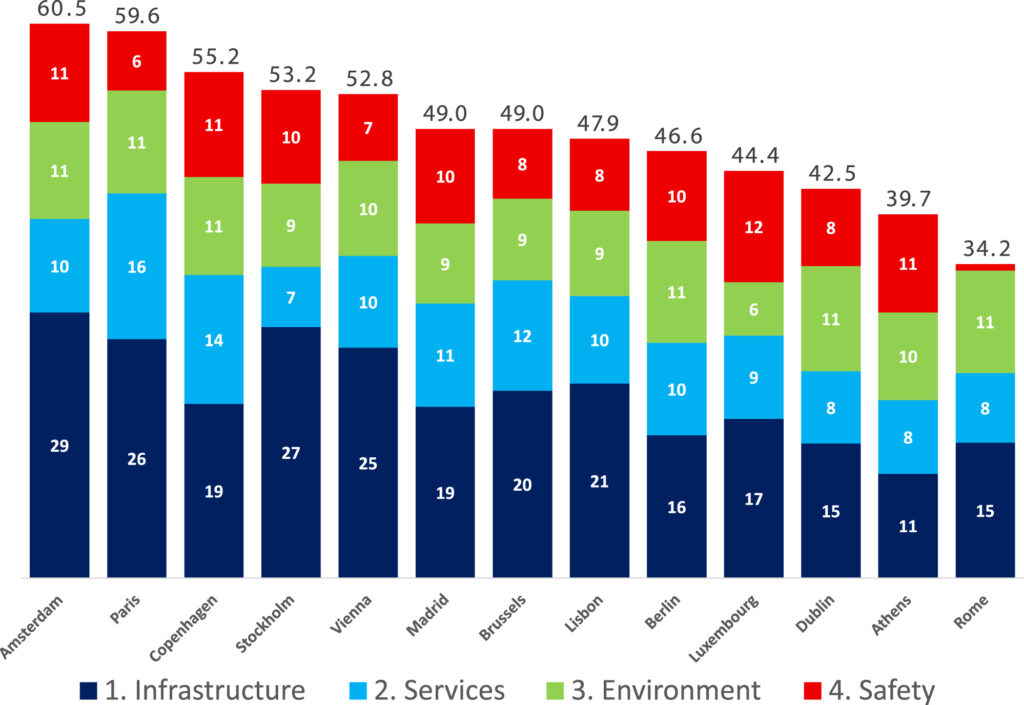
The final step of the methodology involves synthesizing all component indicators into a composite index that represents overall bikeability and cycling readiness. This composite measure enables systematic ranking and comparison among European capitals.
Conclusion
The BIKE Index reveals notable disparities in cycling conditions across European capitals, with high scores indicating environments where infrastructure, services, safety, and environmental constraints align to support daily bike use. The study offers a scalable and transparent index for urban bikeability, providing planners and policymakers with actionable insights for sustainable mobility enhancement.
Building on this city-level perspective, tools such as the Climate Action Navigator complement index-based assessments by offering detailed, spatially explicit insights into bikeability, including information on path quality and network characteristics at a higher resolution.
Reference:
Quintero Gómez, A., & Calvo-Bascones, P. (2026). BIKE (Bicycle Integration Key Elements) Index: Benchmarking urban bikeability and cycling readiness. Sustainable Cities and Society, 136, 107096. https://doi.org/10.1016/j.scs.2025.107096
]]>Rapid advances in data availability and machine learning are creating new opportunities and challenges for urban research and planning. The editorial outlines the main themes of the special issue, including AI-driven methods for integrating heterogeneous urban data, modelling urban processes such as mobility, land use, public health, and climate resilience, and examining how AI systems interact with social and spatial dynamics in cities. Its focus is on approaches that combine geographic information science with machine learning and computer vision. While methodological innovation and practical relevance is emphasized, ethical, legal, and governance issues should also be considered while using AI in urban contexts.
Overall, the editorial presents the special issue as a contribution to urban analytics and city science that demonstrates the capacity of Urban AI to reshape how cities understand, govern, and respond to environmental and social challenges. The collected studies show how the integration of advanced sensing technologies, artificial intelligence, and participatory data practices enables more detailed and dynamic insights into the interactions between people, infrastructure, and urban environments. The research also illustrates how Urban AI can support more precise and context-sensitive interventions in urban planning and governance. Taken together, the papers showcase current practices and emerging directions in Urban AI research, pointing toward more sustainable, inclusive, and resilient urban futures.
Reference: Knoblauch, S., Li, H., Biljecki, F., Li, W., & Zipf, A. (2026). Urban AI for a sustainable built environment: Progress and future directions. Environment and Planning B: Urban Analytics and City Science, 0(0). Urban AI for a sustainable built environment: Progress and future directions – Steffen Knoblauch, Hao Li, Filip Biljecki, Wenwen Li, Alexander Zipf, 2026
]]>ohsome-planet is build for people and organizations that want to work with the OSM data, but in a GIS-ready data format. Typical users include data analysts and researchers who explore OSM data in depth and combine it with other geospatial or non-spatial datasets for further analysis.
When we introduced ohsome-planet in March 2025, it enabled users to derive a full-history OSM dataset in Parquet format for a specific point in time. However, incorporating newer OSM data required re-running the entire workflow and re-computing contributions that had already been processed. Even though ohsome-planet is blazing fast, this approach still caused unnecessary overhead in terms of computing time and resources. With the new release under the codename “Tajogaite”, ohsome-planet now provides the functionality to continuously produce and analyze all OSM edits in near real time, for the entire globe, a specific country or your custom region of interest.
To achieve this, ohsome-planet consumes the replication .osc diff files provided by the OSM planet server or regional variants of these provided by GeoFabrik. These files contain information about all the OSM edits, e.g. for a particular minute. However, working with these .osc files in a GIS system or analysing the edits is complicated because they only contain information about a single version, but not the actual geometry or tag changes. To be able to derive change, you need to compare to a previous version. This information is not provided in the .osc files.
In order to process these incremental updates captured in the .osc files, ohsome-planet produces a copy of the most recent version of each OSM element and stores these into a RocksDB-based replication store. As new replication files become available, they are transformed into GIS-ready ohsome-planet contributions in Parquet format with native GEO support. The replication store is updated accordingly, enabling ohsome-planet to process the next file. This is similar to the approach of other well-known tools in the OSM software ecosystem such as osm2pgsql, Overpass API’s augmented diffs or OSMCha, but with a crucial difference: Once an ohsome-planet replication Parquet file is created it contains all the information needed to run your analysis, e.g. in DuckDB, QGIS or any other software you prefer.
In addition, ohsome-planet has evolved into a fully-fledged OSM changeset processing tool. Most developers probably rely either on ChangesetMD or a self-written implementation to maintain an up-to-date database with OSM changeset information. We did so too in the past! However, while working with ohsome-planet, we recognized the need for a faster alternative that makes use of more modern features of PostgreSQL and PostGIS. Hence, we extended ohsome-planet so that it can be used to populate a PostgreSQL database with OSM changeset information and keep it up-to-date. With ohsome-planet we can set up an OSM changeset database on our server in less than 15 minutes. The tool also detects changesets missing from the minutely replication files due to a bug in the implementation of the OSM planet server.
Among many other improvements, the tool now also supports S3-compatible object stores as the final output location. This allows Parquet files to be written directly into an S3 bucket, where they become instantly available to downstream tools such as web maps or data science workflows. Writing data directly to S3 simplifies data sharing with collaborators and users and makes it easier to integrate ohsome-planet into modern data orchestration pipelines.
Finally, as ohsome-planet’s functionality has grown, we have significantly improved its documentation. Check out the README and CLI documentation on GitHub to learn how you can use to tool for your use cases.
We look forward to hearing your feedback!
]]>As our tools grow more advanced and our partners rely on them, much of our time goes to maintenance, adding features, and daily tasks. Without setting aside time to experiment, it is hard to try new ideas, apply scientific knowledge, and prepare for the next generation of tools.
How Innovation Weeks Started at HeiGIT
Innovation weeks were introduced to give everyone at HeiGIT a structured opportunity to share their own ideas, form teams and explore them beyond regular project responsabilities. From the start, the goal behind Innovation Weeks was simple but effective: take a short break from regular project work and try something new, even if it might not succeed. Topics were deliberately broad, and ideas came from across HeiGIT and GIScience, leading to a wide range of creative projects.
This idea builds on earlier experiences at HeiGIT, where giving teams time and freedom to experiment led to successful tools such as MapSwipe and the Sketch Map Tool.
HeiGIT held its first Innovation Weeks in September 2023, organized by Johannes Link and supported by Adam Rousell. Two more Innovation Weeks took place in November 2023. By 2024, the format was well established, with events in April, July, and October. Management and the organizing team set fixed dates for Innovation Weeks. This gave structure and made the event visible, but it also brought some challenges. Some colleagues could not join and would feel stressed because they had urgent projects that could not be delayed.
This year, Benjamin Herfort and Johannes Link organized Innovation Summer together. They used what they learned from past years and adjusted the format to better align with HeiGIT’s growing, more diverse work environment. Instead of set weeks, teams could choose any time between July and September to work on their innovation topic, for up to two weeks each. This made it easier for people to take part, but it also meant teams had to plan more carefully to balance innovation with other deadlines.
Innovation does not mean immediate implementation
A core idea behind Innovation Weeks and Innovation Summer is that not every idea has to be put into action. This is important because innovation thrives when people can try out new ideas beyond their usual work, without feeling pressured to turn every experiment into a final product.
It is often hard to know which ideas will last. Looking back, some innovation topics from 2023 and 2024 are only now, years later, starting to be used in practice.
Some examples are:
- Vector Tiles (Proxy) were explored during an Innovation Week in 2024 and will soon be available in the Climate Action Navigator. At that time, there were many ideas but no concrete plans. Innovation Weeks gave us the chance to explore the technology and see its potential.
- OSM-aware LLMs were explored in July 2024. This sparked ongoing discussions and now shapes the work of HeiGIT’s research team.
- Accelerating Geospatial Data Science with DuckDB and Parquet Files, which happened in April 2024, laid the groundwork for efficiently analyzing large datasets. Today, DuckDB is widely used at HeiGIT.
Innovation Summer often felt a bit hectic, but in a good way. Many colleagues looked forward to these times because they could finally work on their own ideas rather than just follow project requirements set by Product Owners. This excitement and motivation are a big reason why innovation works at HeiGIT.
Why should Innovation Weeks become a regular part of our work?
Management first decided to introduce Innovation Weeks to ensure HeiGIT continues exploring new approaches and technologies, rather than just maintaining existing tools. As HeiGIT has grown and tools like MapSwipe, Sketch Map Tool, and openrouteservice are used by many partners, a new challenge has come up: maintenance and feature development can easily take up all our time.
If we do not set aside time for innovation, these tools could become outdated. Innovation Weeks help address this problem by providing space to balance research freedom with the responsibility to deliver reliable software for humanitarian aid and climate action.
In 2015, HeiGIT was free to build the first MapSwipe prototype. The first Sketch Map Tool was also developed in a research project that allowed a lot of flexibility and experimentation. Innovation Weeks are meant to keep some of that freedom, even as our work becomes more structured and focused on providing sound technology.
By making Innovation Weeks official and setting clear guidelines, colleagues got both permission and time to try new things. This turned the general wish for innovation into a lasting practice at HeiGIT.
What does a “successful” outcome look like?
There are no KPIs or instant success metrics, and that’s by design. Two weeks is simply too short a time to know whether an idea will succeed.
Success can mean many things, such as:
- High participation and motivation from different teams
- Collaboration between colleagues from different teams who do not often work together
- Planting early seeds for research papers, new software features, partnerships, or funded projects
Often, it takes two or three years before we see the real impact of an innovation topic.
In the future, innovation formats may continue to evolve: new spaces, external collaborators, or broader learning focused themes could help spark fresh ideas.
In the end, Innovation Weeks and Innovation Summer are about asking one simple but important question: What will be the MapSwipe or Sketch Map Tool of 2025, and what will we be proud of in 2030?
Making room to explore this question is what keeps HeiGIT innovative.
]]>Public health efforts fundamentally consists in planning efficient healthcare systems that reach as many people as possible with an adequate level of care. Since people usually need to travel to health facilities, questions of access, coverage, and equity are inherently spatial. This applies not just to emergency outbreak responses, but also to long-term efforts such as planning mobile clinics, routine immunization, maternal health, and other community-level health interventions.
During an outbreak response, this spatial dimension becomes even more critical. Decision-makers need to understand very rapidly what is happening where, how an outbreak is spreading, and which areas are at risk of becoming affected next. Planning the response—such as where to prioritize interventions, how to allocate resources, or which populations may be cut off from care—is therefore, again, a geospatial problem. GIS provides the tools to take data-informed decisions, enabling practitioners to move beyond static maps and towards data analysis that directly inform action.
A GIS Training to Bridge the Gap between Data Analysis and Health Professionals
In December 2025, we held a GIS training course fucused on public health, with the primary objective to familiarize health professionals with GIS technology and bridge the gap between Information Management and Health Specialists.
The participant group intentionally included both health professionals and information managers, as one of the goals was to strengthen collaboration between these roles.

Over the course of four days, participants from the French Red Cross, Colombian Red Cross, German Red Cross (Health and Surge), and the Robert Koch Institute built practical, applied GIS skills for public health and outbreak response, with the help of two facilitators from HeiGIT.
The training was split into two parts:
- Two days of follow-along GIS training that covered core GIS concepts, datasets, and analytical workflows. Using a measles response in Chad as a case study, the group learned how to join non-spatial report data to administrative boundaries, to visualize outbreak trends and to calculate service areas for specific facilities.
- Two days of tabletop scenario exercises, in which a cholera outbreak was simulated. Participants were given a realistic outbreak scenario, datasets, and narrative updates. Their task was to analyze the situation and prepare a concise briefing for a humanitarian coordinator under time pressure and an evolving scenario.
Participants worked with real, key humanitarian and public health datasets, including OpenStreetMap, WorldPop, and data from HDX, and learned how to critically assess and combine these sources.
A strong emphasis was placed on accessibility analysis, for example to learn how population data, road networks, and travel time can be combined to assess access to health services.

Improving Operative Results Through Cross-Team Collaboration
This training improved collaboration between Health and Information Management staff. Health specialists gained a clearer understanding of what intermediate GIS analysis entails and why close collaboration with colleagues from Information Management is essential. At the same time, Information Managers developed a much better understanding of what information is operationally critical during an outbreak response and of the importance of timing, clarity, and relevance.
It was inspiring to witness the synergy between health professionals, who had just discovered the potential of GIS, and Information Management experts familiar with the methods. During the scenario exercises, it became very clear that when they work side by side, they can produce impressively high-quality results in a very short time.
Many health specialists reported that they now better understand the skill level required for GIS analysis and the added value it brings, as well as which questions and requests are realistic during an outbreak response. Conversely, Information Management participants highlighted a stronger understanding of health-sector priorities, helping them tailor analyses more effectively to operational needs. This underpins the value of joint, cross-disciplinary training rather than role-specific capacity building.
Next Steps & Training Materials
Designed as a pilot, this course will help shape eventual future trainings in this domain. We are planning on organizing more GIS trainings in the future, with an improved structure based on lessons learned and incorporating remote delivery formats.
In the meanwhile, the training material used during the first two days of the course is already publicly available on the IFRC Network GIS Training Platform:
- Public Health Outbreak and Preparedness training track: Exercise Track: Outbreak and Preparedness in the Public Health Sector — GIS Resource Training Center
- Additional operational mapping tutorials: 4.9. Operational Maps Tutorials — GIS Resource Training Center
The full dataset and storyline for the cholera outbreak scenario used in the tabletop exercise will be published soon.
]]>Over the past months, we have collected valuable insights through a variety of initiatives: mapathon volunteers provided essential data for the project by helping to map smoothness and surface features; senior participants shared their daily routines and travel experiences in travel diaries; and we have conducted a survey specifically for older adults to understand their mobility preferences and challenges.
Now, we are expanding our survey to include people of all ages. Why? In order to fully understand the mobility needs of seniors, we need a reference group from other age brackets. Comparing the experiences of younger and older residents allows us to identify which route features are universally important—such as distance and directness—and which are especially critical for seniors, like safety, comfort, and accessibility.
By participating, you contribute to more precise, senior-focused conclusions. The insights gathered will help the research team develop a routing app that meets the needs of older citizens.
We invite all residents of Mannheim to take part in the survey: Silver Ways Survey. Participants aged 65 and over are encouraged to complete the older adults Survey, accessible via the main survey page. The survey is currently available in English and German, with Turkish and Swedish versions coming soon.
Take part in shaping a more walkable city for everyone!
The research design needed a realistic, network-based travel times rather than straight-line distances. Jakarta’s dense built environment, complex street structure, and inconsistent pedestrian infrastructure mean that spatial proximity alone does not accurately capture access. This methodological challenge led the researchers to employ openrouteservice to analyse disparities in walkability at the city scale.
openrouteservice for accessibility analysis
The study integrated openrouteservice via its QGIS plugin to calculate walking travel times and to generate pedestrian isochrones. With these functions the researchers assessed how accessible the mapped UGS locations are from residents’ postal-code centroids.
The openrouteservice Distance Matrix was used to compute walking travel times for each respondent area to each UGS location. This provided a measure of accessibility that accounts for the actual pedestrian network. Because respondents’ home locations were represented by postal code centroids, the travel times reflect the typical experience of residents while remaining grounded in the network-based methodology central to the study.
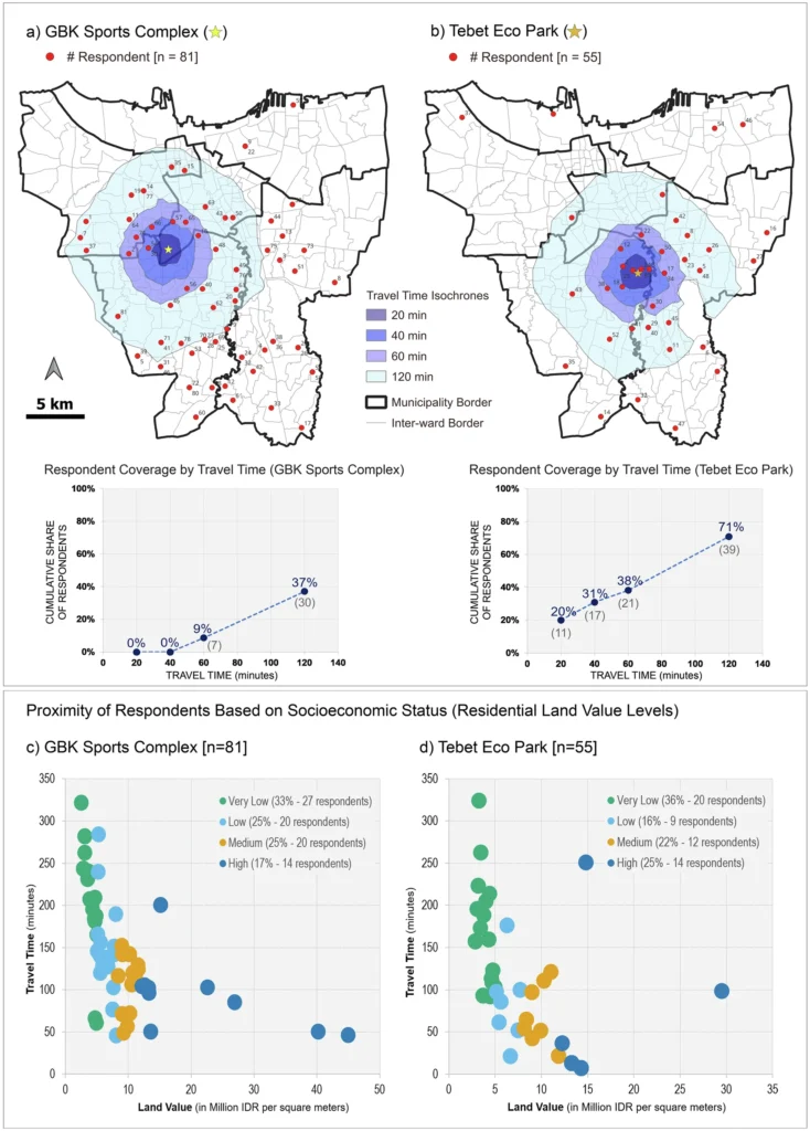
To complement these calculations, the researchers used openrouteservice to produce pedestrian isochrones at intervals of 20, 40, 60, and 120 minutes around selected UGS sites. These isochrones showed which parts of Jakarta are within a reasonable walking distance of the most frequently mapped and highly valued green spaces, such as Tebet Eco Park and the GBK Sports Complex. The resulting spatial patterns, along with scatter plot distributions, enabled a straightforward comparison of accessibility across socioeconomic groups by overlaying the isochrones with land-value data.
The analysis revealed that residents living in lower-land-value areas generally face longer walking times to reach culturally significant UGS. In contrast, higher-land-value areas were more likely to fall within shorter travel-time isochrone bands. By combining openrouteservice outputs with socioeconomic data, the study demonstrated how network-based accessibility measures can expose inequities that would be obscured by simpler measures such as Euclidean distance.
The study illustrates the value of precise accessibility modelling for understanding cultural ecosystem service provision, highlighting how methodological choices can reveal hidden access inequalities and shape insights into environmental justice in rapidly urbanizing regions.
Are you applying openrouteservice in research, projects on sustainable mobility or disaster management? Get in touch with communications[at]heigit.org to be featured on our blog.
Reference:
Rahman, I., Grunwald, A. & Saha, S. Access to cultural ecosystem services and how urban green spaces marginalize underprivileged groups. npj Urban Sustain 5, 36 (2025). https://doi.org/10.1038/s42949-025-00221-z
ORS Tools – openrouteservice routing, isochrones and matrix calculations for QGIS
]]>As cities grow and urban mobility demands intensify, accurately forecasting traffic speed has become increasingly important for optimizing transportation networks and urban efficiency. Traditional methods, reliant on sensors and traffic flow data, face limitations in coverage and scalability. While platforms like Google Maps offer real-time traffic data, they are often costly and restricted due to privacy and licensing concerns. To address these challenges, this paper proposes an alternative, low-cost approach for traffic speed prediction and spatial completion using open data, focusing on the integration of OpenStreetMap (OSM) features and Street View imagery (SVI).
The study adopts an environment-driven modeling strategy, particularly suited to urban areas where conventional observations are sparse or uneven. By classifying traffic speeds into distinct categories instead of continuous values, the model emphasizes long-term patterns and improves interpretability. This approach makes it more applicable for route planning, policy formulation, and emissions assessments. The model also breaks away from heavy reliance on real-time speed data and uses contextual features from OSM and SVI to predict traffic conditions across a broader urban network, including suburban areas and roads with limited or no observations.

Workflow of the proposed speed class prediction framework integrating multi-source open data, spatial graph representation, and supervised learning to produce complete urban traffic speed class maps.
Berlin is selected as the case study due to its heterogeneous urban structure and well-developed transportation system shaped by long-term sustainable mobility policies. Road-related characteristics are primarily derived from OSM, with data quality assessed using the ohsome dashboard. In Berlin, OSM covers approximately 96 % of the Microsoft Roads-defined network, with a mapping saturation of 97.09 %, indicating sufficient data quality for the analysis.
Key findings highlight the significant improvements in predictive performance when combining multi-source features. Integrating OSM features and SVI data boosted model accuracy, with notable gains in F1 score, precision, and recall. Contextual OSM features showed robust performance across different traffic periods and speed classes, while SVI contributed complementary information, albeit with some redundancy. The model’s ability to generalize across space makes it scalable, and a cost-effective solution for urban traffic speed estimation.
The study’s main contributions include proposing a reproducible framework for large-scale traffic speed classification, demonstrating the value of combining environmental data sources, and offering insights into the effectiveness of different features in traffic prediction. These findings suggest that open and standardized data sources can support transferable traffic speed inference frameworks, with potential applicability in different urban contexts.
Reference: Tang, S., Randhawa, S., Rui, J., Ludwig, C., Knoblauch, S., Hatfield, C., & Zipf, A. (2026). Estimating road speed classes: Integrating OpenStreetMap and Street View imagery for missing data imputation. Computers, Environment and Urban Systems, 125, Article 102392. https://doi.org/10.1016/j.compenvurbsys.2025.102392
]]>Keeping our homes warm is a major source of CO2 emissions. In Germany, around three quarters of all households still rely on burning fossil fuels like natural gas and oil to stay warm, which makes residential heating a key sector to mitigate climate change. To better understand the problem and tackle it locally, we need accurate emissions data at the finest resolution possible.
The Heating Emissions assessment tool estimates CO₂ emissions from heating in residential buildings with a precision of 100 meters. The heating emissions can be shown in absolute numbers (kg/year) and per capita.
The latest version of Heating Emissions, launched in November 2025, now shows additional information about the construction year and the energy carrier of the buildings. The time period in which a residential area was built is a crucial factor for energy consumption, as older buildings tend to have worse insulation and require more energy to stay warm. The energy carrier used for heating is then a key element in determining CO2 emissions, as different energy sources have a varying climate impact.
These new indicators are useful to understand the reasons behind different emission levels, as they provide at-a-glance insights on the factors responsible for different heating emissions in different neighborhoods. They help local stakeholders understand the emission reduction potential in different areas and what needs to change locally to cut emissions effectively.
Use Case: Heating Emissions in Kalbach-Riedberg (Frankfurt am Main, Germany)
Let’s take a look at the district Kalbach-Riedberg in Frankurt am Main, Germany. The Heating Emissions assessment tool provides maps showing annual estimates of CO2 emissions and energy consumption in 100 x 100 m grid cells.
In Figure 1, we can see that there is a neighborhood with relatively high CO2 emissions, where several grid cells have CO2 emissions of about 150,000 kg/year. Only a few steps away, there is another neighborhood where most grid cells have zero emissions. Why is there such a striking difference?
Taking a look at the estimated energy consumption, we can see that the neighborhood with the low emissions also has a lower energy consumption. However, the estimated annual energy consumption in this neighborhood is still above 70 kWh per square meter in all grid cells. So how can most grid cells have zero emissions?

The new indicators can provide further insights. If we look at the building construction year (Figure 2), we can see that the neighborhood with the higher emission estimates is mostly composed of older buildings constructed between 1949 and 1978. Buildings constructed in this period are often not well insulated, which explains their higher energy consumption. On the other hand, the lower energy consumption in the other neighborhood can be explained by its newer buildings which were mostly built after 2000, when the insulation standards were already much higher. But as we have seen in Figure 1, these buildings still consume energy for heating, so we still don´t know why they seem to have zero emissions.
On the right side of Figure 2, we can see the dominant energy carrier in each grid cell. In the neighborhood with the older buildings and higher energy consumption, gas is the most common energy carrier. So the higher emissions in this neighborhood are a result of higher energy consumption caused by the lower insulation in the predominantly older buildings and the burning of gas to keep them warm. In the other neighborhood, the energy carrier that heats most buildings is district heating. When buildings are connected to a district heating network, the heat is generated in a central district heating plant, not in the building itself. Thus, no emissions are generated in the building itself, which is why our map shows zero emissions for these buildings.

It is worth noting that even though their energy consumption is much lower due to their better insulation, emissions may still be generated to keep these buildings warm if fossil fuels are burned in the district heating power plant. However, since the aim of the Heating Emissions assessment tool is to show emissions directly where they occur, these buildings are shown to have zero heating emissions.
Why do we show it this way? For buildings connected to district heating, it is not the homeowner who controls the heating energy source. In this case, the district heating provider is the relevant stakeholder to reduce emissions, e. g. making sure that the heat is generated using renewable energy sources.
The Climate Action Navigator
The current enhancements to Heating Emissions are part of a broader development of the Climate Action Navigator, which already delivers high-resolution assessments on climate-relevant topics such as urban walkability and bikeability, cities´ CO2 budgets, land consumption, and emissions linked to land use changes.
Whenever possible, CAN uses freely accessible data (like OpenStreetMap and satellite imagery) and open software tools, thereby ensuring accessibility, broad applicability, and adaption opportunities. CAN´s assessment tools aim to help stakeholders identify both strengths and gaps in climate mitigation across sectors. By visualizing data at street-level resolution, interventions and improvements can be targeted and consider the specific local context.
]]>Through our work with practitioners and humanitarian actors, we’ve heard a consistent message: communities and organizations seek greater independence and flexibility in accessing imagery, along with precise coverage tailored to their specific needs and timelines. Integrating drone imagery directly into the Sketch Map Tool has been one of the most frequent asks from the community.
This is exactly where OpenAerialMap Browser+1 (OAM) comes in. OAM is an open service and toolset for searching, sharing, and using openly licensed satellite and drone imagery. It serves as a shared global resource for aerial imagery contributed by humanitarian organizations, local drone pilots, and mapping projects worldwide.
At the same time, community-based ground mapping has become more important. Local knowledge provides essential context that aerial imagery alone cannot offer. However, this presents a challenge:
How can teams easily integrate drone imagery into their on-the-ground mapping workflows?
TheSketch Map Tool is an easy-to-use tool for participatory mapping through offline collection, digitization, and georeferencing of local data. Connecting directly with OpenAerialMap (OAM), an open repository of drone and aerial imagery. Users can instantly add OAM images as a background layer using the image ID. No downloads or preprocessing are required.
This means that local actors who already host their drone data on OAM, or who work with partners that do, can go from freshly captured imagery to printed, annotated community maps and back to digital GIS layers in a single, coherent workflow.
Key benefits
- Faster disaster assessments with up-to-date shared drone imagery
- Improved accuracy in settlement and community planning
- Enhanced environmental and land-use monitoring
- Increased collaboration through OAM’s open-data model
- More inclusive participation: communities can work with imagery they or their partners collected themselves, instead of relying only on global satellite basemaps.
This integration streamlines the combination of current aerial imagery with local, community-generated insights, bringing the strengths of both into a single workflow.
How it works
When creating a Sketch Map, you can choose between OpenStreetMap data and ESRI Satellite imagery as background layers. Now, a new button allows direct integration of imagery from OAM:
Clicking on the symbol…

…will open a window in which you can insert the image ID of the image of interest (copy from OAM)

Adding the ID will open the image directly as a background layer in the Sketch Map Tool:

Just three simple steps empower anyone to turn their own—or openly shared—aerial imagery into participatory maps, giving communities a practical alternative when they can’t use OSM or prefer not to rely on commercial data.
And we have another pre-Christmas gift: Apart from the OAM integration, the marking detection has been further enhanced: While previously all detected markings were treated as polygons, a new post-processing algorithm now enables the detection of point features. These will now be provided along with the polygons when downloading the extracted data as geodata. Opening up even more use cases and facilitating broader use of the tool.
Both of these new features were enabled through continuous support from the German Red Crossand financial support by the German Federal Foreign Office.
To learn more about how the Sketch Map Tool works, watch this quick video tutorial or directly visit the project webpage. To stay up to date on new Sketch Map Tool releases and case studies, you can subscribe to the Sketch Map Tool Newsletter.
Questions or ideas on how to next use the Sketch Map Tool? Write us at [email protected]. We are looking forward to getting in touch.
]]>The use of AI algorithms to generate geospatial data has spread beyond major technology corporations such as Google, Meta, and Microsoft to include smaller academic and private research laboratories. This trend raises new challenges, as AI-generated data may be imported into OSM either incrementally or in medium-sized batches without explicit attribution or declaration of origin. Such practices complicate provenance tracking and provoke questions about whether it remains possible to distinguish between AI- and human-generated features once they are integrated into the database.
The primary contribution of this paper is to expose the vulnerabilities and risks associated with the current approach to integrating AI-aR data into OSM. The research team examines how these integration practices affect the reliability of crowdsourced mapping platforms and the integrity of their datasets.
To address these concerns, the researchers conducted a twofold investigation. First, they analyzed community discussions, identifying emotional concerns and the evolving role of human mappers. Next, they assessed whether AI-assisted Roads (AI-aR) can be reliably detected within OSM, using machine learning models as diagnostic tools to reveal transparency limitations and advocate for improved tagging practices.
Community debates highlight persistent tensions surrounding inadequate tagging practices, loss of local context, and the growing influence of corporate actors. Experimental results indicate that machine learning models perform best on benchmark datasets containing purely human-generated or AI-generated data, yet their accuracy declines on mixed, real-world edits. Incorporating temporal features improves performance, suggesting that time-dependent patterns play an important role in identifying AI-generated content. Nevertheless, these patterns remain unstable and subject to rapid change, limiting their long-term reliability.
The research findings underscore the danger of data quality erosion driven by mechanisms such as validation-loop bias and the accountability sink effect. As human and AI mapping efforts become increasingly intertwined, distinguishing between AI-assisted and human-generated data will become progressively more difficult. Current models may be most effective when analyzing newly added AI content with minimal human modification, but their performance degrades as collaborative editing blurs data provenance over time.
To contribute to an open dialogue, Francis Andorful presented these findings at the State of the Map Europe conference, where the work served as an opportunity to communicate research insights back to the OSM community and to stimulate further discussion.
This research was supported by the Robert and Christine Danziger Foundation as well as partly funded by the Klaus Tschira Foundation and Coordenação de Aperfeiçoamento de Pessoal de Nível Superior (Brasil (CAPES)).
Reference: Andorful, F., Herfort, B., Melanda, E. A., Antonio, N. D., Zipf, A., & Camboim, S. P. (2025). Transparency and Trust in Collaborative Mapping: Concerns and Dilemmas in AI-Assisted Road Integration within OpenStreetMap. Annals of the American Association of Geographers, 1–22. https://doi.org/10.1080/24694452.2025.2589286
]]>hiBike is a key assessment tool of the Climate Action Navigator (CAN) for analyzing the bikeability of cities and towns. It evaluates how bike-friendly the urban street infrastructure is by using indicators co-developed with real-life users like the Radlobby Austria.
We have now released a new version of hiBike, which adds two new indicators (Greenness and Detour Factors) to the preexistent ones (Bikeable Path Categories, Dooring Risk, Path Smoothness, and Surface Types). Moreover, we have extended the summary statistics to provide more actionable information for stakeholders such as NGOs, city administrations, and citizens’ initiatives to identify strengths and gaps in the cycling infrastructure of their cities.
Greenness: How Much Greenery Is There on My Cycling Path?
Cycling is generally more enjoyable when there is vegetation (such as trees or parks) or water (such as a river or pond) nearby. We take this into account by adding a “greenness” indicator to our bikeability assessment tool. The new greenness indicator aggregates the Normalized Difference Vegetation Index (NDVI) to show vegetation presence within a small buffer around bikeable paths. This feature enables users to identify areas where greenness enhances comfort or where it may be lacking.
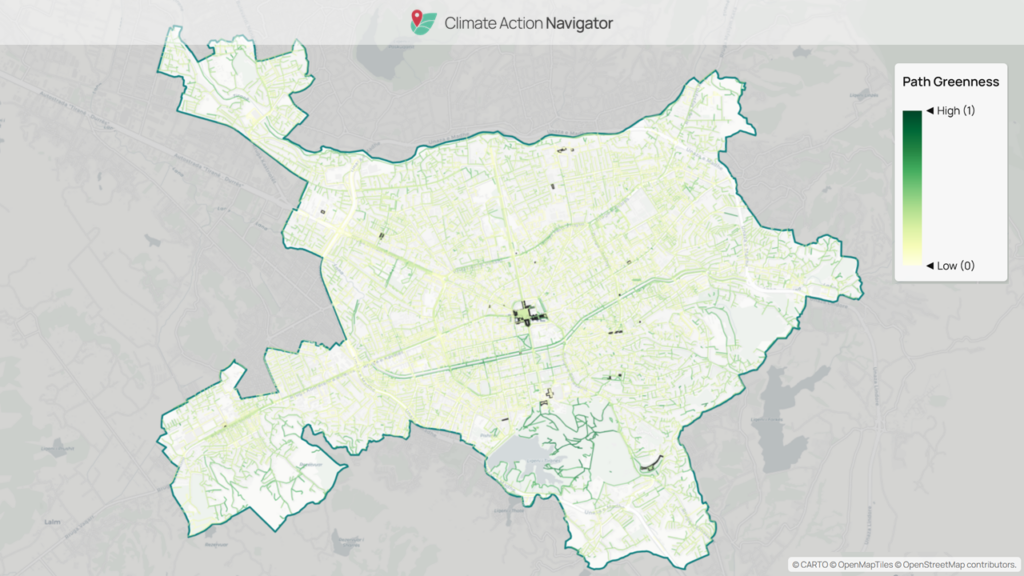
Detour Factors: Can I Take the Shortest Route to My Destination?
When cycling to a desired destination, we generally wish to take the shortest route, avoiding lengthy detours as much as possible. Detour factors highlight areas where a long detour is necessary or reaching a neighboring cell is impossible for cyclists. The latter case indicates that the cycling infrastructure is missing (or that it is not mapped). For city planners and advocacy groups, such insights are essential for identifying structural barriers and prioritizing interventions.

Summaries: Strengthening Data Transparency and Quality
The new hiBike version introduces extended summary statistics that give more detailed information on the percentage of paths in each category, including path-sharing characteristics, surface quality, and greenness. Except for greenness, all these summaries function as a data quality check, helping users understand how well cycling infrastructure is mapped in their area of interest. The greenness summary provides the user with a handy overview of the overall greenness of the selected area.
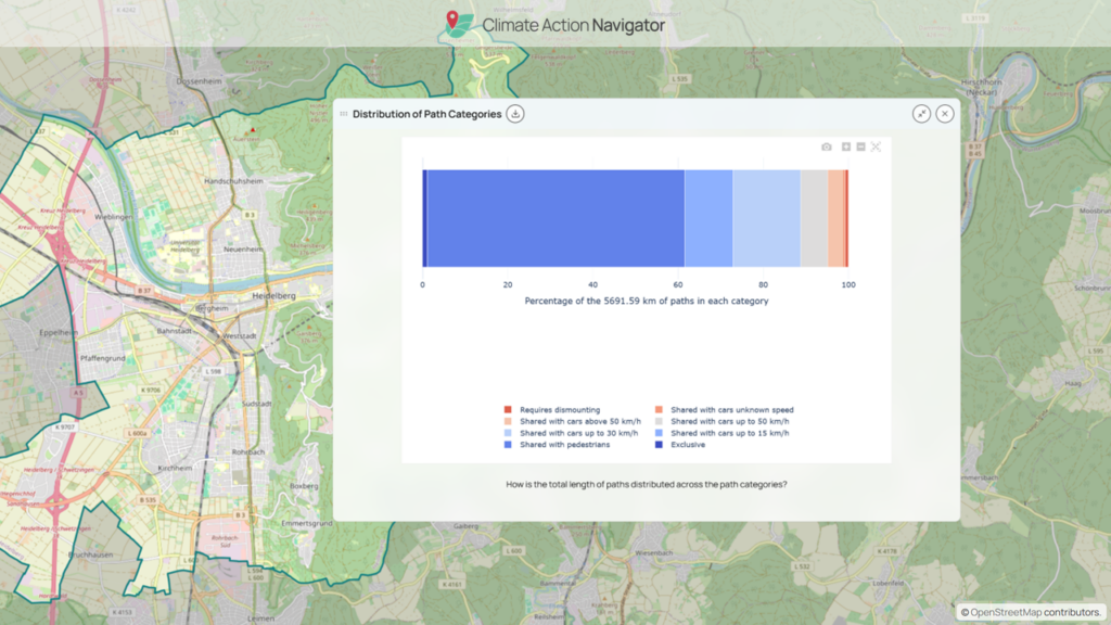
The Climate Action Navigator
The current enhancements to hiBike are part of a broader development of the Climate Action Navigator, which already delivers high-resolution assessments on climate-relevant topics such as urban walkability, cities´ CO2 budgets, residential heating emissions, land consumption, and emissions linked to land use changes.
Whenever possible, CAN uses freely accessible data (like OpenStreetMap and satellite imagery) and open software tools, thereby ensuring accessibility, broad applicability, and adaption opportunities. CAN´s assessment tools aim to help stakeholders identify both strengths and gaps in climate mitigation across sectors. By visualizing data at street-level resolution, interventions and improvements can be targeted and consider the specific local context.
Assess how your city or district is doing with the Climate Action Navigator: https://climate-action.heigit.org/webapp/dashboard
]]>Since our founding in 2019, our vision has been simple but ambitious: to advance open geoinformation for the benefit of society and the environment. We build tools to support informed decisions in sustainable mobility, humanitarian aid, and climate action, powered by spatial data analytics and machine learning. This mission has shaped our work from the very beginning and is still at the heart of what we do today.
A lot has changed over the years, but some things have remained constant. Our long-standing collaboration with the GIScience research group continues to form the backbone of our technologies, and we are grateful for the ongoing exchange that fuels so many of our innovations. We also marked a major milestone for our funding organization, the Klaus Tschira Stiftung, which turned 30 this year.
On the innovation side, many of our long-standing ideas finally came to life: from our first flood risk assessments in Pakistan to the launch of the Climate Action Navigator (CAN) and new features for ohsomeNow Stats and openrouteservice. We also expanded our network in humanitarian response and kicked off new collaborations in climate action.
Internally, we also underwent some structural changes. The former Smart Mobility and Big Spatial Data teams merged to form Technical Innovation Group (TIGr), bringing together complementary expertise and strengthening the technical foundation of our work. We also saw a change in leadership: we said farewell to our managing director Gesa Schönberger and welcomed our Innovation Manager, Stefan Gumbrich as her successor. Stefan describes this transition as “both an honor and a joy,” and looks forward to continuing our shared mission together with the HeiGIT team.
As a tradition, we also try to give back every year beyond our work: HeiGIT is donating 5,000 € to the Heidelberger Bündnis to support local initiatives in our home city.
Of course, we cannot capture every project, achievement, or idea that moved us this year. Instead, we want to share a few personal highlights from our colleagues: what made them proud, which moments stood out, and what excites them most for 2026.

What Made This Year Special For Us
This year, our achievements reflected the dedication of our team. Colleagues took pride in seeing long-term projects come to life.
A highlight of the year was launching the Climate Action Navigator with new assessment tools to help city planners, NGOs, and grassroots organizations build more climate-resilient communities. “It was a great team effort, and the positive feedback was well deserved. I’m especially proud of how the team adapts to change and integrates new members smoothly,” shared Kirsten von Elverfeldt, Community Engagement Manager for Climate Action. As the Climate Action Navigator gradually expanded with additional assessment tools, it sparked discussions with stakeholders on walkability, bikeability, heating emissions, and land consumption, underscoring the demand for accessible, actionable indicators.
On the research front, and as always in close collaboration with the GIScience research group, we published numerous papers in 2025. Our growing body of manuscripts reflects years of collective effort. A good example of this is the HEAL project: over several years, it produced multiple publications and led to a routing app now used in cities to support heat-aware mobility. Reflecting on this work, Christina Ludwig, Researcher at HeiGIT and GIScience, shared: “Having our work finally published is the result of a lot of dedication and very good collaboration within the team over the last three years, which makes this special.”
In humanitarian geoinformation, tools like the Sketch Map Tool reached new communities, supporting participatory mapping worldwide, while the IFRC Networks GIS Training Platform expanded to English and Spanish, strengthening accessibility, knowledge transfer, and capacity building.
Some projects start small and gradually develop into major initiatives. A case in point is the work on AILAS project, which began with a specific partner need in Madagascar and grew into a central focus for the team.
“It’s a great example of how a small, partner-driven idea can evolve into a core topic. What began with concrete requirements on the ground gradually expanded: a ZIM proposal, integration into a follow-up project, deploying cameras in Madagascar, and now receiving large amounts of real field data,” reflected Marcel Maurer, Product Owner at the Geoinformation for Humanitarian Aid Team.

Memorable Moments
Beyond achievements, colleagues remembered standout moments when teamwork, recognition, and meaningful connections made their work resonate and highlighted HeiGIT’s ties to the wider community.
A major milestone was publishing a road surface dataset along with a paper based on street-level imagery, marking HeiGIT’s shift from analyzing external data to creating open datasets. The first dataset, along with the newly published PlanetScope global road surface dataset, are both freely available on the Humanitarian Data Exchange, supporting research, economic development, environmental sustainability, route planning, and emergency response. “For me, it shows where our work is going: producing relevant data and turning research into reliable services,” said Benjamin Herfort, Team Lead of the Technical Innovation Group.
Hosting the AI4AA (Artificial Intelligence for Anticipatory Action) workshop was another highlight. “The workshop brought together humanitarian practitioners, technical experts, and researchers to discuss the values and risks of AI for anticipatory action,” recalled Melanie Eckle-Elze, Partner Engagement Manager at Geoinformation for Humanitarian Aid Team.
Many memorable moments were tied to the real-world impact of our tools. For instance, ohsomeNow Stats, with its new data and H3 hexagon maps, has become a key resource for humanitarian mapping groups to manage disaster scenarios, store data, and motivate mappers.

Looking Ahead to 2026
When we asked colleagues what excites them most about 2026, one theme stood out: making our tools even more useful and easier to apply in real-world contexts.
A major focus will be routing and mobility. Collaborations with organizations like the Logistics Cluster (LogIE) provide direct feedback from field missions. Their experience on the ground supports the development of a dynamic routing prototype for humanitarian logistics, built on openrouteservice. We also plan to continue improving climate-sensitive travel and work to integrate public transport routing in openrouteservice. This is still work in progress, and we are excited to share the first results of these efforts in 2026.
As OpenStreetMap (OSM) continues to be the cornerstone of many of our technologies and methods, ohsome-planet and ohsomeDB will simplify the use of OSM data and support research-driven applications.
Street-level imagery will play an increasing role in research and applied projects. The Climate Action team aims to extract new insights to feed into the navigator, helping cities and partners plan more resilient, accessible environments. There is more to come, as we plan to enrich our datasets and fine-tune our models with street-view-imagery.
Tools supporting humanitarian and community engagement will also evolve with the focus on inclusivity, smoother integration with partner workflows, and reaching more trainers and volunteers worldwide. Across projects, there is a shared goal to release more open datasets and improve the full cycle from data collection to decision-making, feedback, and collaboration, grounded in research.

As we wrap up the year, we want to extend our heartfelt thanks to all who make our work possible.
Thank you to the Klaus Tschira Stiftung for providing base funding and supporting our mission, to GIScience for providing the research foundation that informs our tools, and to all our partners and collaborators for sharing our vision and turning it into reality with us.
Merry Christmas and Happy New Year! Stay tuned for all the exciting updates in 2026!
]]>