A year ago as I was preparing to launch my brand new app called Twine - RSS Reader on the App Store and Google Play, I started going through the usual process of generating release artifacts, submitting the app to their respective stores, waiting for reviews and then finally handling rollouts or in some scenarios hotfixes in early stages. As a mobile developer, I am pretty used to this process, I have done this hundreds if not thousands of times, and I still hate this.
There are a few reasons why I'm not too fond of this process
- It's a manual process, generating artifacts for both platforms, tracking versioning, creating releases in respective stores and then handling phased rollouts individually.
- It doesn't scale well if I need to maintain different app variants, such as nightly builds and production releases.
- Trying to do hotfixes to these releases is a cumbersome process.
But the good thing is, I only had to do that for the first release. After that, I set up Tramline to release my app. Tramline is a service that lets you release your app without drowning in the process.
I had already used it for another app of mine called Pinnit. I loved it, so this was the first thing I set up when preparing to release the app.
In this article, I won't cover the setup process, as it's already well-explained in their documentation. Instead, I will now show what the release process for Twine looks like.
Release Process
My usual release process goes like this for Twine, I commit/merge all my changes to my main branch, and every night Tramline triggers a nightly release and deploys it to TestFlight and Google Play Internal Testing. Once I am happy with the changes, I click a couple of buttons and it triggers my GH Actions to build the artifacts with proper versioning and then deploy them to respective stores and I can manage hotfixes and phased rollouts right from the Tramline dashboard.
Now let's look at the 2 release trains (Release trains are the building blocks of the Tramline) Twine has.
- Nightly
- Release
Nightly Train 🌃🚃
The nightly release train is an automated train, that takes changes from my main branch every night and back merges them into a separate branch called nightly
During this process, Tramline handles building the artifacts using GitHub Actions, tracks app versioning using semantic versioning (semver) and generates the automated release notes for the nightly release.
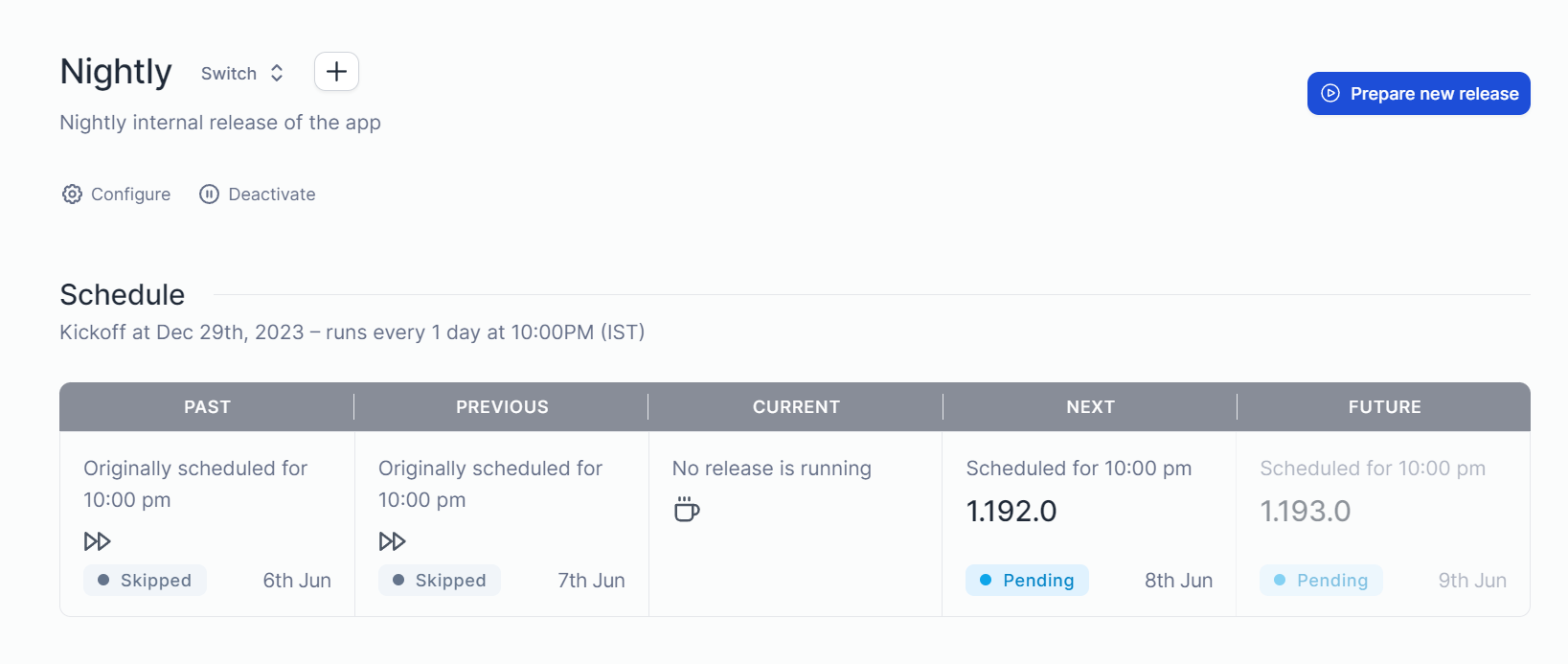
In the above screenshot, two releases are skipped for the nightly release, that's because Tramline is smart enough to check if there are any changes in the trunk since the last release to prepare a new release.
Most of the time I don't do anything with this train, I just let it run automatically. But if there are scenarios where I want to test a new change immediately from the store, I do a manual release using the "prepare new release" option.
Next, let's look at the main release train.
Production Train ✨🚃
With the production release train, I don't have any automated releases configured. Instead, I do a manual release.
It goes like this, I commit/merge all changes to the main branch. Then, I click on the "prepare new release" option on Tramline.

That lets me select what kind of release I want to make, which determines the app versioning on both Android & iOS.

Once I click on start, Tramline will cut a new branch from the main branch with r/release/yyyy-mm-dd format and start the release process. Similar to the Nightly train, it starts the GitHub Action to build the artifacts and uploads them to TestFlight and Internal Testing as the first step, and then we start the production release.
First I edit the release notes, since it's a multiplatform app built using Compose and Kotlin. The changelog is mostly similar, for both Android and iOS.
(I wish there was a unified text entry for this with an option to add a platform-specific changelog. Makes it a bit easier if it's a common codebase)

After that, I click start deployment, which starts the production release. Since these stores require reviews, Tramline shows an option to submit it for review and track the status of the review before making the release. (It's only available for iOS at the moment since Google Play API doesn't have this functionality). If you add Slack integration, Tramline can send notifications about these changes along with other useful release information.

Once the review process of the app is done, I start the release and a phased rollout starts. This is something I have configured when creating the release train step. App Store doesn't allow custom phase rollout strategies, so I am matching my Google Play rollout percentages with default App Store ones. That's why you use the "Increase Rollout" option in only one of them.

If everything is good with the release, it goes to 100% automatically. But if I notice any issues/crashes with the release that are critical. Which is easy to observe with the BugSnag integration in the Tramline dashboard. I just push my fixes to my release branch. Tramline then provides me the option to apply those fixes to individual releases.

If I apply these patches, the release now goes into patch mode. It starts to increase the patch version of the release and does the whole above process again.

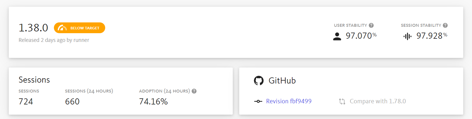
Once the release is done, it's now locked and shows the reldex score and appropriate release information.

It also displays the release health information from BugSnag like adoption rate and stability right in the Tramline dashboard.

That's it, now new release of Twine is released to the App Store and Google Play. For me, Tramline gets rid of the manual release process of generating artifacts locally and handling the releases in individual stores, and also I don't have to directly interact with the App Store Connect or Google Play APIs.
I don't have to drown in the process and just start deploying, that's what I like about Tramline.
If you like this, you can try it by signing up at tramline.app
You can check out the GitHub Actions I have used for generating my release artifacts, here. Feel free to star the project on GitHub and leave a review on the App Store or Play Store.
 msasikanth
Thanks for reading, until next time ✌🏾
]]>So, let's see what happened in the last couple of weeks.
- I celebrated my 30th birthday 🥳
- Played a lot of Like a Dragon: Infinite Wealth, still have to finish it
- Catching up on all the F1 news that's happening, and there is a lot this season 😂
- Moved error reporting on Twine from Sentry to BugSnag
- Started a new project
Twine feature updates
In the last 2 weeks, I released 3 updates to Twine that resolved a lot of issues and edge cases that users were experiencing and also worked on some quality-of-life features that people have been requesting. So far, I am quite happy with the stability of the app.
For the next set of updates, I want to prioritise features. I do have a couple of them on my backlog and looking forward to finishing them off.
It's probably also time for me to space out my releases so that I don't burn myself out, trying to make something every week.
Sentry to BugSnag
Initially, I went with Sentry KMP implementation, mainly because of my familiarity with using Sentry before at work. I like it, but it does have quirks that annoy me, so I decided to migrate from Sentry to BugSnag on Twine.
While the Sentry KMP library worked, it often missed some unhandled errors for me or didn't even show different versions on my releases page for some reason. and more importantly, the library is just in the early stages which leads to, it not having the best experience when updating once in a while.
Since BugSnag didn't have a KMP library, I went with BugSnag integration in CrashKiOS. So far it's working well. I have started receiving detailed error logs and was able to resolve a couple of important errors in the last 2 weeks. I am also a fan of the user experience on BugSnag.
It also shows the health of a release, which I am a huge fan of. Great way to quickly glance at how my releases are doing on both platforms. However, the session count seems wrong since it does not count each platform separately and seems to just combine them. Hopefully, it will improve once they support KMP apps natively.
New project
Twine is one of the projects I want to keep working on and make it better and eventually build features to earn from it as well. But working on the same project over and over again can feel boring for me. So, I decided on a small-scale project to play around with whenever I have time or I don't have the mental space to work on Twine.
I cannot wait to finish this project soon and share more info.
Links I found interesting
This is something new I want to try, I want to start including a handful of links that I find interesting or noteworthy.
That's it for this devlog. See you folks next time, have a great week ahead 👋🏾
]]>Well now onto the dev log, this was a fun and eventful
]]>Alright, here we go. Another weekend, another dev log. I am still trying to figure out how to structure this or how often I would want to post this. So bear with me as I figure that out.
Well now onto the dev log, this was a fun and eventful week. I decided to post about Twine on Hacker News and Lobsters, and both did well and reached the top of the main page.
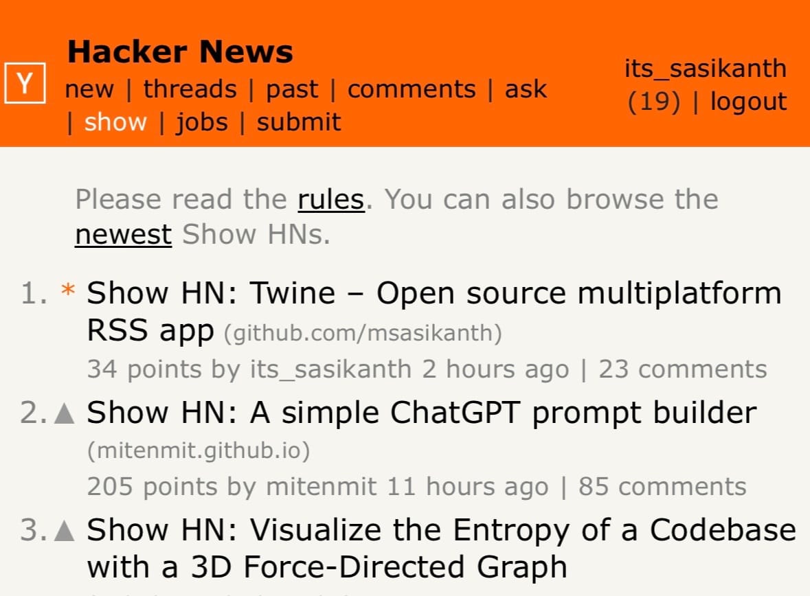
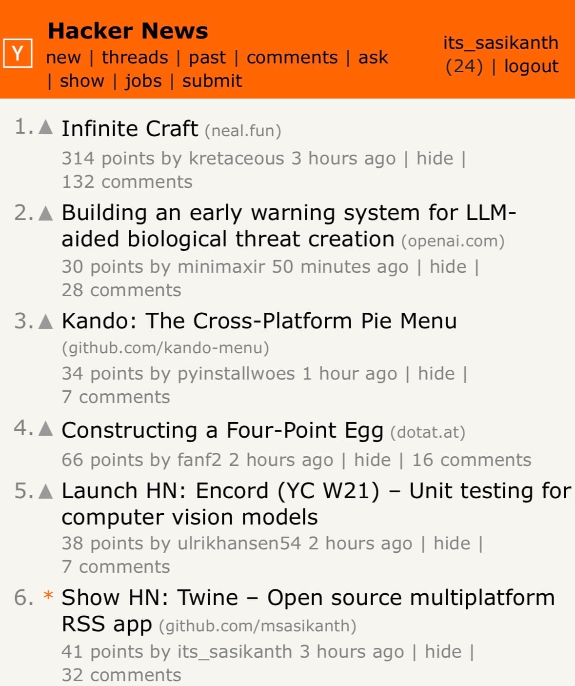
That was a surprise for me because I had posted it in the past, but at that time I barely got any feedback on the project. However last time I didn't have a fully fleshed-out project README on GitHub with just a few images, and the app had slightly fewer features and not-so-great screenshots on both the App Store and Play Store. So, this time after receiving some feedback on Reddit, I had to do a fresh new set of screenshots on Figma for the app and I think they turned out well.

So, it's a learning experience for me to understand how important these things are. I always thought I just had to focus more on building the best product I could, but selling it is also a skill I need to learn and get better at.
Apart from this, I continued working on Twine, features, refactoring some stuff and of course fixing bugs like dealing with config changes on Android 🙃.
Starting, one of the smallest changes that will have a huge impact on the release on iOS for me is, switching to M1 machines on GitHub Actions. I just had to update my machine to macos-14 and it uses the new M1 machines.
msasikanthThis shaved off more than 5 minutes from my archive builds for iOS when making releases.
Migrated Twine to use Coil 3 multi-platform. This helped me remove a bunch of code I had to do for loading images on iOS and also offered better support for different formats and caching. I am glad this finally happened 🙌🏾
It was interesting and frustrating at times trying to figure out how to integrate some of the new changes into the dynamic content theming I had or DI, it's mostly to do with how I structured my code initially though, so did some refactoring around it. You can check the changes here:
msasikanthNext up
Of course, I continue to work on new features and improving Twine in general. I have picked out a few features I want to get done this year (not in any order).
- Labels
- Per feed customisations
- Notifications
- Improve reader view
There is one more major change I want to implement.
Monetising Twine
My initial plan for Twine was to keep it open source and then get sponsors for the project on GitHub. So, that I can sustainably work in my free time.

But unfortunately, that did not work as expected. Most people aren't familiar with that or don't even have visibility about something like that when using the app, especially for people outside of the dev community.
So, late last year I was planning on introducing monetisation in the app and discussed it with a few people and these options seem like good options. Don't worry, I still want to keep the core app free, and I am not adding ads or making the app paid now. There are a couple of features I can potentially offer as an in-app purchase which provides value to users.
- Customisations (potentially app & reader view themes, app icons, etc.,?)
- Integrations
- Provide support for 3rd party feed readers APIs like feed bin, self-hosted fever instances, etc.,
- Adding a tip option in the app
or as a completely new product
- Desktop apps (potentially?)
I think these act as a good way to monetise the app. What do you folks think? Are these something you are interested in or find value in? Let me know in the comments.
Edit: Forgot to mention this originally, but these changes will continue to be open source as well. In case you’re wondering.
If you want to continue receiving these dev logs, feel free to sign up below.
]]>Lately, my YouTube recommendations are flooded with dev logs, showcasing the progress of building indie frontend projects or games. That inspired me to start logging my experience building Twine, my cross-platform RSS reader app or any of my programming explorations. But instead of doing a video, I have decided to write.
msasikanthSo, why am I doing this? There are a couple of things I want to achieve with this
- Capture different ideas and experiences I had when building Twine. I think this acts as a good way for me to keep track of my thought process, and explorations and potentially also helps others in their programming journey 🤞🏾
- Improve my content writing frequency and ability(?). I am not that consistent with my content writing, nor am I that great at writing articles in my opinion. So, I feel like this kinda of helps me with that, I don't need to have the pressure of doing something "cool" and instead just capture my experience working on Twine for that week or since I have written last.
Let's start dev log for this week (Week 04, 2024). So, what I have been up to?
- I have implemented the reader view for the app, it's been a long-requested feature, ever since I first open-sourced the project. So, it feels nice to finally close this one off.
To implement the reader view I had to fork Readability4J, to Kotlin multiplatform to process the RSS HTML content into a readable HTML. One thing that made this fork possible was fleeksoft/ksoup, which allowed me to replace Jsoup usages.
In terms of the reader view, I am just using a webview, to render the generated HTML. I had to write some HTML and CSS for formatting the reader view. It's been a while since I have done that, I felt so damn rusty 😂
- In RSS feeds you don't always receive full post content. So, one thing I have done with my reader view is the ability to pull the article from the web and convert it into a readable view with a button press. It was pretty straightforward as I just loaded the HTML and passed it through the readability class to generate the HTML and render it. But this is definitely a really useful thing to have for me. Here is a sample showcasing that.
Currently, I am waiting for a new webview release, which contains a couple of changes I contributed to. Once that is available I will push these changes to production.
- Next up, I finally started working on tags implementation for Twine. While I do have an idea of how the DB implementation is gonna look and work, one thing that I have been mulling over from the start is how the user experience is gonna look. After trying out a few implementations of this on different projects, I think I have an idea of how Twine implementation is gonna look like. Finishing this will bring Twine to feature match with most of the RSS readers out there, and also allow me to explore integrations for the project. So, that's something I am looking forward to.
- Apart from working on Twine, I have been playing Gran Turismo 7 and got Like A Dragon: Infinite Wealth today, so been playing those in my free time. As always been playing a ton of Overwatch 2 🥲
and that's it, for my first-ever dev log, and what I have worked on Twine this week. I will try to be consistent with these and at least try to write one every weekend. But I don't want to force myself if I haven't done anything instead decided to take a break.
Remember to subscribe so you can begin receiving more dev logs and other updates directly in your email.
]]>Unless you're living under a rock, you might have heard of or used Figma before, whether to design or for handoff, it's a collaborative design tool built using web technologies. It's a fantastic tool!
We are not going to talk about why Figma is amazing today. Instead, we are going to focus on Figma Plugins. Plugins are how Figma allows us to extend the capabilities of Figma design or FigJam, it has a vibrant community of plugins that vary from generating text content for placeholders to linting for accessibility or generating full-fledged components or design systems.
Since Figma is built on top of web technologies, it requires plugins to be JavaScript module to run them. But, we can write the plugin in a different language though, for example when we create a new plugin from their template. It provides a TypeScript template and once you compile it, it outputs a JavaScript file that is used by Figma.
So, I wanted to try writing a plugin using Kotlin/JS. It's a similar concept, we write Kotlin code and it compiles to JavaScript. First, let's create a new Kotlin Multiplatform project in IntelliJ IDEA

That should create a simple project that just prints "Hello, world" to the console.

Let's compile the code to generate the JS module. You can run the following Gradle command to do that.
./gradlew browserDistributionThis would compile your project into a single JS module that is ready for distribution. You can find it under build/distributions

Alright, we have our JS file. Now how do we get Figma to run it? This is where we define a manifest file for Figma to import the plugin from. Let's create the following manifest.json file in the root directory of the project.
{
  "name": "Figma Plugin KT",
  "id": "737805260747778092",
  "api": "1.0.0",
  "main": "build/distributions/figma-plugin-kt.js",
  "capabilities": [],
  "enableProposedApi": false,
  "editorType": [
    "figma"
  ]
}
Then open Figma, navigate to Account > Plugins, and then select Import plugin from manifest from the In development section


That's it, now you have your plugin ready to use in Figma. You can now open or create a new Figma design file. Then press CMD/CTRL + / , and enter the plugin name to run it. Since this plugin prints a message, you have to open the console to view it. You can follow the same shortcut mentioned above and type "Open console".

But wait a minute, why is that toast message saying running plugin even after the message is finished? Well, that's because we haven't closed the plugin after performing our operation.
Let's jump back to your Kotlin code and do that. After the print statement let's add this JS code block, and then generate the distributions again.
fun main() {
  println("Hello, ${greet()}")
  js("figma.closePlugin('Operation successful ✅')")
}
Now, when you run your plugin in Figma, it will automatically close the plugin after printing the greeting and show this message.

So, that's it right? Well not exactly. As you can see even though we are building this project in Kotlin, we are still using raw JS strings to do the Figma-related operations, thus defeating any advantage we are getting by writing a plugin in Kotlin. I would like to have type safety when writing Figma plugin APIs and be able to use any Kotlin standard library functions that are compatible. Let's take a look at how we can do that.
Fortunately, Kotlin/JS offers a way other ways to run JavaScript code from Kotlin. That is via having custom bindings. Let's Figma API exposes a global object to interact with its APIs called figma.
We would have to create a new Kotlin file and add a variable with the same name as in their APIs. So, let's do that. Let's create a new Kotlin file that exposes the Figma API global object
external val figma: PluginAPI

external interface PluginAPI {

}
Here the external modifier indicates that the code implementation of it is in JavaScript, so it won't complain about not having any body in the code.
Let's add the closePlugin API we used before to the PluginAPI interface, so that we can use it in our main file.
external interface PluginAPI {
  fun closePlugin(message: String = definedExternally)
}
Here, the definedExternally indicates that the message is an optional parameter.
Now let's replace the JS code in our main file with this.
fun main() {
  println("Hello, ${greet()}")
  figma.closePlugin("Operation successful ✅")
}
When you run the plugin again in Figma, you should see everything working as expected. This time we are using type-safe Kotlin APIs rather than a raw JS string in Kotlin.
But, you might be thinking this seems tedious work to write all the external declarations manually one by one. Well, Kotlin folks think so too. That's why they have created an experimental library called Dukat, this would allow us to convert TypeScript definition files to Kotlin declarations. Let's install that
npm install -g dukatNow we need the Figma plugin API typings. Fortunately, Figma exposes the plugin API typings via GitHub and npm, you can find them here.

Once we downloaded the typings repo, the files that are important to us are index.d.ts and plugin-api.d.ts. Let's run Dukat on that.
dukat -d \
~/Projects/figma-plugin-kt/types \
~/Downloads/figma-typings/index.d.ts \
~/Downloads/figma-typings/plugin-api.d.ts
This should generate the Kotlin declarations we need along with library declarations as well. Now, we have access to all the APIs that Figma Plugin provides. To test this, you can update your main code to this
fun main() {
  val interRegularFont = object : FontName {
    override val family get() = "Inter"
    override val style get() = "Regular"
  }

  figma.loadFontAsync(interRegularFont).then {
    val text = figma.createText()
    text.characters = "Hello, world"
    text.fontSize = 24

    figma.closePlugin("Operation successful ✅")
  }
}
Once we run the plugin, a text should be created in the Figma canvas.
Gotchas
- While Dukat helps generates the Kotlin declarations, it's far from perfect. Sometimes the generated files can have a lot of errors, like not having a
overridemodifier, or having that when it's not needed, or wrong types, etc., So, there is some manual effort involved to resolve them accordingly before we can generate a JS module for distribution.
That's it, this is how we can create Figma Plugins using Kotlin/JS. Now I wonder if I can use Jetpack Compose UI here for plugin UI. Well, that's for a different time I guess. See you later 👋🏾
You can find the source code here
]]>Recently I was looking into setting up templates for creating new projects. Obviously, a GitHub template was the first option, but I was not a huge fan of having to create a new GitHub repo from the template and then start changing things like app name, package name, application ID, removing unnecessary configurations, etc.,
Ideally, I wanted to have the option to configure things when creating a project so that I can pick and choose what I want. For example, whether or not I want to configure any CI checks, release pipeline, build configurations, etc.,
That's why I started looking into how Android Studio provides the project templates when creating a new project in the hopes of adding my own option to that new project wizard which would allow me to do those things. This post shows how you can create an IDE plugin to provide your templates in Android Studio's new project wizard.
Note: While the following approach and APIs used in this article are public, they are not documented and hence not considered "offical" approach for creating templates.
Alright, now let's get started...
Prerequisites
In order to create Android Studio plugins, we need to use IntelliJ IDEA CE (or IntelliJ IDEA Ultimate).
Once you installed IntelliJ IDEA, create a new project to create an IDE Plugin

After the project is created, open the build.gradle.kts or build.gradle file and let's configure the Gradle IntelliJ plugin to support the Android plugin. Add the following code to the intellij configuration block and sync the project.
intellij {
  type.set("AI") // Target IDE Platform
  version.set("2022.2.1.11")

  plugins.set(listOf(
    "org.jetbrains.android"
  ))
}
Gradle IntelliJ plugin configuration
The above code sets the plugin dependency and changes the IDE type to use Android Studio. The version we used here is Android Studio Flamingo Canary 11. You can find the Android Studio versions here. (Depending on the Android Studio version, the APIs you have access to in your plugin may change)
Now open plugin.xml file, this is where you can configure all the information related to the plugin including things like id, name, version, depends on, etc.,
We are interested in the depends configuration. By default, the plugin depends on the IntelliJ platform only, but we also want to make sure the IDE has the Android plugin for our plugin to work. We can add the following two lines in the plugin.xml
  <idea-plugin>
    <depends>org.jetbrains.android</depends>
    <depends>com.intellij.modules.androidstudio</depends>
  </idea-plugin>
Plugin compatibility requirements
That's it, you have the project configured to build an Android Studio plugin.
Creating project templates
In order to provide your own project templates in the new project wizard, there are a couple of things we need to configure.
- Template: Describes a template available in the new project wizard. Describes the template and options available for the template and which context to show it in.
- Recipe: Instructions for generating the project for a template. Once the user selects the template from the wizard and inputs the params, the recipe is executed with parameters supplied by the user
Create Template
Android Studio provides a template DSL to create these templates. You can also take a look at existing templates to build your own templates.
So, let's create one. Create a new file called ProjectTemplate.kt, and add a new variable to provide the template.
import com.android.tools.idea.wizard.template.Category
import com.android.tools.idea.wizard.template.CheckBoxWidget
import com.android.tools.idea.wizard.template.FormFactor
import com.android.tools.idea.wizard.template.ModuleTemplateData
import com.android.tools.idea.wizard.template.PackageNameWidget
import com.android.tools.idea.wizard.template.TemplateConstraint
import com.android.tools.idea.wizard.template.TemplateData
import com.android.tools.idea.wizard.template.TextFieldWidget
import com.android.tools.idea.wizard.template.WizardUiContext
import com.android.tools.idea.wizard.template.booleanParameter
import com.android.tools.idea.wizard.template.impl.defaultPackageNameParameter
import com.android.tools.idea.wizard.template.stringParameter
import com.android.tools.idea.wizard.template.template
import java.io.File

val projectTemplate
  get() = template {
    name = "My Project Template"
    description = "My Project Template"
    minApi = 21
    constraints = listOf(
      TemplateConstraint.AndroidX,
      TemplateConstraint.Kotlin
    )
    category = Category.Application
    formFactor = FormFactor.Mobile
    screens = listOf(WizardUiContext.NewProject, WizardUiContext.NewProjectExtraDetail)

    val activityName = stringParameter {
      name = "Activity name"
      default = "MainActivity"
    }

    val addComposeDependencies = booleanParameter {
      name = "Add Compose Dependencies"
      default = false
    }

    val packageName = defaultPackageNameParameter

    widgets(
      TextFieldWidget(activityName),
      CheckBoxWidget(addComposeDependencies),
      PackageNameWidget(packageName)
    )

    // I am reusing the thumbnail provided by Android Studio, but
    // replace it with your own
    thumb { File("compose-activity-material3").resolve("template_compose_empty_activity_material3.png") }

    recipe = { data: TemplateData ->
      projectRecipe(
        moduleData = data as ModuleTemplateData,
        packageName = packageName.value,
        activityName = activityName.value,
        canAddComposeDependencies = addComposeDependencies.value
      )
    }
  }
- Name: Name of the project template
- Description: Description of the template
- MinApi: Minimum SDK version required to build this template
- Constraints: Conditions under which the template should be rendered in the new project wizard. For example, we don't want to show this template if AndroidX or Kotlin support is not available or enabled in the IDE
- Category: Determines which menu entry the template belongs to. For example, Application, Activity, Compose, Service, etc.,
- FormFactory: Determines which form factor the template belongs to. Templates with particular form factors can only be rendered in the corresponding category. For example, when you're creating a new project you have the categories for templates like phone and tables, wear os, etc.,
- Screens: UI Context in which the template should be displayed. Should include all possible contexts. For example, we defined a context of
NewProjectandNewProjectExtraDetailin the above template. This means this template is only shown as an option when we are creating a new project. You can also addNewModuleorMenuEntryand others. (Note:NewProjectExtraDetailwill show an extra page after the initial configuration to allow for more customization) - Widgets: Collecting of
Widgets to render inNewProjectExtraDetailcontext. For example, this will be useful in case you wanna provide more config options after the default initial new project wizard page. - Thumb: Thumbnail for the template to show in the new project wizard
- Recipe: The recipe used to generate the template output. It will be called after the user provides values for all the configuration parameters.
Create Recipe
Now let's create our recipe for generating the project. Create a file called ProjectRecipe.kt and an extension function for RecipeExecutor called projectRecipe
import com.android.tools.idea.wizard.template.ModuleTemplateData
import com.android.tools.idea.wizard.template.PackageName
import com.android.tools.idea.wizard.template.RecipeExecutor

fun RecipeExecutor.projectRecipe(
  moduleData: ModuleTemplateData,
  packageName: PackageName,
  activityName: String,
  canAddComposeDependencies: Boolean
) {

}
Basically RecipeExecutor is an execution engine for the instructions we provide in the recipe. So, let's provide some instructions to generate a project.
For this example let's keep it simple and create a project with empty activity and the ability to toggle whether or not we want to add Compose dependencies to it.
RecipeExecutor provides functions to do some common actions like adding dependencies, plugins, build features, etc., Let's use the addDependency function to add the required Compose dependencies.
private const val COMPOSE_BOM_VERSION = "2022.10.00"
private const val COMPOSE_KOTLIN_COMPILER_VERSION = "1.3.2"

fun RecipeExecutor.projectRecipe(
  moduleData: ModuleTemplateData,
  packageName: PackageName,
  activityName: String,
  canAddComposeDependencies: Boolean
) {
  addAllKotlinDependencies(moduleData)
  addMaterial3Dependency()

  if (canAddComposeDependencies) {
    addDependency(mavenCoordinate = "androidx.activity:activity-compose:1.5.1")

    // Add Compose dependencies, using the BOM to set versions
    addPlatformDependency(mavenCoordinate = "androidx.compose:compose-bom:$COMPOSE_BOM_VERSION")
    addPlatformDependency(mavenCoordinate = "androidx.compose:compose-bom:$COMPOSE_BOM_VERSION", "androidTestImplementation")

    addDependency(mavenCoordinate = "androidx.compose.ui:ui")
    addDependency(mavenCoordinate = "androidx.compose.ui:ui-graphics")
    addDependency(mavenCoordinate = "androidx.compose.ui:ui-tooling", configuration = "debugImplementation")
    addDependency(mavenCoordinate = "androidx.compose.ui:ui-tooling-preview")
    addDependency(mavenCoordinate = "androidx.compose.ui:ui-test-manifest", configuration="debugImplementation")
    addDependency(mavenCoordinate = "androidx.compose.ui:ui-test-junit4", configuration="androidTestImplementation")
    addDependency(mavenCoordinate = "androidx.compose.material3:material3")

    requireJavaVersion("1.8", true)
    setBuildFeature("compose", true)
    // Note: kotlinCompilerVersion default is declared in TaskManager.COMPOSE_KOTLIN_COMPILER_VERSION
    setComposeOptions(kotlinCompilerExtensionVersion = COMPOSE_KOTLIN_COMPILER_VERSION)
  }
}
Now that we configured our build file, let's create our empty activity. Android Studio templates use string templates to create the files. So, let's create an empty activity string template in EmptyActivity.kt file.
import com.android.tools.idea.wizard.template.escapeKotlinIdentifier

fun emptyActivity(
  packageName: String,
  activityClass: String
) = """
package ${escapeKotlinIdentifier(packageName)}

import androidx.appcompat.app.AppCompatActivity
import android.os.Bundle

class $activityClass : AppCompatActivity() {
    override fun onCreate(savedInstanceState: Bundle?) {
        super.onCreate(savedInstanceState)
    }
}

"""
Finally, let's create the activity and save it in the recipe
fun RecipeExecutor.projectRecipe(
  moduleData: ModuleTemplateData,
  packageName: PackageName,
  activityName: String,
  canAddComposeDependencies: Boolean
) {
  // ...configuring dependencies

  val emptyActivity = emptyActivity(packageName, activityName)
  val emptyActivityPath = moduleData.srcDir.resolve("$activityName.kt")
  save(emptyActivity, emptyActivityPath)
  open(emptyActivityPath)
}
That's it you have created your first project template for Android Studio. While I only showcased adding dependencies and a Kotlin file. You can pretty much add any file type as they just rely on a string template. For example, you can create scripts or GH Actions or editor config, etc.,
If you tried to run/build the plugin now and test it in Android Studio you won't see the template show up just yet. There is one final step to provide this template to Android Studio.
Providing the templates to Android Studio
Android Studio provides templates to the new project wizard using something called a WizardTemplateProvider . It's an interface that implements a function to return a list of Templates.
The WizardTemplateProvider itself is exposed as a plugin extension, which means we can provide our own template provider to add to the already existing template provides. (Android Studio provides its own templates using a WizardTemplateProviderImpl class)
First, let's implement a class called MyProjectTemplateProvider which extends WizardTemplateProvider.
import com.android.tools.idea.wizard.template.Template
import com.android.tools.idea.wizard.template.WizardTemplateProvider

class MyProjectTemplatesProvider : WizardTemplateProvider() {

  override fun getTemplates(): List<Template> {
    return listOf(projectTemplate)
  }
}
Now, open the plugin.xml file and add a new extension to set our wizardTemplateProvider
<extensions defaultExtensionNs="com.android.tools.idea.wizard.template">
  <wizardTemplateProvider implementation="dev.sasikanth.myprojecttemplates.MyProjectTemplatesProvider"/>
</extensions>
That's it, now any Template you provide in MyProjectTemplatesProvider will be visible in the new project wizard after you install your plugin in Android Studio.
You can verify that the plugin and template are working as expected by running ./gradlew runIde.
Installing the plugin
Run the ./gradle buildPlugin command to generate the plugin jar. It should generate in our build/libs folder in the project.
Now open Android Studio and go to the plugins section and click on the gear icon to select install from disk option

Select the jar file you just created and restart the Android Studio.
Now when you create a new project, you should see your project template.


You can provide multiple project templates with this approach and configure the items when creating the project. You can find the sample used in this article here
]]>Earlier today I was looking into automatically building an APK/AAB artifact for one of the projects I am working on, using GitHub Actions. After the basic setup, I had to run the assemble command and it generated the artifact then I upload that to the action, or I can publish it somewhere I want. Pretty straightforward.
But one issue is, I had to manually update the version code and version name every time I had to make a new release. While it's not that big of work, I instead let a computer take care of versioning than me.
On Simple, we use Bitrise which provides us with a step that sets the version when running the workflow. So, I wanted to do something similar to that. I wanted to have a step that generates a version based on the current date and build/run.
So, one of the immediate approaches that came to mind for something like that was using gradle.properties. I can define a custom property and then read that in my build file when setting the version code and name. That would look something like this
appVersionCode=1
appVersionName=0.1versionCode = providers.gradleProperty("appVersionCode").get()
versionName = providers.gradleProperty("appVersionName").get()...and then I just have to pass the values I generated using properties in the Gradle command
./gradlew :app:assembleDebug \
-PappVersionCode=1 \
-PappVersionName=2022-12-24-1
That's it, this would generate the artifact with the version code and name I passed.
But I do want to see if there was a native way of doing this. After a bit of Googling and command clicking, I found that build tools have Gradle property that does help with this.
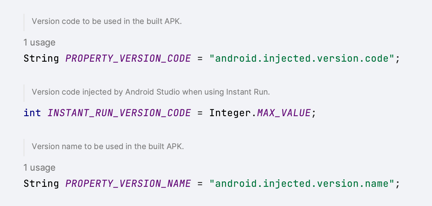
That's it, with these properties I didn't have to make any changes to the project build files and instead just had to pass the version information in the Gradle command
// version code and name are generated and are passed to this command

./gradlew :app:assembleDebug \
-Pandroid.injected.version.code=1 \
-Pandroid.injected.version.name=2022-12-24-1
This was a bit of a small thing I learned today, so wanted to share it. Hopefully, this will be useful for someone else as well :D
]]>One of the common things you might see in a lot of popular desktop apps is, that they have a custom title bar that contains fancy toolbar icons or a search bar or some other custom view. Compose Desktop allows us to use our own title bar by just making our Window undecorated. But what if you won't make that toolbar draggable as well? Compose provides an API for that as well, which is aptly named WindowDraggableArea
The usage of it is pretty straightforward. We first start by making our Window undecorated, which allows us to use our own title bar.
Window(
  state = rememberWindowState(),
  undecorated = true,
  transparent = true,
  onCloseRequest = ::exitApplication
) {
  // content here
}
Now, we can define our fancy title bar composable and place it in the window content. To make our title bar draggable, we simply wrap it in WindowDraggableArea
Window(
  state = rememberWindowState(),
  undecorated = true,
  transparent = true,
  onCloseRequest = ::exitApplication
) {
   WindowDraggableArea {
	 AppTitleBar()
   }
}
Under the hood, WindowDraggableArea is a simple Box view that uses pointer inputs to allow us to drag our window.
@Composable
fun WindowScope.WindowDraggableArea(
    modifier: Modifier = Modifier,
    content: @Composable () -> Unit = {}
) {
    val handler = remember { DragHandler(window) }
    Box(
        modifier = modifier.pointerInput(Unit) {
            forEachGesture {
                awaitPointerEventScope {
                    awaitFirstDown()
                    handler.register()
                }
            }
        }
    ) {
        content()
    }
}
If you look at the function definition, you will also notice WindowDraggableArea is an extension of WindowScope . That means you can only use it in singleWindowApplication , Window and Dialog . If you want to use it in a different Composable, you need to pass WindowScope as a receiver.
@Composable
fun WindowScope.AppTitleBar() {
  WindowDraggableArea {
    // title bar content
  }
}
That’s it, now you can create your own custom title bar and have the option to drag it across the desktop, or have a draggable area anywhere in your app.
Gotchas
- When you mark your window as undecorated, along with the toolbar the window frame and the elevation that is handled by the OS are also disabled/removed. So, the app will not have any elevation like other apps. Unfortunately setting elevation on your content just clips it.
- Resizing undecorated windows is currently not supported. There is an open issue for that on the
compose-jbrepo.
Here is a Compose Desktop app with a custom title bar I had to implement recently.

Update (27/04/2022): Fixed JSON to have String as a key type. Thanks, @janhavisinghh for letting me know.
Keeping the app up-to-date has a lot of benefits for the user, they can use all the new features, have the latest bug fixes and improvements and have access to the latest security patches. While some users update the app periodically or have the background updates enabled, others might not.
Google has a library to address this issue, which is aptly named In-app updates. which allows us to prompt the users to update their app. It gives a lot of different information and allows us to start the update right from the app. One of the interesting properties available as part of this library is updatePriority . Which lets us handle how we want to display a message that there is an update or how we update the app (flexibile or immediate).
We can set integer values between 0 & 5 for update priority, with 0 being the default and 5 being the highest priority. In order for us to set the update priority, we have to use the Google Play Developer API, and then we can check it on the client-side using AppUpdateInfo#getPriority().
While this is a great way for us to define priorities for our updates, and handle them accordingly in our app. We are required to use Google Developer API to set this, there is no other way around it currently. We cannot update it from Google Play Console while making a release as well. Personally, I would like to have control over it. I want to be able to update the priority while or after making a release. For that, we can use Firebase Remote Config.
Firebase Remote Config is a service that lets us control the behavior and appearance of the app. It will fetch this information from the Firebase servers periodically and update them. We can use this to pass in a minimal JSON file that let us define essentially a key/value pair with version code being the key and priority being the value.
Something like this
{
 "8145": 1,
 "8150": 5
}
Now, all we have to do is parse this information and use it on the client-side.
There are a lot of JSON parsing libraries for Android out there. I am using Moshi for this, but you can use any one of them. We can first start by defining what type we are expecting the parsed JSON is and create a Moshi adapter for it.
val type = Types.newParameterizedType(Map::class.java, String::class.java, Integer::class.java)
val updatePrioritiesAdapter = moshi.adapter<Map<String, Int>>(type)
Then we can fetch our JSON from the Firebase Remote Config and use the adapter to parse it
val json = remoteConfig.getValue("update_priorities").toString()
val updatePriorities: Map<String, Int> = updatePrioritiesAdapter.fromJson(json)
So, we have our Map<Int, Int> which contains our update priorities information. Now we need to get the version code for the update from our app. For that, we can use the in-app updates library which provides us with other information like the available version code which is the version code of the update that is available from Google Play store.
appUpdateInfoTask.addOnSuccessListener { appUpdateInfo ->
  val availableVersionCode = appUpdateInfo.availableVersionCode().toString()
  val updatePriority = updatePriorities.getOrDefault(availableVersionCode, defaultUpdatePriority)
  // handle priority
}
That’s it. Now we can easily update the update priority for a new version without having to do that using Google Developer API 🙌
]]>One of the common use cases I have noticed when using HiltViewModel’s(or even normal ViewModel with Dagger) is figuring out how to provide runtime screen arguments. Usually the ones you send as intent extras or fragment arguments.
You can use AssistedInject to provide these arguments at runtime as a workaround as mentioned in this comment. While it works, according to the later comment in that thread, it’s not recommend, since it’s possible to leak your activity/fragment instance into your ViewModel, which is not good.
In the same comment, the author also recommends a different workaround that Dagger/Hilt team recommends. Which is using SavedStateHandle that we are injecting, to directly read the arguments. Let’s take a look at how this workaround works.
SavedStateHandle creation
First, we need to understand how we are getting SavedStateHandle in the ViewModel.
@HiltViewModel
class MyViewModel @Inject constructor(
  savedStateHandle: SavedStateHandle
) : ViewModel(savedStateHandle)
When we are creating the ViewModel inside an Activity or Fragment, and you are not providing a default factory.
@AndroidEntryPoint
class MyActivity : AppCompatActivity() {
  // using ktx extensions to create ViewModel
  private val myViewModel: MyViewModel by viewModels()
}
Internally activity/fragment uses SavedStateViewModelFactory to create ViewModel’s which will provide SavedStateHandle as a constructor param. It basically receives the default arguments that are passed down from the screen and uses SavedStateHandle#createHandle to create the handle from the bundle.
So, that’s how we end up getting a SavedStateHandle in our ViewModel. Since it contains the same arguments bundle we get in the screen, that means we can read the arguments from the SavedStateHandle in our ViewModel.
Reading SavedStateHandle arguments
If you’re using Dagger Hilt for your DI, annotating your ViewModel with HiltViewModel will automatically provide the SavedStateHandle.
Now that we have our SavedStateHandle in our ViewModel. We can just read the arguments from it, let’s consider we have a UserDetailVieWModel that requires a user id to load the user details.
@HiltViewModel
class UserDetailViewModel @Inject constructor(
 savedStateHandle: SavedStateHandle) : ViewModel() {
   private val userId = savedStateHandle.get<UUID>(USER_ID_KEY)
}
That’s it, you now have access to the user id you need to load the data.
Navigation safe args & type safety
While we can get the arguments, we are missing type safety. If you’re using safe args plugin from Navigation Component, in v2.4.0, Google has added a function that can read the arguments from a SavedStateHandle. So, you can pass the handle to that function to have some type safety when retrieving the arguments.
@HiltViewModel
class UserDetailViewModel @Inject constructor(
 savedStateHandle: SavedStateHandle) : ViewModel() {
   private val args = UserDetailDestinationArgs.fromSavedStateHandle(savedStateHandle)
 private val userId = args.userId}
Wrapping up
So, this is how you can access your screen arguments in ViewModel’s. If you’re not using Hilt, you may still have to use AssistedInject depending on the dependencies you have in the ViewModel. But if you’re using Hilt, this is a good way to get the runtime arguments. If there are any other runtime arguments you want to pass to ViewModel, you can pass them when calling a specific function or even considering providing those arguments using components.
Before we jump into how to use ViewModel’s in custom views, let’s take a look at why you would want to do something like this.
Let’s consider a screen with a list of views showing a bunch of data and having some state. While it’s entirely possible to handle this scenario at your screen level, you would be doing a bunch of things in your state management and it becomes harder to manage and test.
One way to simplify the state management of this screen is to extracting out it into a bunch of custom views that manage their state. (You don’t have to use a ViewModel to do this, but this article focuses on Jetpack ViewModel)
Alright, now that we established some context. Let’s look at code now.

Creating a ViewModel in the view
Great, you have extracted out the view from your screen to a custom view, and you have created a ViewModel to accompany that. Now, all you have to do is use ViewModelProvider to create/get the ViewModel.

Here comes your first issue, to create/get a ViewModel from the ViewModelProvider you would need to provide access to the ViewModelStoreOwner when constructing ViewModelProvider, and View is not a ViewModelStoreOwner.
So, you have 2 ways to get the store owner.
-
Implementing
ViewModelStoreOwnerinterface in your custom view -
Getting nearest
ViewModelStoreOwner
Implementing ViewModelStoreOwner interface in your custom view
I won’t go into too much detail about the first option, but I didn’t prefer this, since it requires us to implement the interface for every custom view where we want to use ViewModel. You can abstract way this with a base class, but you would end up creating a bunch of base classes for different view group types.
Although, this option is good if you want to scope your ViewModel lifecycle to the custom view and clear it once your view is destroyed. But for our use case, we will be placing these custom views inside a screen (fragment or activity) which is a ViewModelStoreOwner, and want our ViewModel’s to be scope to that screen.
Getting nearest ViewModelStoreOwner
In this approach, we would want to get the nearest ViewModelStoreOwner which is usually an Activity, Fragment, or a custom store owner. So, how do we do that?
Let me introduce you to ViewTreeViewModelStoreOwner, this allows us to get the nearest ViewModelStoreOwner for a view. This checks the ancestors of the view to get the store owner. Which is exactly what we need.
Let’s take a look at an example:
You can use ViewTreeViewModelStoreOwner#get to get the nearest ViewModelStoreOwner and provide it when constructing the ViewModelProvider.
private val viewModel by lazy {
    ViewModelProvider(ViewTreeViewModelStoreOwner.get(this)!!).get<SummaryViewModel>()
}
If you’re using viewmodel-ktx artifact, you can use findViewTreeViewModelStoreOwner extension.
private val viewModel by lazy {
    ViewModelProvider(findViewTreeViewModelStoreOwner()!!).get<SummaryViewModel>()
}
This will create/get the ViewModel scoped to the screen ViewModel lifecycle.
Important: Since ViewTreeViewModelStoreOwner relies on getting store owner from the ancestors, make sure you are calling it in onAttachedToWindow.
Bonus
Now you have your ViewModel’s in your custom views, but how do you observe LiveData or lifecycle-aware observers?
Well, again there are two options
-
Implementing
LifecycleOwnerinterface in your custom view -
Getting nearest
LifecycleOwnerusingViewTreeLifecycleOwner
Both of these are good options depending on which lifecycle scope you would want your observer to observe.
Here is the full code for the custom view
class SummaryView(context: Context, attrs: AttributeSet?) : ConstraintLayout(context, attrs) {

  private val viewModel by lazy {
    ViewModelProvider(findViewTreeViewModelStoreOwner()!!).get<SummaryViewModel>()
  }

  override fun onAttachedToWindow() {
    super.onAttachedToWindow()
    viewModel.summaryModel.observe(findViewTreeLifecycleOwner()!!, ::populateSummaryView)
  }

  private fun populateSummaryView(summaryModel: SummaryModel) {
    // do stuff
  }
}
Well, that’s all folks. Until next time 👋🏾
]]>In the first article we had taken a look at how to reuse Material Theming in Compose using MDC theme adapter.
In this article, let’s go over how we can start using Compose in existing view groups. The reason why we would want to do something like this is to iteratively migrate older code to Compose instead of migrating the entire project at once.
In order to use Compose in Android UI toolkit, Compose ships with these 2 classes:
Both of these classes allow us to define Composable functions in our existing Android classes. So, the obvious question is how do we decided which one to use when.
ComposeView
ComposeView is a custom view that can host Compose UI content. We can define this in our layout XML or constructing it programatically and use ComposeView#setContent to define the composable function for the view.
ComposeView(context: Context, attrs: AttributeSet?, defStyleAttr: Int)
Let’s say we have a TextView we want to migrate to Compose UI. We can replace the TextView in our layout XML to ComposeView with same ID.
<?xml version="1.0" encoding="utf-8"?>
<FrameLayout>

  <!--  <TextView-->
  <!--    android:id="@+id/textview"-->
  <!--    android:layout_width="match_parent"-->
  <!--    android:layout_height="wrap_content"-->
  <!--    android:gravity="center_horizontal"-->
  <!--    android:text="@string/hello_world" />-->

  <androidx.compose.ui.platform.ComposeView
    android:id="@+id/textview"
    android:layout_width="match_parent"
    android:layout_height="wrap_content" />

</FrameLayout>
We can then get the ComposeView in our class that uses this layout XML, and setContent
binding.textView.setContent {
  AppTheme {
    Text(stringResource(R.string.hello_world))
  }
}
That’s it, we have now replaced our TextView from Android UI toolkit with Text from Compose UI. This is a simple example, but in general ComposeView is really useful for migrating simple UI components, that don’t have complex or no state to avoid bloating your class, or for reusing existing composable functions.
I personally like to avoid managing state any state in setContent and instead move it into the composable function or create a custom view using AbstractComposeView.
AbstractComposeView
AbstractComposeView, as the name suggests is an abstract class and a base class for custom views implemented using Compose UI. We cannot use this in layout XML directly and instead have to extend it. All the subclasses that extend AbstractComposeView should override Content function, where the composable function can be defined.
AbstractComposeView(
    context: Context,
    attrs: AttributeSet? = null,
    defStyleAttr: Int = 0
)
The benefit of using AbstractComposeView over ComposeView is, we can create custom views that host Compose UI and use them in your layout XML or construct them programatically.
class ProgressButton(
    context: Context
) : AbstractComposeView(context) {
  private val progressState by mutableStateOf(ButtonState.IDLE)
  private val text by mutableStateOf("Click me!")
  @Composable
  override fun Content() {
    AppTheme {
      Button(
          modifier = Modifier
              .fillMaxWidth(),
          onClick = {
            // Handle clicks
          }
      ) {
        if (progressState == PROGRESS) {
          LinearProgressIndicator(modifier = Modifier.fillMaxWidth())
        } else {
          Text(text = text)
        }
      }
    }
  }
}
AbstractComposeView is a great way to move your custom views or components that have a complex internal state to Compose to avoid bloating your current classes with the state code.
Conclusion
Obviously, this article might not have covered all the cases where you should choose one over the other. It depends on various scenarios and codebase. In general start with ComposeView to migrate small parts of the layout to Compose and if you think there is a lot of internal state, you can either move it to the composable function or if you want to reuse the component, you can create a custom view with AbstractComposeView.
Once all the parts of the screen are migrated to Compose, you can completely remove the layout file and build the composable UI in your Activity or Fragment or even use the composable function as screen.
if I missed something or got anything wrong, feel free to reach out to me on Twitter or write to [email protected]
]]>So Jetpack Compose is now stable and production-ready 🎉 . With that comes the question, how can I integrate it into my existing project?
Obviously, we cannot hold back the updates to completely migrate all the screens and views to Compose UI. So it has to be done iteratively. So with that in mind, I recently did a small scoping exercise for adopting Compose for my work project (on my stream at twitch.tv/sasikanth, self-plug 😛. Feel free to follow). During that, I went over different aspects of adopting Compose to an existing project.
-
Theming
-
Compose in Views
-
Android Views in Compose
-
Navigation
-
Managing State
Today we are going, to begin with, the first and my favourite section theming 🎨 🙌. (Over the next few weeks I will publish articles covering the rest of the things)
Using existing Material themes
The first thing I looked into when adopting Compose was to see how much I can get away with the existing theming setup, I didn’t want to re-implement all the Material theming setup from XML to Compose theming.
Fortunately, good folks at Google have a solution for that, MDC-Android Compose Theme Adapter which enables us to reuse the Material themes defined in XML for theming in Compose. Once we have added the dependency, we can use MdcTheme for composable instead of MaterialTheme (Which is the default when using Compose UI Material package). The MdcTheme will create the Compose theme based on the Activity/Context theme.
MdcTheme {
    // MaterialTheme.colors, MaterialTheme.shapes, MaterialTheme.typography
    // will now contain copies of the context's theme
}
One of the things I found useful was, you can customise the generated values from MdcTheme by using the createMdcTheme function and then modifying the colors, shapes and typography and creating a MaterialTheme. This is useful to slowly start migrating the theming implementation to Compose.
val context = LocalContext.current
val layoutDirection = LocalLayoutDirection.current
var (colors, type, shapes) = createMdcTheme(
    context = context,
    layoutDirection = layoutDirection
)

// Modify colors, type or shapes as required. Then pass them
// through to MaterialTheme...

MaterialTheme(
    colors = colors,
    typography = type,
    shapes = shapes
) {
    // rest of layout
}
Custom attributes
One thing the MdcTheme didn’t generate for us was custom attributes. For that we created Kotlin extension based on the type. For example, we had typography like Body0, Body2Numeric, Headline6Numeric, ButtonBig etc.,
val Typography.body0
  get() = TextStyle(
      fontWeight = FontWeight.Normal,
      fontSize = 18.sp,
      letterSpacing = 0.011.sp,
      lineHeight = 28.sp
  )

val Typography.buttonBig
  get() = button.copy(
      fontSize = 16.sp,
      letterSpacing = 0.0781.sp,
      lineHeight = 20.sp
  )
This helped us get all of our custom attributes that are missed when using MdcTheme.
Wrapping up
While the MDC theme adapter is great and covers the most commonly used theming functionality and attributes from the existing XML theming setup. It does have some limitations, so do take a look at those before using it. If you’re using an AppCompat or non-MDC theme, then use the AppCompat Compose Theme Adapter.
Overall this approach helped us quickly jump into writing Compose code and migrating our fragments/views into Composable functions without needing to spend a bunch of time reimplementing our theming setup.
]]>There are few different approaches for managing dependencies, these are generally used approaches (at least on the Android development side).
-
Manual management: This is the basic approach that we get when we create a project, while this is good enough for most single module projects. It gets annoying to manage dependencies either for version updates or adding/removing as the projects grow and adds more modules.
-
Gradle extra property: This approach is quite popular with a lot of developers and you can find it being used in a lot of open-source projects and Google recommends this approach as well in their docs. With this approach, you can share the dependencies or versions or both. It’s a step up from manual dependency management.
-
Gradle buildSrc & Kotlin DSL: This approach became quite popular with a lot of developers recently and even the Android team uses this approach in the Jetpack libraries. In this approach you get the benefit of sharing your dependencies as well as using Kotlin for Gradle build files, this approach provides you with auto-completion of the versions/dependencies in your Gradle files. One downside of this approach is, if you’re just changing versions in the config file, Gradle will rebuild the entire
buildSrcwhich includes plugins you defined.
You can refer this article for more information on these approaches: Kotlin + buildSrc for Better Gradle Dependency Management – Handstand Sam
Gradle Version Catalog
Version catalog is a preview feature that is available in Gradle 7.0.0. This feature allows us to define our dependencies and versions in a separate configuration file (or in the settings.gradle.kts file) and then Gradle will generate type-safe accessors that can be used in the build scripts with auto-completion in IDE.
A version catalog is a list of dependencies, represented as dependency coordinates, that a user can pick from when declaring dependencies in a build script.
I will be using Gradle Kotlin DSL for examples, but this can be used with Groovy as well
Here is a small example of how the generated type-safe accessor will look like.
dependencies {
  implementation(libs.androidx.appcompat)
}
In this above example, libs is the catalog that is generated (you can configure the name, more on that later) and androidx.appcompat is the dependency. These generated references can be used in build scripts across the project and also can be shared across the org for different projects.
So obviously this seems like something the other approaches would provide, now let’s look at one of the great advantages of using the catalog. Version catalog provides us with a way to define bundles, which are a group of dependencies. Essentially you can now bundle different dependencies that are commonly used together and define them as a single dependency in your build script.
Let’s take Retrofit for example, when declaring the Retrofit dependency we usually end up adding additional dependencies to add additional support such as Moshi, Interceptors, Rx support etc., So instead of declaring the dependencies individually
implementation(libs.retrofit.base)
implementation(libs.retrofit.moshi)
implementation(libs.retrofit.rx)
While this doesn’t seem bad, imagine a mid/large scale project where we have a bunch of these similar dependencies in our build scripts.
Now with bundles, we can define the bundle with dependencies in our config file and then reference that bundle in our build script.
implementation(libs.bundles.retrofit)
So instead of 3 different dependencies, we have a single dependency that can be declared in our build scripts 🤯. Adding a single bundle in the implementation is the same as defining them individually.
✨ Setup ✨
Now let’s look at how to set up a version catalog in your app. Before we can create a dependency configuration file and start using the generated accessors, we need to first enable the version catalog feature, since it’s in feature preview. To enable it just add this to your settings.gradle.kts file
enableFeaturePreview("VERSION_CATALOGS")
Once you run the Gradle sync, the feature is enabled. Now we can start adding the catalog. There are 2 approaches we can take for defining the catalog.
-
Creating the catalog in
settings.gradle.ktsfile -
Creating a separate configuration file called
libs.versions.tomlin thegradle/subdirectory.
Creating the catalog in settings.gradle.kts file
One of the easiest ways to try out this feature is to define the version catalog in the settings.gradle.kts file. Let’s consider the above retrofit example, for the retrofit dependencies to be available, we need to associate an alias with the GAV (group, artifact, version) coordinates.
# version catalog in `settings.gradle.kts`

dependencyResolutionManagement {
  versionCatalogs {
    create("libs") {
      alias("retrofit-base").to("com.squareup.retrofit2:retrofit:2.9.0")
      alias("retrofit-moshi").to("com.squareup.retrofit2:converter-moshi:2.9.0")
      alias("retrofit-rx").to("com.squareup.retrofit2:adapter-rxjava2:2.9.0")
    }
  }
}
This would generate our type-safe accessors for each subgroup, like so libs.retrofit.base, libs.retrofit.moshi, libs.retrofit.rx. Since we have used the name “libs” for creating the version catalog the extension is available by the name libs in our build scripts. But we can change that name here and have a different one like deps, dependencies, etc.,
As you can see in the above example, we are using the same version for Retrofit. Instead of repeating it, we can declare the version and reference it.
# referencing same version

dependencyResolutionManagement {
  versionCatalogs {
    create("libs") {
      version("retrofit", "2.9.0")

      alias("retrofit-base").to("com.squareup.retrofit2", "retrofit").versionRef("retrofit")
      alias("retrofit-moshi").to("com.squareup.retrofit2", "converter-moshi").versionRef("retrofit")
      alias("retrofit-rx").to("com.squareup.retrofit2", "adapter-rxjava2").versionRef("retrofit")
    }
  }
}
Type-safe accessors are also available for the versions that are defined separately. For example, you can get the retrofit version like so if you want.
# getting retrofit version

libs.versions.retrofit.get()
Now let’s take a look at how to define bundles, it’s straightforward. We already have everything we need in place, so we just need to pass the aliases to the bundle.
# defining bundle

dependencyResolutionManagement {
  versionCatalogs {
    create("libs") {
      version("retrofit", "2.9.0")

      alias("retrofit-base").to("com.squareup.retrofit2", "retrofit").versionRef("retrofit")
      alias("retrofit-moshi").to("com.squareup.retrofit2", "converter-moshi").versionRef("retrofit")
      alias("retrofit-rx").to("com.squareup.retrofit2", "adapter-rxjava2").versionRef("retrofit")

      bundle("retrofit", listOf("retrofit-base", "retrofit-moshi", "retrofit-rx"))
    }
  }
}
That’s it, now we can reference our bundle in the build script, by calling libs.bundles.retrofit.
libs.versions.toml file
If you’re like me and don’t want to add dependencies in your settings.gradle.kts file, Gradle provides another approach. You can create a libs.versions.toml file in your gradle/ subdirectory in your project.
Wait, hold up. What’s is that TOML format? you might ask. It’s a configuration file format that is minimal and easy to understand, you can read more about it here.
Once we added the libs.versions.toml file, Gradle will automatically pick that as input to the libs catalog. In case you want to change the name. In settings.gradle.kts you can change the default name
# Changing default libraries extension name

dependencyResolutionManagement {
  defaultLibrariesExtensionName.set("dependencies")
}
Now that we have our configuration file setup, let’s look at the options it provides. Well, there isn’t much, it has 3 sections we can use
-
The [versions] section is used to declare versions that can be referenced by dependencies
-
The [libraries] section is used to declare the aliases to coordinates
-
The [bundles] section is used to declare dependency bundles
Let’s take our catalog defined in settings.gradle.kts and declare it in the configuration file.
# libs.versions.toml example

[versions]
retrofit = "2.9.0"

[libraries]
retrofit-base = { module = "com.squareup.retrofit2:retrofit", version.ref = "retrofit" }
retrofit-rx = { module = "com.squareup.retrofit2:adapter-rxjava2", version.ref = "retrofit" }
retrofit-moshi = { module = "com.squareup.retrofit2:converter-moshi", version.ref = "retrofit" }

[bundles]
retrofit = ["retrofit-retrofit", "retrofit-rx", "retrofit-moshi"]
That’s it, we have our configuration file and we can start referencing the generated type-safe accessors in our build scripts.
Personally, I like this approach, this kind of configuration file allows us to share across org if required, gives a quick overview of all the dependencies (excluding transitive dependencies) in the project. But feel free to use whatever approach you find comfortable with.
Gotchas
So far we have talked about how amazing and useful the version catalog is. Now let’s take a step back and see what are some of the gotchas when using this feature.
-
Preview Feature: Let’s get this out of the way first, this still a preview feature, so it’s subjected to change and may also be unreliable in certain cases. So use it at your own risk.
-
Alias naming: When I was first started exploring this feature and started creating aliases, I quickly ran into build errors when defining alias names. Later I learn that it’s illegal to have an alias to dependency which also belongs to a nested group. For example, if you look at our retrofit declarations we used the alias
retrofit-baseinstead of justretrofit. The reason for it is, we are defining other aliases likeretrofit-rxorretrofit-moshi, so Gradle has to generate sub group accessors for them as well. One of the recommended approaches to resolve this issue is to have a different name, but you can also switch cases when defining sub groups, likeretrofitRxorretrofitMoshi. -
Plugin management: At the time of writing this article there isn’t a way to define plugins in the catalog. But there is a proposal open for this feature and the Gradle team is working on it, so we may see it in future. For now we can use
pluginManagementAPI insettings.gradle.kts
pluginManagement {
  plugins {
    id("com.diffplug.spotless") version "5.14.1"
  }
}
- IDE Support: At the time of writing the current stable Android Studio (v4.2.2) shows a
MISSING_DEPENDENCY_CLASSerror in build scripts, to resolve that we have to update to Android Studio Arctic Fox or above. (For IntelliJ Idea users update to IDEA 2021.1 or above). While it shows this error in the editor, everything complies and syncs fine.
The editor doesn’t show update suggestions for dependencies as well, not even in the project structure dialog (at least in Android Studio). But you can use 3rd party plugins or CLI tools to resolve this issue.
Conclusion
Version catalog is an improvement from the existing approaches. Bundles provide a really good way to define commonly used dependencies in the build scripts. It’s faster to build compared to the buildSrc approach I was using before, which offers type safety and auto-completion. Overall I am happy to use this approach in my projects going forward.
Resources
-
Sharing Versions - Gradle Docs
-
Frequently asked questions about Version Catalog - Cédric Champeau
If you want to discuss more or if I got anything wrong, feel free to reach to me via email or on Twitter. Until next time ✌🏾
]]>When developing an application, there's an opportunity to polish the user experience by using icon animations to define different states of a particular interaction.
On Android, icon animations can be performed using AnimatedVectorDrawables, which provide us with a way to play them manually. However, when dealing with several icon animations, and when tying them to states, it results in a lot of boilerplate code. With this in mind, another option Android provides is AnimatedStateListDrawables.
AnimatedStateListDrawable is similar to StateListDrawable, as it allows us to change a drawable based on its state, but instead of simply swapping them, AnimatedStateListDrawable can define AnimatedVectorDrawables to animate changes between states.
Let’s take a look at an example. We start by implementing a StateListDrawable and then convert it to an AnimatedStateListDrawable.
<?xml version="1.0" encoding="utf-8"?>
<selector xmlns:android="http://schemas.android.com/apk/res/android">
    <item android:drawable="@drawable/ic_home_selected" android:state_checked="true" />
    <item android:drawable="@drawable/ic_home_unselected" android:state_checked="false" />
</selector>
We create our StateListDrawable using the selector tag and define the items to change the drawable based on the states defined. This would create a drawable that would switch the home icon based on the checked state of the view.
Now let’s animate the drawable transition, we start by changing the root tag to animated-selector and define a transition that uses AnimatedVectorDrawable.
<?xml version="1.0" encoding="utf-8"?>
<animated-selector xmlns:android="http://schemas.android.com/apk/res/android">
    <item
        android:id="@+id/selected"
        android:drawable="@drawable/ic_home_selected"
        android:state_checked="true" />
    <item
        android:id="@+id/unselected"
        android:drawable="@drawable/ic_home_unselected"
        android:state_checked="false" />

    <transition
        android:drawable="@drawable/avd_home_unselected_to_selected"
        android:fromId="@id/unselected"
        android:toId="@id/selected" />
    <transition
        android:drawable="@drawable/avd_home_selected_to_unselected"
        android:fromId="@id/selected"
        android:toId="@id/unselected" />
</animated-selector>
That’s it, now whenever our view state changes the AnimatedStateListDrawable will automatically run the drawable transition to animate the icon.
You can find the sample source code here. In the sample app, I have used the AnimatedStateListDrawable with BottomNavigationView to animate icons when the selected page changes.
