Spectral clustering

In the last few posts, we’ve been studying clustering, i.e. algorithms that try to cut a given data set into a number of smaller, more tightly packed subsets, each of which might represent a different phenomenon or a different type of data point. The algorithms in the last two posts focused on using the “density” of a data set to construct a graph in which each connected component was a single cluster. This method is very effective for data sets in which the clusters are sufficiently separated, and relies on picking one or more parameters that determine the “scale” at which to examine the data. However, there are cases where it is not possible to arrange things so that clusters of the data set naturally produce separate components of a graph. So this week we’ll look at ways of finding clusters in a connected graph. The main algorithm that we’ll look at, spectral clustering, comes from a somewhat surprising connection to physics, and while it may sound intimidating at first, we’ll see that it’s really not so bad.

Continue reading

Posted in Clustering, Unsupervised learning | 9 Comments

Mapper and the choice of scale

In last week’s post, I described the DBSCAN clustering algorithm, which uses the notion of density to determine which data points in a data set form tightly packed groups called clusters. This algorithm relies on two parameters – a distance value d and a density value K – and we noted that we can think of these parameters as determining what “scale” we want to look at the data at. For larger values of d, we can think of DBSCAN as looking at the data set from far away so that points that are relatively close to each other all blur together. For small values of d, we can think of the algorithm as looking closely at the data so that all the gaps between data points look really big (relative to d). In this situation, seeing more detail can be a problem, since we don’t want to miss the forest for the trees. In order for DBSCAN to give us a meaningful collection of clusters, we need to choose these parameters carefully. Ideally, we would want to look at any given data set across a range of scales and this is a common theme in the field known as topological data analysis. In this post, I’ll describe an algorithm call Mapper that comes from this perspective, and which is behind the software developed by the topological data analysis startup Ayasdi.

Continue reading

Posted in Clustering, Unsupervised learning | 4 Comments

Clusters and DBScan

A few weeks ago, I mentioned the idea of a clustering algorithm, but here’s a recap of the idea: Often, a single data set will be made up of different groups of data points, each of which corresponds to a different type of point or a different phenomenon that generated the points. For example, in the classic iris data set, the coordinates of each data point are measurements taken from an iris flower. There are 150 data points, with 50 from each of three species. As one might expect, these data points form three (mostly) distinct groups, called clusters. For a general data set, if we know how many clusters there are and that each cluster is a simple shape like a Gaussian blob, we could determine the structure of the data set using something like K-means or a mixture model. However, in many cases the clusters that make up a data set do not have a simple structure, or we may not know how many there are. In these situations, we need a more flexible algorithm. (Note that K-means is often thought of as a clustering algorithm, but note I’m going to, since it assumes a particular structure for each cluster.)

Continue reading

Posted in Clustering, Unsupervised learning | 7 Comments

Graphs and networks

In last week’s post, I discussed the difference between the extrinsic and intrinsic structures of a data set. The extrinsic structure, which has to do with how the data points sit in the data space, is encoded by the vector coordinates of the data points. (And remember that these are not spacial coordinates, but abstract coordinates, so the dimension can be arbitrarily high.) The intrinsic structure, on the other hand, has to do with which data points are near each other. The standard way to encode this a very different kind of structure, which is called either a graph or a network, depending on the context. In fact, each of the two terms comes with its own entourage of terminology for all the different parts of the graph/network.

This structure is very simple, consisting of a number of dots that are called vertices in graph terminology and called nodes in network terminology. Between some of these dots are lines that are called edges in graph terminology or links in network terminology, as in the Figure below. (So a graph is made up of vertices connected by edges, while a network is made up of nodes connected by links.) Network terminology is generally used in situations where you want to think of transporting/sending things along the links between nodes, whether those things are physical objects (road networks and rail networks) or information (computer networks and social networks).

graphwords

Graph terminology is more often used in situations where you want the edges/links to represent other types of relationships between the vertices/nodes. An example that has gotten some attention recently is the “interest graph” in which the vertices are people and topics, and each edge links a person to a topic that they are interested in. You might say that a social network should really be called a graph since we often think of it in terms of the relationships between people rather than the status updates and tweets that get sent between them. In practice, there’s no precise rule for deciding which terms to use, but luckily it isn’t too hard to keep up with both types of terminology.

As I noted last week, there are some data sets (such as social networks) that have an intrinsic structure, but do not have an obvious extrinsic structure. On the other hand, given a data set with an extrinsic structure, in the form of vector coordinates for each data point (This is the type of data that the blog posts before last week all focussed on.) we can always extract an intrinsic structure by building a graph as follows: For each data point, we will put a vertex in the graph. Then for any two points in the original data set that are close together as vectors/points in space, we will connect them by an edge in the graph. (Notice that I’ve switched to graph terms, rather then network terms.)

Now, there are many ways we could do this. First, note that the distances between points are highly dependent on the way that we normalize the data, and we’ll get very different results if we use different normalization schemes. This is a major issue, but there are no general rules for picking the right way to normalize, so I’m going to gloss over this point for now. However, I should note that it is very closely related to the topic of feature selection/engineering, which I’m planning to discuss in future posts.

Once we’ve normalized the data, there are two basic ways to decide what we mean by “close enough”: The first way is to pick a number d and connect any two points whose vector distance is less than d. The second way is to pick a number K and connect each data point to the K other points that are closest to it. Depending on the data set, these two approaches may produce very different results. The second of these methods seems to be more popular in practice because each vertex in the resulting graph has roughly the same number of edges coming out of it (which has some computational benefits.)

We can also augment the basic graph structure by recording numbers called weights that indicate how far apart two data points connected by an edge actually are. The weight between to vertices should be closer to 1 for closer data points and closer to 0 for farther away points. When the points get far enough away that we don’t have an edge at all, we can think of the weight as being equal to zero. These weights are sometimes thought of as the similarity between the two vertices connected by each edge. A common formula for the weight of an edge is the Gaussian function of their distance, which has the property we want: The Gaussian function is equal to 1 when the distance is zero and approaches zero as the distance increases.

There are a number of very different ways in which researchers analyze graphs/networks. One approach, which is more closely associated with the network side of things than the graph side, focuses on understanding individual nodes and how they are related to the entire network. For example, there is the question of centrality: Which node would we expect to have the most traffic flowing past it, whether that means an overloaded server on a computer network, or the most important person in a social network.

However, when thinking of graphs/networks as representing the intrinsic structure of a data set, the focus tends to be on a different type of question. These have to do with thinking of the graph/network as a single geometric object, or as a collection of points sampled from an unseen probability distribution. Latt week, I mentioned the clustering problem, which mostly has to do with the intrinsic structure of a data set. That’s what I’ll focus on in the next few posts. But for this week, I want to demonstrate how we can translate certain algorithms from the setting of vector data sets to graphs.

Modeling algorithms like regression and SVM are difficult to translate to graphs because they rely heavily and explicitly on the extrinsic/vector structure of the data set. However, there are two algorithms we’ve seen that only use the distances between the points: K-nearest neighbors and K-means.

Above, we used vector distances to construct graphs, but now we’ll need to go the opposite way, defining distances between the vertices in a graph. Note that this will include defining distances for far away points, which I’ve been saying is not part of the intrinsic structure. However, this is still different from defining an extrinsic/vector structure because, for example, we still won’t have a notion of angles/dot products.

For an unweighted graph, such as a graph defined by a social network, we will define the distance between two points as being the smallest number of edges that you have to cross to get from one vertex to the other. In other words, this distance is defined by a shortest path (aka a geodesic) between the vertices. For the graph on the left in the Figure above, the distance from the far-left vertex to the far-right vertex will be three. Note that it’s possible that the graph will have two or more pieces (called components) that are not connected by edges. In this case, the distance between vertices in separate components is infinite since there are no paths between them. However, lets not worry about that for now.

If we have a weighted graph then just counting the number of edges between two vertices isn’t exactly what we want to do. Recall that higher weights correspond to closer together vertices, so if two vertices are connected by a long path of high-weight edges, they may be closer together than two vertices connected by a small number of low weight edges. To get around this, we can define the similarity score of a path of edges by multiplying all the weights together. If all the weights are less than one, then this number will go down as we add edges, since adding an edge corresponds to multiplying the total by a number smaller than one. (This method doesn’t work if some of the edges have weight greater than or equal to one.) We can then define the similarity of two vertices to be the smallest similarity score of any path of edges between them.

If we used a Gaussian similarity measure to define the weights on the graph then we can convert the similarity scores back to distances by revering the process, i.e. taking the inverse of the Gaussian function (which involves logarithms and square roots.) However, it turns out that we can translate the KNN and K-means algorithms to the graph setting without explicitly converting the similarities back to distances.

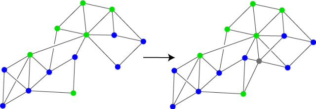
For the KNN algorithm, we will assume that we have a graph in which the vertices are endowed with labels, say blue and green as in the graph on the left in the Figure below. The goal of the algorithm is to choose a label/color for a new data point, which we will insert into the graph in some way, whether by calculating its vector distance to the existing vertices and connecting it to the closest ones, or by using connections that are given to us explicitly, such as the new vertex’s facebook friends. The new vertex is shown in grey in the graph on the right. We can calculate the distance from the new vertex to each of the labeled vertices, choose the K closest ones, and pick the most common label among these to apply to the new vertex. Note that if the graph has weighted edges then we will want to pick the K most “similar” vertices, i.e. the vertices in which the similarity scores to the new vertex are highest.

graphKNN

In the original version of KNN, we noted that this algorithm works by defining a distribution around the data set, closely related to the Voronoi cells that appeared in the Nearest Neighbors algorithm (the precursor to KNN). In the graph, there is no space “around” the data points, so there isn’t an explicit distribution defined by graph KNN. But hopefully, you’re comfortable by now, between looking at kernels and normalization, with the idea that there are many different possible spaces that the data set could be sitting in. When we turn a data set into a graph, we should think of it as still being in one of these, but we don’t know exactly which one. The space is hidden to us, kind of like a black box. We can think of the new points that we add to the graph as being sampled from this hidden space, where the distribution defined by graph KNN lives.

This is a slightly bigger problem with K-means, since the original K-means algorithm relies on calculating “centroids” which are outside the data set. In particular, since we don’t have a vector space that contains the data, we don’t have a notion of taking the average of a set of vertices. (We can’t add vertices together the way we can add vectors.) So for K-means, we will have to replace the centroids with a different notion. There are a number of possibilities, but the simplest is the following: Given a set of vertices in a graph, we will say that the radius of a vertex is the largest distance (or smallest similarity) to any other point in the set. The radius center of a set of vertices in the graph will be the vertex with smallest radius. So we can think of the radius center as being the vertex of the graph/data set that is closest to the hidden centroid in the hidden data space.

With this definition, we can translate K-means directly into the graph setting. We’ll start with K randomly selected vertices, then we’ll repeat the following two steps: First, for each vertex in the graph, associate the vertex to whichever of the selected vertices it is closest to. Second, make a list of the radius centers of each of the resulting sets of vertices. Then we’ll use this new list of radius centers as the selected vertices in the next step. As with vector K-means, this will give us a small number of vertices that are more or less evenly distributed throughout the graph. As with graph KNN, we can’t explicitly see the Voronoi cells produced at each step in graph K-means like we can in vector K-means. However, we can again think of these Voronoi cells as living in some unseen data space that contains the vertices of the graph.

Before I end this post, I want to point out one more thing: If we were to form a graph from a vector data set, using the Gaussian function to define the weights, then convert our similarity scores back to distances as described above, we would find that a lot of the distances had gotten bigger, possibly quite a bit bigger. This is because the distance that comes from the graph, which I’ll call the intrinsic distance, is defined by shortest paths within the graph, i.e. paths that stay “near the data points”. If we could see the underlying probability density function that defined the data set, then these paths would mostly stick to the dark parts of the probability cloud. On the other hand, distance in the original vector space, which I’ll call the extrinsic distance, is defined by shortest paths without restrictions, so these paths can take short cuts that the graph paths cannot.

graphdistanceIf the data set forms a very curved shape, as in the Figure to the left, then these types of distance could be off by quite a bit. In the Figure, the intrinsic distance between the two red vertices, indicated by the green path, is much longer than the extrinsic distance, which is indicated by the dotted blue line.

Since these two notions of distance can be so different, this begs the question: Which of them is better for understanding the data set? There is no good answer to this question, partially because both distances depend heavily on the way the data is normalized and a number of other factors. Thus both types of distance could be potentially quite bad. On the other hand, with the correct parameters and normalization, each type of distance will encode very different types of information about the data. In the Figure above, using only the extrinsic structure of the data set would make it hard to distinguish from a Gaussian blob. The intrinsic structure demonstrates the true complexity of the data set by indicating a number of different “fingers”. However, the intrinsic structure doesn’t tell you how these fingers sit with respect to each other in the data space. So ideally, it’s best to consider both the intrinsic and extrinsic structures of a data set by looking at both vector representations and graph representations of the data.

Posted in Uncategorized | 7 Comments

Intrinsic vs. Extrinsic Structure

At this point, I think it will be useful to introduce an idea from geometry that is very helpful in pure mathematics, and that I find helpful for understanding the geometry of data sets. This idea is difference between the intrinsic structure of an object (such as a data set) and its extrinsic structure. Have you ever gone into a building, walked down a number of different halls and through different rooms, and when you finally got to where you’re going and looked out the window, you realized that you had no idea which direction you were facing, or which side of the building you were actually on? The intrinsic structure of a building has to do with how the rooms, halls and staircases connect up to each other. The extrinsic structure is how these rooms, halls and staircases sit with respect to the outside world. So, while you’re inside the building you may be very aware of the intrinsic structure, but completely lose track of the extrinsic structure.

You can see a similar distinction with subway maps, such as the famous London tube map. This map records how the different tube stops connect to each other, but it distorts how the stops sit within the city. In other words, the coordinates on the tube map do not represent the physical/GPS coordinates of the different stops. But while you’re riding a subway, the physical coordinates of the different stops are much less important than the inter-connectivity of the stations. In other words, the intrinsic structure of the subway is more important (while you’re riding it) than the extrinsic structure. On the other hand, if you were walking through a city, you would be more interested in the extrinsic structure of the city since, for example, that would tell you the distance in miles (or kilometers) between you and your destination.

Data sets also have both intrinsic and extrinsic structure, though there isn’t a sharp line between where the intrinsic structure ends and the extrinsic structure begins. These are more intuitive terms than precise definitions. In the figure below, which shows three two-dimensional data sets, the set on the left has an intrinsic structure very similar to that of the middle data set: Both have two blobs of data points connected by a narrow neck of data points. However, in the data set on the left the narrow neck forms a roughly straight line. In the center, the tube curves around, so that the entire set roughly follows a circle.

inextrinsic

If you were somehow shrunk down so that you could walk around “inside” the data set and could only see nearby data points, you might think of the two blobs in each data set as rooms, and the narrow neck as a hallway. If you walked from one room to the other, you might not notice whether or not it was curving. So as in the building example, you would have a hard time telling the difference between the two sets from “inside” of them. Thus the difference between the two data sets is mostly a matter of intrinsic structure, rather than extrinsic structure.

On the other hand, the set on the right has a very similar extrinsic structure to the data set in the middle: Both sets roughly follow a circle, so from far away, we might not notice the difference. However the data set on the right consists of a single circular neck/hallway, without any blobs. Thus the intrinsic structures of the center data set and the right data set are very difference.

As we noted above, in real life, we will sometimes be more interested in intrinsic structure and sometimes we’ll be more interested in extrinsic structure. Similarly, we will sometimes be more interested in the intrinsic structure of data set and sometime in its extrinsic structure. More precisely, we will be interested in both, but will focus more on one or the other at different stages in the analysis. For example, a simple model fitting algorithm, such as regression, logistic regression or SVM, gives us a description of the extrinsic structure of the data set by giving us a best fit hyperplane or a decision boundary. However, these algorithms don’t tell us anything about the intrinsic structure. In some sense, these algorithms assume that the intrinsic structure is relatively simple and can lead to very inaccurate models if it isn’t. So ideally, we would want to understand the intrinsic structure of the data set before we apply such an algorithm.

More flexible algorithms, such as KNN, neural networks and decision trees, are able to adapt to the intrinsic structure of a data set, and thus produce a more accurate model. (Though each algorithm has parameters that affect how flexible it can be in adapting to different intrinsic structures.) Of course, they encode the intrinsic and extrinsic structure in a way that is essentially unreadable by humans. Somewhere in the middle is the mixture model algorithm: The output of this algorithm reflects the extrinsic structure of the data set, but in order to use a mixture model, you first need to choose the types of simple models that will make up the mixture. This boils down to deciding what intrinsic structure we want the final model/distribution to have. If that intrinsic structure matches the intrinsic structure of the data set then the final model will be reasonably accurate. So again, an approach like this will work better if you first spend some time trying to understand the intrinsic structure of the data.

The distinction between intrinsic and extrinsic structure is closely related to the difference between local and global structure: The local structure of something is the structure that you see when you zoom in very close, while the global structure is what you see when you look at it from far away. For example, the local structure of your shirt is a tangle of crisscrossing threads. Its global structure is a two-dimensional shape with four holes (one for your head, two for your arms and a big hole at the bottom for your waist.) The extrinsic structure of an object is essentially the same as its global structure. However, an object’s intrinsic structure isn’t the same as its local structure. Instead, it’s more or less what you get by combining all the local structures and fitting them together. So the intrinsic structure of your shirt is also two-dimensional with four holes, but the intrinsic structure doesn’t know whether the shirt is folded up, hanging, or crumpled in a pile. The intrinsic/extrinsic dichotomy is also closely related to the difference between geometry and topology, but that’ll have to wait for a later post.

Note that some data sets don’t have a natural extrinsic structure, or at least not one that makes sense. For example, consider how we would analyze a data set of books based on their subjects. We can all agree that two books about physics will be very similar, and a book about chemistry will be slightly less similar to either of the physics books. However, it’s not obvious whether a book on poetry would be closer to a physics book than a book on management would be. In other words, it is clear what the distances between nearby books should be (the local/intrinsic structure), but not what the distances between far away books should be (the global/extrinsic structure).

We could define an extrinsic structure on books, for example by counting how many times each word appears in each book, and defining vectors based on this word count. However, it is unlikely that the resulting vectors would accurately reflect the structure that we want. There are various ways to modify this structure, such as by combining synonyms, disambiguating different uses of the same word, but there is no canonical approach. In fact, when data analysts choose these more complicated structures, the goal is essentially to find an extrinsic structure that best reflects the (relatively) well defined intrinsic structure.

Another example of a data set with no extrinsic structure is a social network: The connections in the network (friends on Facebook, followers on twitter, etc.) define the nearby points, similar to a subway map. However, there generally won’t be a natural extrinsic structure. (I’ll go into more detail about graphs and networks in next week’s post.) As with the books example, there are different ways to impose an extrinsic structure on a data set of this form, but there isn’t a single best extrinsic structure.

The main way in which the intrinsic structure of a data set is usually explored in practice is by searching for clusters, or clumps of data points. There are a number of different ways in which clusters are defined, and a corresponding number of algorithms for finding them, some of which I’ll cover in upcoming posts. Clusters can be densely packed sets of data points surrounded by less dense parts of the data set. Or, they can be blobs of data points that are either separated from the rest of the data set or connected by relatively thin bottlenecks, as in the Figure above. As you can see, both of these descriptions are in terms of intrinsic properties of the data set.

Up until now, the posts on this blog have focused primarily on extrinsic structure, with the goal of building models/distributions. These algorithms mostly fall into the category of supervised learning or predictive analytics: Building models that answer specific questions about data, by using a training data set for which the answer is already known. The next few posts will focus on unsupervised learning or descriptive analytics – methods whose goal is not to build a model or answer a specific question, but rather to better understand the structure as a preliminary step before building a model. Finding clusters is one of the main problems in this area and will be the focus of the upcoming posts. Throughout these posts on unsupervised learning, the intrinsic structure will be an underlying theme.

Posted in Unsupervised learning | 11 Comments

K-means

The subject of this weeks post is probably one of the most polarizing algorithms in the data world: It seems that most experts either swear by K-means or absolutely hate it. The difference of opinion boils down to one of the fundamental questions in data analysis: Is it more important for algorithms to be based on a firm theoretical foundation, to work in a wide range of settings and to have provable accuracy guarantees, or is it more important for algorithms to be fast, simple and to work pretty well in the situations where you need them? K-means definitely fits the latter of these descriptions, so as a mathematician I was initially one of the haters. However, I’ve recently come to terms with K-means and, as I’ll describe below, my current view is that K-means can actually be very effective when used in certain ways that it wasn’t necessarily designed for.

The basic idea behind the K-means algorithm is essentially a very restricted mixture model: We select a number K and create a mixture model with K simple models, each of which is a Gaussian blob. However, unlike in general mixture models where we allow each Gaussian blob to be a different size and to be stretched in different directions, as on the left in the Figure below, K-means requires that each blob be a fixed size and completely symmetrical (so no stretching), as on the right. You can imagine the sorts of complaints that this would face: Most data sets aren’t made up of symmetric Gaussian blobs of the same size. In fact, unless you miraculously scale your data perfectly, you’re pretty much guaranteed that it won’t be.

kmeansvsmixture

However, if the data is made up of well separated clumps, even if those clumps aren’t perfectly round and all the same size, K-means will often (though not always) be able to find them. (These “clumps” are often called clusters, but I’m going to leave a general discussion of clusters for a later post.)

So when you use K-means as a substitute for a mixture, you’re taking a risk that the final answer will be pretty lousy. The trade-off for taking this risk is that the algorithm is much much faster than training a general Gaussian mixture model. K-means still follows the two-step Expectation Maximization outline of a mixture model, but each step has been optimized to the point that you can barely tell where it came from.

First, note that since each of the Gaussian blobs in our mixture model is the same exact size and shape, the only information we need to record about each blob is its center. So our “model” will consist of K points spread throughout the data space. Recall that the first step in the Expectation Maximization algorithm is to assign each data point to one of the simple models (i.e. one of the Gaussian blobs) based on which one assigns it the highest probability. The probability that one of the Gaussian blobs assigns to a given point goes down as we get farther away, and all the blobs are identical. Thus each data point will simply be assigned to whichever center point is closest to it. That’s step one.

To understand what’s happening here, consider the data points shown in black in the figure below. We have a smaller number of blob centers, shown in blue. When we assign each data point to its closest blob center, this should remind you of the nearest neighbor algorithm. In the post on nearest neighbors, we noted that the set of all points that were closer to a given data point than to any other data point form what’s called a Voronoi cell around each data point. For K-means, we’ll get something very similar, except that the Voronoi cells are around the blob centers rather than data points. The Voronoi cells are outlined in blue on the left of the Figure. Each data point will be in the Voronoi cell around one of the blob centers, and we will assign it to this blob.

kmeans

For step two, we need to adjust each of the Gaussian blobs to maximize the probability of all the points assigned to it. In general mixture models, this involves repeatedly adjusting the parameters using the notion of a gradient. However, if we’re not allowed to stretch the Gaussian blobs then we can immediately figure out exactly where to put them: We’ll want the point where we get the smallest possible number when we add up the distances squared from the center point to each of the data points assigned to it, i.e. all the data points in a given Voronoi cell.

In other words, if we take all the data points in one of the Voronoi cells and think of these data points as heavy balls connected by bars that hold them in place, we will want to move the center point of the Gaussian blob to the center of gravity of this structure. This center of gravity is called the centroid. As it turns out, the center of gravity is straightforward to calculate – you just take the average of the data values in each dimension. So for step two we move each Gaussian blob so that it is centered at the centroid of the points that were assigned to it in the first step. These centroids are shown in red in the center Figure.

Then we repeat – We go back through the data points and reassign them based on the new center points of the Gaussian blobs. (In other words, we form new Voronoi cells around the red points.) Then we calculate the centroids of each of the new subsets of data points (the points in each new Voronoi cell), then reassign the data points and so on.

After we repeat these two steps enough times, we’ll get to a point where step one assigns the data points to centers in exactly the same ways as the previous time that we ran it. So there won’t be a need to calculate the centroids again (since we’ll just get the ones we already have) and the K-means algorithm will terminate. In the Figure above, these would be something like the blue points shown on the right. It’s also common to run through the two steps a fixed number of times, rather than running it all the way to the point where the centroids stop moving, hoping that this will give you a reasonably good approximation of the final answer.

If the data happens to be separated into a certain number of well defined, tightly packed clumps/clusters and you happen to select K to be equal to this number then there’s a reasonable chance that the blob centers that the algorithm ends with will be the centers of these clumps/clusters. As always, we usually won’t be able to directly “see” whether or not this is the case, since most data has more than three dimensions. However, there are a number of measures that have been devised to measure how good K-means has done.

The most common one is to compare the distances between the final center points to the average distance from each data point to the center that it is assigned to. If the first of these numbers is much higher than the second then that means that K-means has found well separated clusters. Since the quality of the final answer depends heavily on picking the right value of K, this is often used to decide which K to use: Simply run K-means with different values of K and choose the one in which the difference between the two numbers is as large as possible.

Of course, this doesn’t solve the problem of what to do when our data set is not composed of a small number of well separated clumps. One of the main criticisms of K-means is that many (perhaps most) interesting data sets tend to have more complicated structures, so it would be naive to try using K-means on them. But like I said at the beginning of this post, I’ve now come to like K-means, nonetheless, by looking at it from a different perspective. In particular, I want to suggest using K-means for an off-label usage very similar to a technique from signal processing called vector quantization. This use of K-means has been suggested by others in the past, but doesn’t seem to be widespread. (It seems to be better known within the signal processing community, since that’s where the idea of vector quantization is well understood, but not as much within machine learning and data mining.)

Notice that the data set shown in the Figure above is not made up of a small number of round Gaussian blobs. In fact, it isn’t even made up of stretched Gaussian blobs, since one of clusters/clumps of points forms a curved shape. But you can see that the final blob centers found by K-means still reflect the structure of the data set, just in a more subtle way: We end up with three blob centers within the round cluster in the lower half of the data set and the rest of the blob centers forming an arc that follows the curved cluster.

To understand why this happens, note that each step in the K-means algorithm reduces the average distance squared from the data points to the blob centers. In other words, we can think of K-means as trying to place the blob centers so that each data point is as close as possible to some blob center. This has the effect of spreading the blob centers evenly around the data set, so the “shape” of the set of blob centers will be very similar to the overall shape of the data set.

So the blob centers found by K-means are very similar to a random sample of the original data set. However, there are two important differences: First, unlike a random sample, the blob centers are not in the original data set. One slight modification would be to take a sample of the original data set by choosing the data point closest to each blob center. Second, the blob centers are not random (though they do depend on the initial choice of centers, which are often chosen randomly.)

The blob centers have two important advantages over the original data: First, there are fewer of them, allowing one to run more sophisticated algorithms in a reasonable amount of time. Since K-means on its own is very fast, this would be a good trade-off. Second, the set of center points are less random than the original data set. In data analysis it’s common to think of randomness as being a good thing: We want random samples of our data to make sure it’s evenly distributed, and of course the field of Statistics is devoted to understanding all the facets of randomness. However, from geometric perspective the problem with random samples is that by their nature, they contain large gaps that can be mistaken for geometric features. This is a fundamental principle of randomness, and in fact you should be suspicious of any “random sample” that does not have both many large gaps between points and many points that are very close together.

One idea that has come out of numerical analysis (a field within mathematics) is that a homogeneous sample is often better than a random sample for large scale simulations. In other words, it’s often good to have data points that are “evenly” spread out within the probability distribution, but with more concentration in the darker parts of the density function. If we choose the number K of blob centers to be relatively large (though still much smaller than the number of data points) then the final set of points that K-means gives us should have this property: It will be relatively evenly spread out, but still have the rough shape of the original data set. So the set of blob centers can be used for the types of more computationally expensive forms of exploratory data analysis (which we’ll discuss in upcoming posts) whose goal is to understand the overall structure of the data well enough to decide what types of models and what types of kernels to use.

Another possible use for the blob centers is to use them as the anchor points for a Gaussian kernel. Recall from last week’s post that a Gaussian kernel is defined by choosing a small number of points in the data space. We want these points to be fairly evenly spread out, but close to the original data set. If we use all the original data points for make the Gaussian kernel then we are more or less guaranteed that our model will suffer from over-fitting. Thus the blob centers will often be a much better option for defining a Gaussian kernel.

So, that’s my take in K-means: If you think of it as a clustering algorithm, or as a substitute for a Gaussian mixture model, then you may be asking for trouble. However, I think that K-means has a great deal of unexplored potential as a quick way to reduce the data set to a relatively small number of representatives for us in exploratory data analysis or forming a Gaussian kernel.

Posted in Modeling, Unsupervised learning | 8 Comments

Gaussian kernels

In order to give a proper introduction to Gaussian kernels, this week’s post is going to start out a little bit more abstract than usual. This level of abstraction isn’t strictly necessary to understand how Gaussian kernels work, but the abstract perspective can be extremely useful as a source of intuition when trying to understand probability distributions in general. So here’s the deal: I’ll try to build up the abstraction slowly, but if you ever get hopelessly lost, or just can’t take it any more, you can skip down to the heading that says “The practical part” in bold – That’s where I’ll switch to a more concrete description of the Gaussian kernel algorithm. Also, if you’re still having trouble, don’t worry too much – Most of the later posts on this blog won’t require that you understand Gaussian kernels, so you can just wait for next week’s post (or skip to it if you’re reading this later on).

Recall that a kernel is a way of placing a data space into a higher dimensional vector space so that the intersections of the data space with hyperplanes in the higher dimensional space determine more complicated, curved decision boundaries in the data space. The main example that we looked at was the kernel that sends a two-dimensional data space to a five-dimensional space by sending each point with coordinates (x,y) to the five-dimensional point with coordinates (x,y,x^2, y^2, x^y). If we wanted to give ourselves even more flexibility, we could pick an even higher dimensional kernel, for example by sending the point (x,y) to the point (x,y,x^2, y^2, x^y, x^3, x^2y, xy^2, y^3) in a nine-dimensional space.

This week, we’re going to go beyond higher dimensional vector spaces to infinite-dimensional vector spaces. You can see how the nine-dimensional kernel above is an extension of the five-dimensional kernel – we’ve essentially just tacked on four more dimensions at the end. If we keep tacking on more dimensions in this way, we’ll get higher and higher dimensional kernels. If we were to keep doing this “forever”, we would end up with infinitely many dimensions. Note that we can only do this in the abstract. Computers can only deal with finite things, so they can’t store and process computations in infinite dimensional vector spaces. But we’ll pretend for a minute that we can, just to see what happens. Then we’ll translate things back into the finite world.

In this hypothetical infinite-dimensional vector space, we can add vectors the same way that we do with regular vectors, by just adding corresponding coordinates. However, in this case, we have to add infinitely coordinates. Similarly, we can multiply by scalars, by multiplying each of the (infinitely many) coordinates by a given number. We’ll define the infinite polynomial kernel by sending each point (x,y) to the infinite vector (x,y,x^2, y^2, x^y, x^3, x^2y, xy^2, y^3, x^4,\ldots). In particular, every monomial in the variables x and y, such as x^7y^42 or y^{10,000} will appear in one of the entries of this kernel, possibly very far down the sequence.

In order to get back to the computational world, we can recover our original five-dimensional kernel by just forgetting all but the first five of the entries. In fact, the original five-dimensional space is contained in this infinite dimensional space. (The original five-dimensional kernel is what we get by projecting the infinite polynomial kernel into this five-dimensional space.)

Now take a deep breath, because we’re going to take this one step further. Consider, for a moment, what a vector is. If you ever took a mathematical linear algebra class, you may remember that vectors are officially defined in terms of their addition and multiplication properties. But I’m going to temporarily ignore that (with apologies to any mathematicians who are reading this.) In the computing world, we usually think of a vector as being a list of numbers. If you’ve read this far, you may be willing to let that list be infinite. But I want you to think of a vector as being a collection of numbers in which each number is assigned to a particular thing. For example, each number in our usual type of vector is assigned to one of the coordinates/features. In one of our infinite vectors, each number is assigned to a spot in our infinitely long list.

But how about this: What would happen if we defined a vector by assigning a number to each point in our (finite dimensional) data space? Such a vector doesn’t pick out a single point in the data space; rather, once you pick this vector, if you point to any point in the data space, the vector tells you a number. Well, actually, we already have a name for that: Something that assigns a number to each point in the data space is a function. In fact, we’ve been looking at functions a lot on this blog, in the form of density functions that define probability distributions. But the point is, we can think of these density functions as vectors in an infinite-dimensional vector space.

How can a function be a vector? Well, we can add two functions by just adding their values at each point. This was the first scheme we discussed for combining distributions in last week’s post on mixture models. The density functions for two vectors (Gaussian blobs) and the result of adding them are shown in the Figure below. We can multiply a function by a number in a similar way,  which would result in making the overall density lighter or darker. In fact, these are both operations that you’ve probably had lots of practice with in algebra class and calculus. So we’re not doing anything new yet, we’re just thinking about things in a different way.

addvectors

The next step is to define a kernel from our original data space into this infintie dimensional space, and here we have a lot of choices. One of the most common choices is the Gaussian blob function which we’ve seen a few times in past posts. For this kernel, we’ll choose a standard size for the Gaussian blobs, i.e. a fixed value for the deviation \sigma. Then we’ll send each data point to the Gaussian function centered at that point. Remember we’re thinking of each of these functions as a vector, so this kernel does what all kernels do: It places each point in our original data space into a higher (in fact, infinite) dimensional vector space.

Now, here’s the problem: In order to bring things back to the computational world, we need to pick out a finite dimensional vector space sitting in this infinite dimensional vector space and “project” the infinite dimensional space into the finite dimensional subspace. We’ll choose a finite-dimensional space by choosing a (finite) number of points in the data space, then taking the vector space spanned by the Gaussian blobs centered at those point. This is the equivalent of the vectors pace defined by the first five coordinates of the infinite polynomial kernel, as above.  The choice of these points is important, but we’ll return to that later. For now, the question is how do we project?

For finite dimensional vectors, the most common way to define a projection is by using the dot product: This is the number that we get by multiplying corresponding coordinates of two vectors, then adding them all together. So, for example the dot product of the three-dimensional vectors (1,2,3) and (2,.5,4) is 1 \cdot 2 + 2 \cdot .5 + 3 \cdot 4 = 15.

We could do something similar with functions, by multiplying the values that they take on corresponding points in the data set. (In other words, we multiply the two functions together.) But we can’t then add all these numbers together because there are infinitely many of them. Instead, we will take an integral! (Note that I’m glossing over a ton of details here, and I again apologize to any mathematicians who are reading this.) The nice thing here is that if we multiply two Gaussian functions and integrate, the number is equal to a Gaussian function of the distance between the center points. (Though the new Gaussian function will have a different deviation value.)

In other words, the Gaussian kernel transforms the dot product in the infinite dimensional space into the Gaussian function of the distance between points in the data space: If two points in the data space are nearby then the angle between the vectors that represent them in the kernel space will be small. If the points are far apart then the corresponding vectors will be close to “perpendicular”.

The practical part

So, lets review what we have so far: To define an N-dimensional Gaussian kernel, we first choose N points in the data space. We can then calculate the kernel coordinates of any point in the data space by calculating its distance to each of these chosen data points and taking the Gaussian function of the distances.

To better understand how this kernel works, lets figure out what the intersection of a hyperplane with the data space looks like. (This is what is done with kernels most of the time, anyway.) Recall that a plane is defined by an equation of the form a_1 x_1 + a_2 x_2 + \cdots + a_N x_N = b where (x_1,\ldots,x_N) are the coordinates of the point (in the higher dimensional kernel space) and a_1,\ldots,a_N are parameters that define the hyperplane. If we’re using a Gaussian kernel then, thanks to our version of the dot product, the values (x_1,\ldots,x_N) measure the distances to our N chosen points. The decision boundary is thus the set of points for which the Gaussian function of the distances to these N points satisfy this equation.

That’s still pretty hard to unpack, so lets look at an example where each of the values a_1,\ldots,a_K is either 1 or -1. Then near each data point with label a_i = 1, the value x_i will be very close to 1, while the other values x_j will be small, so the sum a_1 x_1 + a_2 x_2 + \cdots + a_N x_N will be positive. Similarly, near a point with a_i = -1, the sum will be negative. Thus if b = 0 then the decision boundary will separate the positive points from the negative points. In fact, it will carve out a region reminiscent of the Gaussian balls that define the kernel. One example is indicated on the left in the Figure below, where the colors indicate whether the coefficients are positive or negative. As you can see, the result looks something like a smooth version of the nearest neighbors algorithm.

gaussianclassif

If we adjust the parameters a_1,\ldots,a_K, this has the effect of changing the sizes of the Gaussian balls around the points, and thus moves the decision boundary towards or away from them, as on the right of the Figure. If a coefficient switches from positive to negative, the decision boundary will move from one side of a point to the other. If we have a labeled data set (which may or may not coincide with the N points that define the Gaussian kernel) then training a linear classification algorithm (such as SVM or logistic regression) in the kernel space corresponds to moving this decision boundary around, within the constraints defined above, to maximize how many of the data points are on the correct side.

So, this gives us more flexibility for choosing the decision boundary (or, at least, a different kind of flexibility) but the final result will be very dependent on the N vectors that we choose. If we choose too many (such as if we let the N points that define the kernel be the same as the data points) then we will risk overfitting, similar to how the nearest neighbor algorithm tends to lead to overfitting. What we really want is a small number of points that are evenly distributed throughout the set, ideally such that each of the N points is close to mostly points in the same class.

Finding such a collection of points is a very different problem from what we’ve been focusing on in the posts so far on this blog, and falls under the category of unsupervised learning/descriptive analytics. (In the context of kernels, it can also be thought of as feature selection/engineering.) In the next few posts, we’ll switch gears and start to explore ideas along these lines.

Posted in Normalization/Kernels | 13 Comments

Mixture models

In the last few posts, we’ve been looking at algorithms that combine a number of simple models/distributions to form a single more complex and sophisticated model. With both neural networks and decision trees/random forests, we were interested in the classification problem: given a set of data points in different categories/classes, predict the class of a new data point. For today’s post on mixture models, we’ll focus on the modeling problem, i.e. determining a single distribution that describes the structure of the overall data set. One version of this that we looked at early on was regression, in which we tried to predict the value of one dimension/feature of a new data point based on the values of its other dimensions. A mixture model, however, is designed to produce descriptions of more complicated data sets, for which you wouldn’t necessarily expect to be able to predict values in the way that you do with regression.

The idea behind a mixture model is that the underlying distribution for a data set may have different types of local structure in different parts of the data space, as in the Figure below. For example, if different data points are the result of different phenomena (for example, different species in a data set of animals, or different demographics of customers in a marketing data set) then we would expect each phenomenon to be described by a different model. We can get a model for the entire data set by combining the models for all the species/demographics/etc.

mixed

We’ve now seen a number of different models that we might want to combine. There’s the linear regression model, where we choose a line/plane/hyperplane and define the density/probability of a point to be the Gaussian function of the distance from the point to the line/plane hyperplane. In other words, the probability is highest right on the line/plane/hyperplane and gets closer to zero as you get farther away. Such a distribution is shown cutting diagonally across the Figure above. We later saw the logistic distribution, where we again choose a line/plane/hyperplane, but this time the density/probability gets closer to one as you get farther away on one side of the line/plane/hyperplane, but gets closer to zero as you get farther away on the other side.

A third type of model/distribution that we saw, but I didn’t describe in quite as much detail, is the Gaussian blob.  The basic Gaussian blob is what you get by choosing a point in your data space and defining the densisty/probability of the distribution to be the Gaussian function of the distance from the point. So, the density is highest right at the point, then gets closer to zero as you get farther away. A Gaussian blob is similar to the regression distribution, except that it’s based on a point rather than a line/plane/hyperplane. You can then create more sophisticated Gaussian blobs by stretching this blob in different directions. The Figure above shows two Gaussian blobs, on on either side of the regression distribution. This was the distribution that was implicit in the PCA algorithm from a few posts back.

We can also take any one of these three models and apply a kernel to it. In fact, we could apply a different kernel to each individual simple distribution in a mixture model before mixing them, and/or we could apply a single kernel to the entire mixture at the end of the process. However, lets not make things too complicated for now.

The next step is to combine these different distributions,  and there are two basic ways we can do it. Recall that each simple distribution defines a probability/density value for each point in the data space. We need to use these different density values at each given point to decide what its probability/density in the mixture model should be. The first possible way is to add together the values the densities of the simple distributions. This is roughly what we would get if we printed each distribution on a sheet of clear plastic (like an old-fashioned overhead projector slide) and then stacked them all on top of each other: The overlaps between the densities add together to give us the overall density.

Another way to think about this is to think of the simple distributions as piles of sand. From this perspective, a regression distribution looks like a long, narrow ridge, something like what a gopher makes when it digs a tunnel near the surface of your lawn. A logistic function will look like the edge of a plateau – very flat on either side, but with a steep wall going up from the lower side to the higher side. A Gaussian blob will look like a single mountain peak, though its base may be an ellipse rather than a perfect circle. When we add the distributions, we pile them on top of each other like the middle picture on the Figure below, where we combine the two Gaussian distributions shown at the top of the Figure.

mixedcombining

The second possibility is to take the maximum density of all the simple models. To picture this, we’ll again think of each simple distribution as a mountain whose height is determined by its density. To combine by the maximum method, we’ll place them all in a mountain range, as if they were holograms that can pass through each other rather than piling on each other, as in the bottom picture in the Figure above. With this method, each simple distribution will peak above the others in certain places, but will be below other distributions in other spots. The density of the mixture distribution will be the overall height of this range at any given point.

These two ways of combining distributions seem very different in how they treat the overlaps between distributions. The addition method makes more sense from a theoretical perspective: If each distribution is a separate phenomenon that is producing data points, then each simple distribution has some chance of putting a data point in any given spot, so the probability that we’ll get a new data point in that spot should be the sum of all the simple distributions. However, (as we’ll see below) the maximum method is much easier to deal with in practice because when we look at a single point, we can essentially ignore the effects of all but one of the distributions. Luckily, if the distributions that we’re combining are reasonably far from each other then their density values along the overlaps will be low enough that there often is not a huge difference between the two methods. So, it is common stick with the maximum method for ease of computation.

So, now that we know how to combine our simple distributions, we have two problems: The first is to decide how many simple distributions to combine and what types to pick. If you happen to already know something about the data set, such as a theoretical framework or some other form of domain knowledge, then this might be used to select the types of simple models. Otherwise, selecting models can be a difficult and subtle problem, similar to the problem of choosing the appropriate kernel for a data set. This problem generally falls under the category of unsupervised learning (the machine learning term) or descriptive analytics (the data mining term). In a few weeks, I’m going to switch gears and start covering unsupervised learning/descriptive analytics, but for now lets assume that we have somehow managed to choose the types of simple distributions we want to combine in our model.

The second problem is to choose the parameters for each simple distribution. Recall that the parameters for a regression or logistic distribution determine the line/plane/hyperplane that the distribution is based around. For a Gaussian blob, the parameters determine what directions the blob will be stretched in, and by how much. The set of parameters for the mixture model is the union of all these parameters for the different simple models. Moreover, if we run any of the distributions through a kernel, then that will give us even more parameters for the mixture model.

Recall that in the post on regression, we saw how we can fit a single model to a data set by trying to maximize the values of all the data points with respect to a probability density function. Specifically, we chose the parameters that give us the largest number when we multiply together the density values of all the points in the data set, giving us the distribution that is “most likely” to have produced the data set. This is what we called maximum likelihood estimation.

In practice, we often can’t calculate this value for every single possible distribution, so we’ll use what’s called gradient descent: We start with a randomly chosen distribution, then figure out what direction to nudge the parameters in to improve the probability score a little. (The gradient is what tells us how to do this.) Then we make these changes to the parameters and again figure out how to further nudge the new parameters of this new distribution, and so on. The process stops when we can no longer make small adjustments that improve the score. We saw this approach in the post on logistic regression, and it is very similar to the basic method for training neural networks.

We’ll select the parameters for a mixture model by a closely related algorithm called Expectation Maximization. We start by choosing initial parameters for each or our simple distributions. We can choose random parameters, though if we have another way of getting an initial estimate (such as domain knowledge) this will often give is a better final answer. Then we want to start adjusting these parameters. However, when we determine how to adjust the parameters, we don’t want to use all the data points for each simple distribution. From a theoretical perspective, most of the data points will have come from other simple distributions in the mixture, so each simple distribution should only care about the data points that it is likely to have produced. From a practical perspective, if we use all the data points for each distribution, we’ll probably end up with all the simple distributions having the same parameters, rather than having them nicely spread throughout the data set.

So, how do we determine which distribution was mostly likely to have produced each data point? This choice is an example of what’s called a latent variable in statistics: The value is not part of the initial data set and is not part of the final answer, but we need to choose a value in order to determine the final answer. It’s sort of like the middle layers of neurons in a neural network, playing a major behind-the-scenes role. In fact, these middle neurons were essentially how neural networks solve the equivalent problem, by having the middle neurons decide how to adjust the parameters of each earlier neuron when looking at a new data point.

But for mixture models, we’ll use a much simpler method than what we saw with neural networks: For each point in our data set, we will calculate its density/probability in each of the simple models with our initial parameters, then assign it to the simple distribution in which it scores the highest. The Figure below shows how the we divide points in the data space between the three simple distributions in the mixture model from the beginning of the post. Points in the red and blue regions get assigned to the Gaussian blobs, while points in the green region go to the linear regression distribution.  Essentially, this method treats the data points as if they were produced by combining the simple distributions using the maximum method, since it only allows each data point to be attributed to one distribution. This is the first step in the Expectation Maximization algorithm.

mixedregions

For the second step, after a collection of data points has been assigned to each distribution, we have each simple model pretend that this collection of data points was the entire data set, and adjust its parameters accordingly. In other words, we figure out how to make each simple distribution better fit the points that are assigned to it  (i.e. with gradient descent) and make these adjustments.

Once we’ve done this for each of the simple distributions, we note that the way we divided the data set between the different simple distributions may no longer be up to date: Some of the distributions may have shifted so that a data point now gets a better probability/density value in a different simple distribution. So, we return to step one and re-divide the data points. Then we re-adjust the distributions accordingly, and so on. At some point, the way we divide the points between the simple distributions will become consistent and we will run out of ways to improve the parameters. At that point, we’ll stop and use whatever collection of parameters we have for the different simple distributions to define the overall distribution.

As with any of these algorithms, we should consider its benefits and limitations. First, note that unlike regression and classification algorithms, mixture models do not explicitly predict anything about new data points. Instead, they give a nice description of data sets with more complicated structure. In particular, because they have at their core a small number of relatively simple models/distributions, they can produce a description of a data set that could potentially be interpreted by a human. In many situations, this will be more valuable than a black box classification or regression algorithm.

There are two major technical limitations: First, the initial values that we choose for the parameters can make a big difference in the final result. Since each step in the expectation maximization procedure only makes incremental changes, it can get stuck in configurations in which there is no small change that will improve things, but there are are larger changes that would produce a much more accurate model. Think of a ball rolling down a hill that gets caught in a small divot half way down. In order to get it to roll the rest of the way down, you have to push it up slightly first. However, the Expectation Maximization algorithm has no procedure for nudging a set or parameters out of analogous divots.

The second limitation is that the quality of the final model/distribution is very dependent on the choice of the number and types of the simple distributions in the mixture. As I mentioned above, if you don’t have a good external reason to choose a particular collection of simple models, this can be very difficult to determine. This is one of the motivations for unsupervised learning/descriptive analytics, which I’ll begin discussing in two weeks, after a brief digression next week into Gaussian kernels.

Posted in Modeling | 7 Comments

Random forests

In last week’s post, I described a classification algorithm called a decision tree that defines a model/distribution for a data set by cutting the data space along vertical and horizontal hyperplanes (or lines in the two-dimensional example that we looked at.) In practice, decision trees are rarely used on their own – It’s much more common to combine them in an algorithm called a random forest. The word forest comes from the fact that the algorithm combines a large number of (decision) trees. In this post, I’ll explain how this algorithm works and how, exactly, random forests are random.

Continue reading

Posted in Classification | 9 Comments

Decision Trees

In the last few posts, we explored how neural networks combine basic classification schemes with relatively simple distributions, such as logistic distributions with line/plane/hyperplane decision boundaries, into much more complex and flexible distributions. In the next few posts, I plan to discuss other ways of doing this, starting this week with decision trees. These are a general framework that can be used for regression (predicting the value of one feature/dimension based on the values of all the others) or for classification (predicting the class of a new data point from a finite set of possibilities). But to keep things simple, I will focus on using them for classification in this post and the next. Continue reading

Posted in Classification | 5 Comments