Neural Networks 3: Training

Note: I’ve started announcing new posts on twitter (@jejomath) for anyone who wants updates when new posts appear.

In the last two posts, I described how a single neuron in a neural network encodes a single, usually simple, classifier algorithm, then how multiple neurons can be linked together to combine the models from these classifiers into geometrically more complex shapes. In particular, the second of these posts explained the evaluation phase of a general neural network. In this week’s post, I’ll explain how our understanding of the evaluation phase can be used to explain the training phase of the a general network, through an algorithm called back propagation.

Continue reading

Posted in Classification | 5 Comments

Neural Networks 2: Evaluation

In last week’s post, I introduced the Artificial Neural Network (ANN) algorithm by explaining how a single neuron in a neural network behaves. Essentially, we can think of a neuron as a classification algorithm with a number of inputs that correspond to the coordinates of data points and a single output that corresponds to the neuron’s prediction of the probability that the data point is in class 1, vs. class 0. I had originally planned to write a single second post about how things work when you connect neurons together, but after I started writing it, I decided to write separate posts about the training and evaluation phases of larger networks. As I explained last time, we need to understand the evaluation phase of a neural network before we can understand the training phase, so this week I’ll cover evaluation.

Continue reading

Posted in Classification | 12 Comments

Neural Networks 1: The neuron

In the next two posts, I plan to introduce the classification algorithm called an Artificial Neural Network (ANN). As the name suggests, this algorithm is meant to mimic the networks of neurons that make up our brains. ANNs are one of the classic tools of artificial intelligence and were initially defined and developed based entirely on the biological model. However, it was discovered early on that they also have a very simple geometric interpretation that fits nicely into the general framework I’ve outlined so far on this blog. In this week’s post, I’ll describe how a single “neuron” in an artificial neural network functions, then next week I’ll explain how they can be combined to form models with very sophisticated geometric structures.

Continue reading

Posted in Classification | 20 Comments

Multi-class classification

If you paid really close attention to my last few posts, you might have noticed that I’ve been cheating slightly. (But if you didn’t notice, don’t worry – it was a subtle cheat.) When I introduced the problem of classification, the main example was choosing a restaurant to recommend to someone. So, most likely we were selecting a restaurant from a fairly long list – half a dozen to perhaps a few hundred depending on where you live. This is called multi-class classification (not to be confused with multi-label classification). However, when I described SVM and logistic regression algorithms, I only every looked at two classes, which would mean selecting from between two different restaurants. This is called binary classification. There’s a good reason why I did this – binary classification algorithms are much easier to come by than multi-class algorithms. In fact, there are relatively few algorithms specifically for multi-class classification. As it turns out, it is possible to apply a binary classifier repeatedly and combine the results to get a multi-class classification, and this is the much more common procedure. In this post, I will discuss a few different ways of doing this.

The process for turning a binary classifier into a multi-class classifier is kind of like a game of twenty questions. However, rather than being allowed to ask any yes/no question, you can only ask questions of the form “Is this data point more likely to be in class A or in class B?” This is a problem because if the data point isn’t in either of class A or class B, then you will still get an answer – it just may be meaningless.

So for example, one scheme you might try is to run your binary classifier for every possible pair of classes and treat it as an election – whichever class gets the most votes wins. If you have three classes of data (red, blue and green) you would train one binary classifier for each pair of classes: 1) red vs. blue, 2) blue vs.green and 3) red vs. green. If you use a linear classifier like SVM or logistic regression, then this will determine three different lines/planes/hyperplanes (depending on the dimension of the data). We will call these lines/planes/hyperplanes the decision boundaries.

When new data point comes in, you check which side of each decision boundary it is on and see which class is most popular: If a new data point is on the green side of both the red vs. green and the blue vs. green hyperplanes then you classify it as green. In this case, the red vs. blue classifier is meaningless, but that’s OK because we ignore that one anyway. If we use a non-linear classifier or run our linear classifier through a kernel then the decision boundaries will be curved shapes rather than flat lines/planes/hyperplanes, but we can combine them the same way.

This scheme is called All vs. All (AVA). The problem is that there will usually be regions in the vector space of all data points in which the three different classifiers will produce a three-way tie. A good way to think about this is to visualize the two-dimensional case with three classes (such as our red, green and blue). An example is shown on the left in the Figure below. The grey region in the figure is the problematic area, where any data point would be on the red side of the red vs. blue line, on the blue side of the blue vs. green line and on the green side of the red vs. green line. This grey region won’t exist if the three lines meet at a single point, but that is unlikely to happen. But because the three instances of the binary classifier are independent, and all are affected by noise, there is bound to be some grey region.

multiAVA

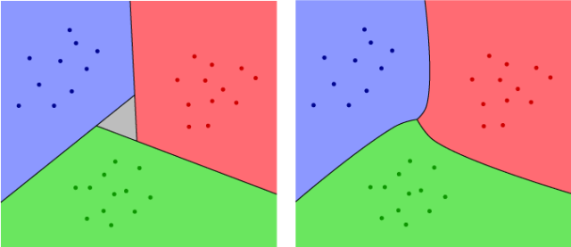
One way to get rid of the grey region is to use a classifier that includes a measure of confidence. For example, logistic regression doesn’t just give us a decision boundary that separates the two classes – it gives us a probability density function, which was represented in my earlier post as a slow transition from green to blue. The shade of green or blue at any given point can be thought of as indicating how confident the algorithm is that a given point is in one class or the other. So, rather than just adding the number of votes for each class, we can add up the confidence values. Since these can be any values, rather then just ones and zeros, it will be much less likely to get a tie. The resulting algorithm will give us an answer at every point except for the points in the three curves where we switch from one color to another. In our red/green/blue example, this will look like the right side of the Figure above. (The pictures are hand drawn, so they are not 100% accurate, but they should give you the basic idea.)

Another popular scheme is to set up for each class a classifier that compares it to all the other classes at once. For our red, green and blue classes, we would train one classifier for each of: 1) red vs. (green or blue), 2) green vs. (red or blue) and 3) blue vs. (red or green). In other words, the first classifier would predict whether a given point is more likely to be in the red class, or in one of the blue or green classes, and similarly for the second and third classifier. We then choose a class for any new data point based on whichever class wins its own election. This scheme is call One vs. All (OVA).

With this scheme, there are two possible things that can go wrong: For a new data point, there may be two or more classes that win their own election (i.e. are determined to be more likely than the rest). Or, there may be no data points for which an individual class wins an election. You can get a rough idea of this from the left side of the Figure below. The grey regions on the outside are the areas where two different classes win their own elections. The grey triangle in the middle is where no class wins. This problem can again be minimized by using a classifier that includes a confidence value, as indicated on the right of the figure.

multiOVA

From the picture, it looks like there isn’t a big difference between the OVA and AVA results, particularly when a confidence value is included. All the methods certainly agree in the regions closest to the different classes of data, which is what we would expect, since there is an obvious answer in these areas. They mostly disagree in the regions between the data sets, where we wouldn’t expect as many new data points to appear. In particular, if the data is determined by well separated probability distributions then the different methods will usually give us the same answer, since most of the new data points will fall near the center of the appropriate class and away from the decision boundaries. However, if the models defined by the individual classifiers are inaccurate or if the different classes of data points are not well separated, AVA and OVA may give you very different results, and which one works better will depend on the situation.

A third scheme for combining binary classifiers uses something more like the usual strategy for a twenty questions game. The idea is to start with very general questions and then slowly narrow down the results. For example, if someone is thinking of a number between 1 and 100 and you want to figure out what it is with twenty yes/no questions, your first question souldn’t be “Is the number 1?”. Instead, you would ask whether or not the number was greater than 50. If the answer is no, then you would ask whether or not the number is greater than 25, and so on. In other words, you try to cut the possibilities in half with each question.

We can do the same thing with binary classifiers: If we have a large number of classes, we can divide them into two sets of classes, say A and B. Then we can divide the classes in A into two smaller sets of classes, divide B into two smaller sets of classes and so on. To run our multi-class classification, we would first train a binary classifier to determine whether a new data point is in some class in A, or in some class in B. (So, this step wouldn’t determine which class in A the data point is in, just whether or not it’s on one of them.) We then train a second binary classifier to determine which of the two subsets of A a point is in, and a third classifier to determine which of the subsets of B a point is in. We continue all the way down, until we get to classifiers that distinguish individual classes. This is called hierarchical classification because the different steps in the scheme form a sort of hierarchy from the first question (the CEO) to the second level questions (the vice-presidents) and down to the final questions (the mailroom clerks) that distinguish individual classes. The resulting structure, if you do this with a linear classifier, is indicated in the figure below. (Note that this is closely related to a method call decision trees, which I’ll discuss in a later post.)

multiHierarchy

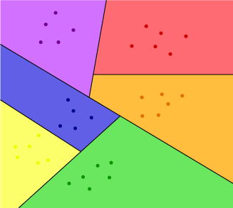
In the Figure, set A consists of the three classes (purple, red and orange) in the upper right and set B consists of the three classes (blue, green and yellow) in the lower left. In the second and third steps, we separate the purple class off from set A, then separate the green class off from B. Then in the final two steps, we separate red from orange and yellow from blue.

This last scheme has the advantage that even without using a confidence indicator from the binary classifier, it always gives you a well defined answer for every new data point (as long as it isn’t right in one of the decision boundaries.) In other words, the hierarchical classification scheme does not produce any grey regions. The tricky thing is that how you choose to construct the hierarchy can have a big impact on how effective the final classifier is. In particular, you want to make sure that each of your initial sets A or B combines classes that are naturally close together in the space containing the data points. Otherwise, there may not be a hyperplane that separates A from B. Of course, we can always use a kernel to separate them, but as a rule of thumb it’s better to arrange things so that you can use the simplest possible kernel.

So, repeating a common theme on this blog, there is no silver bullet (or free lunch) when it comes to choosing a scheme for combining binary classifiers. The best way to make the right decision is to use a combination of experience with the type of data your working on and an understanding of the structure of the data, based on experimentation, visualization and other types of exploratory techniques. Otherwise, since you can’t actually see the data and the model in the same way that I’ve drawn the above examples, it can be very difficult to tell when a model or classification scheme is really effective or just deceptive garbage.

Posted in Classification | 12 Comments

Kernels

Over the last few weeks, I’ve introduced two classification methods – Support Vector Machines (SVM) and Logistic Regression – that attempt to find a line, plane or hyperplane (depending on the dimension) that separates two classes of data points. This has the advantage over more flexible methods like K Nearest Neighbors, that once the line/plane/hyperplane is found, new data points can be very quickly classified. This simple model is also less susceptible to overfitting. Both SVM and logistic regression work well when such a line/plane/hyperplane exists (when the two classes are linearly separable), but for data that forms a curved shape, there won’t be a line/plane/hyperplane that completely separates the two classes. We saw a similar problem with linear regression and were able to address it by replacing the line/plane/hyperplane with a curve, or a higher dimensional curved shape, which required adding parameters to the model. We could probably do something similar for SVM and logistic regression. However, rather than adapting each algorithm independently in this way, the more common approach is to use a general tool called a kernel to generalize any linear algorithm to use curved shapes.

Continue reading

Posted in Classification, Normalization/Kernels | 18 Comments

Logistic regression

In the last post, I introduced the Support Vector Machine (SVM) algorithm, which attempts to find a line/plane/hyperplane that separates the two classes of points in a given data set. This algorithm adapts elements of linear regression, a statistical tool (namely, approximating the data set with a relatively simple model) to the classification problem, which has its roots in computer science. As we saw, one of the problems with SVM is that the output ultimately depends on a relatively small number of data points, namely the support vectors. In this post, I’ll discuss logistic regression, an algorithm that attempts to fix this problem by adapting the regression more directly to the problem of classification.

Recall that in linear regression, we used lines in the plane (or planes/hyperplanes in higher dimensions) to describe different probability distributions. We then chose the line such that the corresponding distribution assigned the maximal probability to the given data points. This general technique is often called maximum likelihood estimation. (Correction: I originally said expectation maximization rather than maximum likelihood. See the comments for an explanation of the difference.)

For linear regression, we defined each distribution to have probability 1 directly on the line and to have the probability go to 0 as we moved farther from the line (following a Gaussian bell curve, shown on the left in the Figure below). This way, maximizing the probability was equivalent to drawing the line as close as possible to the points. But if we have two classes of points, we don’t want the line to be close to all the points – We want it to be in the space between the two classes of points, in some sense as far as possible from the points. In particular, we need to define an maximum likelihood problem that takes into account the two different types of data points.

Logistic

We’ll do this by thinking of one of the classes of data (such as the blue points) as being at height one above the plane, while the other class (the green points) are right in the plane. We’ll then choose a distribution that is close to the plane on one side of the line, but above the plane on the other side. A cross section of this distribution is a curve called the logistic function, shown in the center of the figure. (This is where logistic regression gets its name from.) The 3D picture, which applies to two-dimensional data, is shown on the right. For higher dimensional data, we have a very similar situation, though (as always) it’s much harder to visualize.

fitdistRecall that we found the best distribution for linear regression by  choosing the one in which the data points are in the darkest possible parts of the distribution. Alternately, we can think of this as putting all the data points at height one above the plane, then choosing the distribution where the Gaussian function is as close as possible to these points, as on the left in the second Figure. For logistic regression, since we’ve put our blue points at height one and our green points at height zero, we will again want to choose the distribution that minimizes the distances from the distribution function (this time, the one based on the logistic curve) to the points above and in the plane. We can think of this as having the data points pull (or push?) on the distribution.

In some ways, this is reminiscent of the Support Vector Machine algorithm, in which we expand a region around the dividing line/plane/hyperplane, until it bumps into data points on either side, then allow the data points to “push back” on the region, forcing the line/plane/hyperplane into a position that maximizes the buffer on either side of the line. As a result, only the data points that the buffer touches (i.e. the support vectors) push on it.

With logistic regression, on the other hand, every data point pushes on the distribution, though not with equal force. Like springs, the points that are closer to the dividing line/plane/hyperplane (not to mention the points that are on the wrong side) push harder because the line from the point to the distribution function is longer. (This is also reminiscent of how I described PCA.) The green points push the dividing line towards the blue points and the blue points push it back towards the green.  The distribution that the logistic regression algorithm chooses can be thought of as the equilibrium point of all these forces.

logisticgreenblue

Another way to think about it, closer to the picture in the linear regression post, is that instead of a distribution that looks like a dark cloud concentrated near the line, we have a distribution that is mostly blue on one side of the line, mostly green on the other side, and has a transition in the middle. We then choose among all the models corresponding to the different lines, by picking the one in which the green data points are in the greenest parts of the distribution and the blue points are in the bluest parts of the distribution. In the example above, you can see that the distribution on the left includes blue points in the green part of the distribution and vice versa. The distribution on the right does a much better job of matching blue to blue and green to green, so this would be closer to model chosen by logistic regression.

It’s worth mentioning that while there is a simple equation for linear regression that immediately gives you the parameters of the best fit line/plane/hyperplane, there is no such equation for logistic regression. Instead, the algorithm is usually implemented by choosing a line/plane/hyperplane at random, then calculating which direction to move it to improve the fit (or, equivalently, what direction the forces of the data points are pushing it in). The process is then repeated on the new line/plane/hyperplane over and over until the combined forces get close enough to equilibrium that repeating further won’t make a noticeable difference.

So this reduces the problem of susceptibility to noise that we saw with SVM. If the data is very noisy/inaccurate then logistic regression will, of course, give you a lousy answer. But unlike SVM, if there are a small number of mislabeled points, outliers, or points with a few incorrect coordinates, then the remaining correct points will (hopefully) outweigh it. On its own, logistic regression still restricts us to a relatively simple model, namely dividing the space of data points along a single line/plane/hyperplane. We were able to modify the linear regression algorithm to more general models by replacing the equation of the line with a more complicated equation describing a curve, or in general replacing the plane/hyperplane with a higher dimensional curved shape. However, rather than doing this directly with logistic regression (and even with SVM), it is more common to use a general method called a kernel. But a discussion of kernels will have to wait for a future post.

Posted in Classification, Regression | 18 Comments

Linear Separation and Support Vector Machines

So far on this blog, we’ve seen two very different approaches to constructing models that predict data distributions. With regression, we replaced the original data points with an equation defining a relatively simple shape that approximates the data, then used this to predict one dimension/feature of new points based on the others. With K Nearest Neighbors, we used the data points directly to define a fairly complicated distribution that divided the data space into two (or more) classes, so that we could predict the classes of new data points. Today, we’ll combine elements of both. We’re going to stick with classification, splitting the data space into two classes, but the goal will be to replace the original data with a simplified (linear) model.

Continue reading

Posted in Classification | 18 Comments

K-Nearest Neighbors

Two posts back, I introduced the Nearest Neighbor classification algorithm and described how it implicitly defines a distribution made up of Voronoi cells around the data points, with each Voronoi cell labeled according to the label of the point that defines it. We saw that this algorithm is very flexible because it does not assume that the data fits a specific model. However, it is also vulnerable to noise: If there are a few mislabeled points in the initial data set then new points near these will be misclassified. This can be thought of as a form of overfitting. In this post, I’ll introduce the K-Nearest Neighbors (KNN) algorithm and explain how it can help to reduce this problem.
Continue reading

Posted in Classification | 8 Comments

Data Normalization

In the last post, on nearest neighbors classification, we used the “distance” between different pairs of points to decide which class each new data point should be placed into. The problem is that there are different ways to calculate distance depending, for example, on how we compare different dimensions/features. To illustrate the point, consider the example from last time of a nearest neighbors algorithm to make restaurant recommendations. Two of the factors we discussed were annual income (which will be useful for guessing how expensive the restaurant should be) and preferred spice level, say on a scale from 0 to 5. The problem is that because spice level is measured on a much shorter scale than income, two people with spice levels 0 and 5, but incomes that are different by $1,000 will be considered closer than two people with the same spice level but incomes that are different by $2,000. To make the algorithm more effective, we need to adjust things so that differences in income don’t outweigh differences in spice level (or vice versa).

Continue reading

Posted in Normalization/Kernels | 3 Comments

Nearest Neighbors Classification

Before we dive into nearest neighbor classification, I want to point out a subtle difference between the regression algorithm that I discussed a few posts back and what I will write about today. The goal of regression was to find a model that allows us to predict one feature/value of a new data point based on the other features/values. So, for example, we might want to predict someone’s height based on their age, weight and some other information. The key is that height is measured on a continuous scale – it can take any numerical value in some range. What we’ll talk about today involves predicting a discrete value from a finite number of choices. This might be a yes/no question, or there might be a small number of choices that don’t necessarily fall on a number scale. The difference between modeling and classification is one of the historical distinctions between data mining (statistics) and machine learning (computer science), and stems from the fact that in artificial intelligence, the goal is for the computer to make a decision rather than just a prediction.

Continue reading

Posted in Classification | 14 Comments