
CSS Grid Lanes adds a whole new capability to CSS Grid. It lets you line up content in either columns or rows — and not both.
This layout pattern allows content of various aspect ratios to pack together. No longer do you need to truncate content artificially to make it fit. Plus, the content that’s earlier in the HTML gets grouped together towards the start of the container. If new items get lazy loaded, they appear at the end without reshuffling what’s already on screen.
It can be tricky to understand the content flow pattern as you are learning Grid Lanes. The content is not flowing down the first column to the very bottom of the container, and then back up to the top of the second column. (If you want that pattern, use CSS Multicolumn or Flexbox.)
With Grid Lanes, the content flows perpendicular to the layout shape you created. When you define columns, the content flows back and forth across those columns, just like to how it would if rows existed. If you define rows, the content will flow up and down through the rows — in the column direction, as if columns were there.

Having a way to see the order of items can make it easier to understand this content flow. Introducing the CSS Grid Lanes Inspector in Safari. It’s just the regular Grid Inspector, now with more features.

Safari’s Grid Inspector already reveals the grid lines for Grid Lanes, and labels track sizes, line numbers, line names, and area names. Now it has a new feature — “Order Numbers”.
By turning on the order numbers in the example above, we can clearly see how Item 1, 2, 3, and 4 flow across the columns, as if there were a row. Then Item 5 is in the middle right, followed by Item 6 on the far right, and so on.
You might be tempted to believe the content order doesn’t matter. With pages like this photo gallery — most users will have no idea how the photos are ordered in the HTML. But for many users, the content order has a big impact on their experience. You should always consider what it’s like to tab through content — watching one item after another sequentially come into focus. Consider what it’s like to listen to the site through a screenreader while navigating by touch or keyboard. With Grid Lanes, you can adjust flow-tolerance to reduce the jumping around and put items where people expect.
To know which value for flow tolerance to choose, it really helps to quickly see the order of items. That makes it immediately clear how your CSS impacts the result.
Order Numbers in the Grid Inspector is an extension of a feature Safari’s Flexbox Inspector has had since Safari 16.0 — marking the order of Flex items. Seeing content order is also helpful when using the order property in Flexbox.

Order Numbers in Safari’s Grid Inspector works for CSS Grid and Subgrid, as well as Grid Lanes.
Try out Safari’s layout tooling
The Grid and Flexbox layout inspectors might seem similar across browsers, but the team behind Safari’s Web Inspector has taken the time to finely polish the details. In both the Grid and Flexbox Inspectors, you can simultaneously activate as many overlays as you want. No limits. And no janky scrolling due to performance struggles.
Safari’s Flexbox Inspector visually distinguishes between excess free space and Flex gaps, since knowing which is which can solve confusion. It shows the boundaries of items, revealing how they are distributed both on the main axis and the cross axis of Flexbox containers. And it lists all the Flexbox containers, making it easier to understand what’s happening overall.
Our Grid Inspector has a simple and clear interface, making it easy to understand the options. It lists all of the Grid containers — and you can show the overlay for every single one at the same time. The overlays don’t disappear when you scroll. And of course, you can change the default colors of the overlays, to best contrast with your site content.
And Safari’s Grid and Flexbox Inspectors are the only browser devtools that label content order. We hope seeing the order of content in Grid Lanes helps you understand it more thoroughly and enjoy using this powerful new layout mechanism.
Try out Order Numbers
Order Numbers in Safari’s Grid Inspector shipped today in Safari Technology Preview 235. Let us know what you think. There’s still time to polish the details to make the most helpful tool possible. You can ping Jen Simmons on Bluesky or Mastodon with links, comments and ideas.
For more
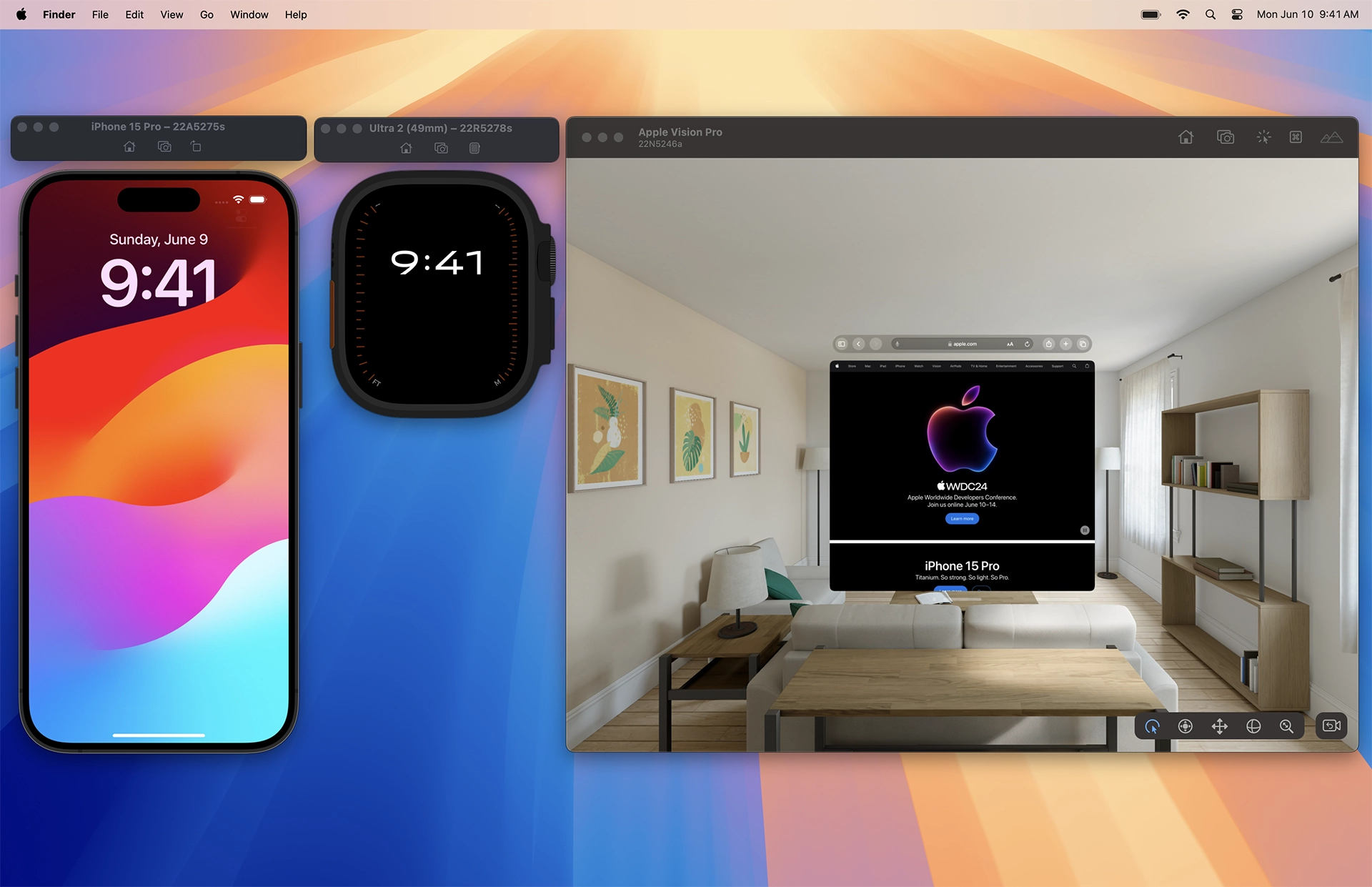
You can see how Safari in visionOS works by watching the Apple Vision Pro introduction at the WWDC23 Keynote or the session Meet Safari for spatial computing. If you don’t have your own Apple Vision Pro, and you want to experience what it’s like in person, you can book a free demo of Apple Vision Pro at your local Apple Store (in available regions).
Let’s take a look at how to use Safari’s suite of developer tools to test, inspect, and debug your site. First, you’ll learn how to use Safari developer tools with the visionOS simulator. Then, you’ll get a walkthrough of pairing Safari and Web Inspector on your Mac with Apple Vision Pro. These instructions work with for visionOS 1.2 and visionOS 2 so you can debug even if you do not have an Apple developer account.
Develop with the visionOS simulator
The Mac is a powerful machine — powerful enough to run macOS, iOS, watchOS, tvOS, visionOS, and iPadOS at the same time. It’s here where app developers work on their apps, write code, and test their code in the appropriate Simulator.
You can test the website you are building in Safari inside Simulator on macOS. This lets you develop the site on your Mac, using your full development environment, with your favorite IDE, Terminal, and more. When you’re ready to test, use Web Inspector on Mac to inspect web pages running in its simulator.

At WWDC24, Apple announced visionOS 2 beta available now to developers with an Apple Developer Program membership. Xcode 16 beta includes the visionOS 2 beta simulator with Safari 18 beta. Or test in visionOS 1.2 with Safari 17.5 by downloading Xcode 15 and installing its simulator.
Get setup
Here’s how to get started using the visionOS simulator:
- Download Xcode 15 from the Mac App Store. (It’s free.) Or download Xcode 15 or Xcode 16 beta from the Xcode website.
- Open Xcode. When asked which platforms you would like to develop for, enable visionOS. If you’d like to also install Simulator for iPhone and iPad, enable iOS.
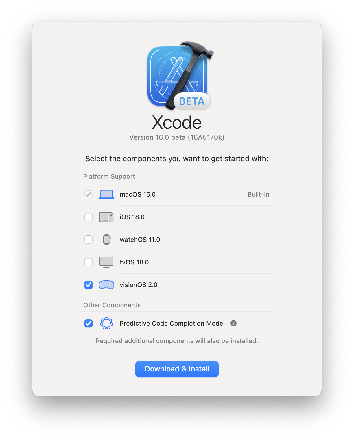
- The visionOS simulator will start downloading.
- Open the Simulator app on macOS. Xcode doesn’t need to be running to use Simulator.
- You will see a visionOS simulator named “Apple Vision Pro”.
- You can use the File menu anytime to create a new simulator or open existing simulators.
- Click on the Safari icon in the visionOS Home View to open Safari. Enter a URL in the navigation bar to go to a website.

Here’s how to get started using Safari’s developer tools on macOS:
- Open Safari on macOS.
- If you don’t see a Develop menu in the Menu Bar, you’ll need to enable Safari’s developer tools.
- Go to Safari > Settings > Advanced, and enable “Show features for web developers”.
- Now you can see “Apple Vision Pro (Simulator)” listed in the Develop menu.
Once you’ve completed this setup, you won’t need to repeat these steps again.
Open a web page in Safari in a visionOS simulator
You can use Safari in visionOS to navigate to a web page, but it’s likely you already have the page open in Safari on macOS. So instead, use this tip to quickly send web pages from macOS to the visionOS simulator:
- In Safari on macOS, go to the web page you’d like to test in the visionOS simulator.
- In the Safari menu bar, go to Develop > Open Page With > Apple Vision Pro.
The visionOS simulator comes to the front, and the web page opens in Safari. This also works for any number of other simulators for iPhone and iPad, which you can always install later.

Learn more about using the visionOS simulator.
Inspect a visionOS simulator with Web Inspector
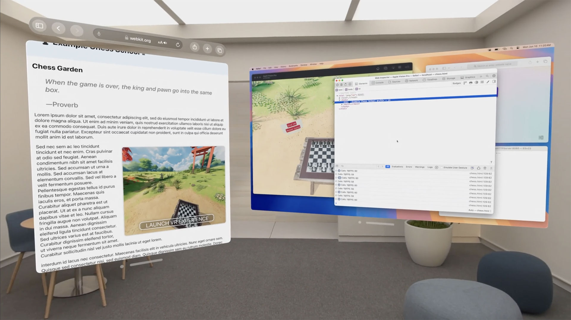
Web Inspector is instrumental when developing or troubleshooting web content in a simulator. To use it for a web page open in Safari in Apple Vision Pro Simulator. Click the Develop menu, select Apple Vision Pro (Simulator), and select the web page you want to inspect.

Web Inspector opens connected to the page loaded in Safari in the visionOS simulator. This brings all of the powerful inspection and debugging tools of Web Inspector to your web content loaded in Safari in any simulator. It also works for connecting to web pages loaded in Safari on iPhone, or iPad simulators.
Preview WebXR and with Feature Flags
Apple announced WebXR support with visionOS 2. If you’re using visionOS 1.2 in Apple Vision Pro or in the visionOS simulator on your Mac, you can still experience WebXR by turning on support for the testable version. You can also preview other new features like the <model> element.
To enable support for WebXR or the <model> element, from the the Home View, go to Settings > Apps > Safari > Advanced > Feature Flags and enable the feature flags for “HTML
Develop with Apple Vision Pro
Apple Vision Pro is a great place to work on a website. Use Mac Virtual Display to bring your Mac web development workflows into Apple Vision Pro. Test your site in Safari in visionOS, while debugging in Safari’s Web Inspector on macOS.
Start a Mac Virtual Display session
Use Apple Vision Pro as a private, portable 4K display for your Mac with Mac Virtual Display. Learn how in Use your Mac with Apple Vision Pro.
Enable Web Inspector for Apple Vision Pro
To get started connecting Safari in Apple Vision Pro with Web Inspector on macOS, you’ll need to go through a one-time set-up process that ensures only your Mac and your Apple Vision Pro have this kind of access to each other.
- In Safari on macOS, if the Develop menu is missing, enable features for web developers.
- Make sure both Apple Vision Pro and your Mac are connected to the same network.
- On Apple Vision Pro, open Settings > Apps > Safari > Advanced, and enable Web Inspector. Then open Settings > General > Remote Devices, and choose your Mac to prepare visionOS for pairing.
- On Mac, open the Develop menu. You should see your Apple Vision Pro listed. Choose “Use for Development…”
- A six-digit PIN code will appear in visionOS. Type it into the form on macOS.
Now your devices are paired. You can reconnect anytime. In Safari on macOS, Apple Vision Pro will now appear in the Develop menu anytime your Apple Vision Pro is on and unlocked.
Alternatively, you can pair with Xcode.
Inspect content from macOS Safari
Now you can inspect a web page that’s running in Safari in Apple Vision Pro using Web Inspector in Safari on macOS:
- In Safari in visionOS, go to the web page you want to inspect.
- On macOS, go to the Develop menu. You’ll see your Apple Vision Pro listed.
- Select the page you want to inspect from the submenu.
A Web Inspector window will open on macOS. Any changes you make will appear in Safari in visionOS.
For more information, read Inspecting visionOS.
Learn more
Learn more about how to download Simulator, pair Apple Vision Pro with Mac, or use Web Inspector while creating content for visionOS by watching Rediscover Safari developer features or by reading Inspecting visionOS.
There are so many screen sizes today that it’s made designing to a specific set of resolutions almost meaningless. Instead, we’re using powerful modern layout tools like Container Queries, Grid, and Flexbox to create fluid layouts so that designs can adapt to any screen size.
Creating resilient, adaptive designs requires tools that help you quickly explore your layouts in every resolution. Responsive Design Mode in Safari does just that. It gives you a fast preview of how your web page layout adapts to different viewport dimensions and aspect ratios in real time.
As part of the suite of developer tools, Responsive Design Mode is available when you enable Show features for web developers in Safari’s Advanced settings. Once enabled, you can jump into Responsive Design Mode for the currently focused tab or window by choosing Enter Response Design Mode from the Develop menu or pressing Command-Control-R (⌃⌘R).
New Design
With its streamlined design in Safari 17, Responsive Design Mode makes it faster and easier to test your designs.

Resizing
Notably, the row of device and window icons is gone, helping you focus on creating adaptive designs that fluidly respond to any screen size as the web moves away from rigid, resolution-specific designs.

Resizing is as easy as clicking the “handles” at any side of the viewport preview and dragging them to any size. You can watch the dimensions of the viewport change in the size display shown in screen point units at the upper-left.
You can even test viewport sizes beyond the size of the display you’re actively using. Keep dragging the handles, and the preview fluidly scales, showing the zoom level as a percentage of the actual size of the viewport. At 100%, each pixel of web content is visible in the preview. When the viewport grows to a size larger than the window size of Safari, the zoom level decreases, indicating the preview is scaled down to fit the available space in the window.
Pixel Density
Another dimension of screen size designers need to consider today is the pixel density of screens. Pixels have gotten much smaller on modern devices, affecting the pixel-based assets in your designs, like interface icons, photos, or videos. A menu next to the effective viewport dimension allows you to change the pixel ratio used in the preview. The 1x, 2x, and 3x settings help you test all the assets you went the extra mile to prepare to give your users the best experience regardless of their device capabilities.
Instead of generating each asset by hand, many folks opt to configure their build tools to automatically resize assets for the srcset attribute on image elements or the image-set() function in CSS to set the pixel ratio for a background-image.
<img src="image_1x.jpg" srcset="image_2x.jpg 2x, image_3x.jpg 3x">

<style>
body {
    background-image: image-set("background_1x.jpg" 1x, "background_2x.jpg" 2x);
}
</style>
Here, the pixel ratio control helps you ensure your tooling is configured correctly to generate all the needed assets.
In CSS you can use media queries to apply styles based on the pixel ratio of the display. For instance, you can set thinner lines on a 2x display:
@media (min-resolution: 2dppx) {
  .dividerLine {
    border: 0.5px solid grey;
  }
}
The pixel ratio control also allows you to test those styles.
Simulators
Responsive Design Mode shows you a good approximation of how your web page layout will be affected by viewport sizes. But iOS, iPadOS, watchOS, and visionOS have different rendering behaviors optimized to their form factors that are necessarily different than macOS.
Fast, real-time feedback is what makes Responsive Design Mode so helpful, but it comes with a tradeoff in accuracy. It’s a familiar problem in technology. For example, Xcode offers SwiftUI developers a preview mode that allows them to see the interfaces their code generates and even lets them interact with the interface in a limited capacity. But the complete experience requires building the project to see the result run in a simulator or on an actual device.
So now, it’s easy to jump into device simulators to try your site designs with the same full-fidelity experience as an actual device.

Responsive Design Mode offers a new Open with Simulator menu for quickly jumping into an Xcode device simulator for the current web page. It shows a list of suggested simulators, but many more are available than what’s listed. You’ll need to download and install Xcode from the App Store for free to run simulators. Selecting the Add simulators… option from the Open with Simulator menu will open a new tab in Safari with instructions on adding more simulators.
To get a more accurate idea of how your web pages will behave in those environments, you can use simulators without needing access to the devices themselves.
Web Inspector
Responsive Design Mode becomes an even more powerful tool when combined with Web Inspector. It allows you to find the source of layout issues while resizing the page or adjusting the pixel ratio. With developer features enabled, select Show Web Inspector from the Develop menu or press Command-Option-I (⌥⌘I).

When debugging narrow viewport sizes, you might find it helpful to click the Dock to left or Dock to right button in Web Inspector to put it side-by-side with the preview viewport.
Feedback
The updated Responsive Design Mode distills the tools to the essentials for quickly assessing the layout of your web pages at any screen size. It gives you at a glance access to layout issues and accelerates testing your pages in a variety of device-accurate simulators.
We love to hearing from you. Send a tweet to @webkit to share your thoughts Responsive Design Mode. Find us on Mastodon at @[email protected] and @[email protected]. If you run into any issues, we welcome your feedback on Safari UI like Responsive Design Mode, or your WebKit bug report about web technologies or Web Inspector. Reporting issues makes an enormouse difference.
Download the latest Safari Technology Preview to stay at the forefront of the web platform and to use the latest Web Inspector features.
Web content and JavaScript is used for various purposes in apps, from providing UI from a webpage to enabling apps to be scriptable. Previously, Web Inspector supported inspecting developer-provisioned apps built directly from Xcode for local development, meaning developers could debug this content so long as the app is installed for development. However, released versions of apps had no way to inspect dynamic web content or scripts, leaving developers and users to have to resort to more complicated workflows to get information that would otherwise be made available by Web Inspector. Now, this same functionality is available through an API on WKWebView and JSContext.
How do I enable inspection?
Across all platforms supporting WKWebView or JSContext, a new property is available called isInspectable (inspectable in Objective-C). It defaults to false, and you can set it to true to opt-in to content being inspectable. This decision is made for each individual WKWebView and JSContext to prevent unintentionally making it enabled for a view or context you don’t intend to be inspectable. So, for example, to make a WKWebView inspectable, you would:
Swift
let webConfiguration = WKWebViewConfiguration()
let webView = WKWebView(frame: .zero, configuration: webConfiguration)
webView.isInspectable = true
Objective-C
WKWebViewConfiguration *webConfiguration = [WKWebViewConfiguration new];
WKWebView *webView = [[WKWebView alloc] initWithFrame:CGRectZero configuration:webConfiguration];
webView.inspectable = YES;
For JSContext, matching API is available, with the addition of C API for developers using JSGlobalContextRef:
Swift
let jsContext = JSContext()
jsContext?.isInspectable = true
Objective-C
JSContext *jsContext = [JSContext new];
jsContext.inspectable = YES;
C
JSGlobalContextRef jsContextRef = JSGlobalContextCreate(NULL);
JSGlobalContextSetInspectable(jsContextRef, true);
The inspectable property can be changed at any point during the lifetime of your WKWebView or JSContext. Disabling inspection while Web Inspector actively inspects the content will automatically close Web Inspector, and no further information about the content will be available.
Once you’ve enabled inspection for your app, you can inspect it from Safari’s Develop menu in the submenu for either your current computer or an attached device. For iOS and iPadOS, you must also have enabled Web Inspector in the Settings app under Safari > Advanced > Web Inspector. You do not need to enable Web Inspector for simulators; it is always enabled. Learn more about enabling Web Inspector…

When should I consider making content inspectable?
A common situation in which you may want the content of WKWebView to be inspectable is in an in-app web browser. The browser shows ordinary web content that would be inspectable when loaded in Safari. It can be beneficial both for the app developer, as well as web authors, to be able to inspect content in these views, as the size of the view may not match that of Safari’s, or the app developer may be injecting script into the view to provide integration with their app.
Web content is often dynamic, delivered by a server—not in the app—and easily changed over time. Unfortunately, not all issues can or will get debugged by folks with access to a developer-provisioned copy of your app.
JSContext can also enable scripting in an app whereby the customer provides the scripts to augment the app. Without the ability for a release version of your app to adopt inspectability, your customers may have no way to debug the scripts they have written. It makes it harder for customers to use this functionality of your app.
Provide readable names for inspectable JSContexts
Unlike WKWebView, which automatically gets a name based on the page currently loaded in the view, every JSContext with inspectable enabled will be listed as JSContext in Safari’s Develop menu. We recommend providing a unique, human-readable name for each inspectable JSContext to make it easier for you and your customers to determine what the JSContext represents. For example, if your app runs different pieces of JavaScript on behalf of the user, you should give each JSContext a name based on what runs inside the context.
API is available to set the user-visible name of a JSContext:
Swift
let jsContext = JSContext()
jsContext?.name = "Context name"
Objective-C
JSContext *jsContext = [JSContext new];
jsContext.name = @"Context name";
C
JSGlobalContextRef jsContextRef = JSGlobalContextCreate(NULL);
`JSGlobalContextSetName`(jsContextRef, JSStringCreateWithUTF8CString("Context name"));
Working with older versions of macOS and iOS
For apps linked against an SDK before macOS 13.3 and iOS 16.4 WKWebViews and JSContexts will continue to follow the previous behavior of always being inspectable when built for debugging from Xcode.
Apps that support older versions of macOS and iOS while linked against the most recent SDK will not get the previous behavior of all content being inspectable in debug builds to avoid confusion about what will and will not be inspectable by customers. Apps targeting older OS versions but linking against the new SDK can use this new API conditionally on OS versions that support it. To conditionally guard usage of the API:
Swift
if #available(macOS 13.3, iOS 16.4, tvOS 16.4, *) {
    webView.isInspectable = true
}
Objective-C
if (@available(macOS 13.3, iOS 16.4, tvOS 16.4, *))
    webView.inspectable = YES;
You can learn more about guarding usage of new API on developer.apple.com.
Feedback
As you explore this new API, please help us by providing feedback if you encounter problems. For issues using this new API, please file feedback from your Mac, iPhone, or iPad. Feedback Assistant will collect the information needed to help us understand what’s happening. For any issues you may experience with Web Inspector itself once inspecting your app’s content, please file a bug on bugs.webkit.org.
Also, we love hearing from you. You can find us on Mastodon at @[email protected], @[email protected], and @[email protected].
html or :root.
While this has the benefit of putting them all in one easy to find place, it has a side effect: because CSS variables are inheritable, all descendant elements effectively inherit all variables from ancestors. This behavior is what enables you to use a CSS variable defined at a higher level on the styles of an element that is deeply nested within the document.
When an element inherits a large number of CSS variables, inspecting its styles can become overwhelming. Likewise, identifying a particular CSS variable to reuse becomes more difficult because you have to search through a large list of them.
Over the past few releases, Web Inspector in Safari Technology Preview has introduced some features to help you when working on projects that use large numbers of CSS variables.
Hiding Unused CSS Variables
Of all inherited CSS variables, only a few are actually used on the styles of any one element. To reduce visual clutter in the Styles panel, unused inherited CSS variables are automatically hidden. They’re replaced with a button that reveals them on click.
This helps focus your attention on just the styles that took effect on the inspected element.
Searching for CSS Variables
The Computed panel in Web Inspector has a section that lists all CSS variables applicable to the inspected element. This list of properties can help you when searching for a CSS variable to reuse.
Use the filter input field to narrow down the list if you know roughly what you’re looking for, either part of the CSS variable name or part of the value.
Grouping CSS Variables
Safari Technology Preview 138 introduced the ability to view this list grouped by value type. This creates separate subsections for CSS variables with values such as colors, numbers, dimensions (numbers followed by CSS units), and so forth. Reduce clutter by collapsing the groups you’re not interested in.
Grouping this way can help you find a CSS variable when you know the type of value you’re looking for, a particular color, for example. Color swatches shown next to variable values together with the ability to group all variables with color values into one distinct section make it easier to visually scan for the desired value.
Jump to CSS Variable Definition
Here’s a tip: place the mouse cursor over any CSS variable in the Computed panel to reveal a go-to arrow. Click this to highlight the place in the Styles panel where the variable is defined. If the target CSS variable is hidden because it is unused, it will be automatically shown. This allows you to quickly jump in context to the place where a CSS variable is defined and edit it.
You can also use the filter input field at the bottom of the Styles panel (as described above) and type the name of the variable, but using the go-to arrow to quickly jump to it is much more convenient.
Fuzzy Autocompletion of CSS Variable Names
Since its inception, Web Inspector has provided autocompletion for CSS properties and values in the Styles panel. More recently, it introduced the ability to provide completion suggestions for CSS variable names when typing within var() function values, as in var(--link-color).
Safari Technology Preview 138 made this even better with the introduction of fuzzy matching for CSS autocompletion. This is particularly useful for CSS variables when you might not remember the full name. With fuzzy matching, you can get results that match the query at any position, not just at the beginning.
For example, if you know that the CSS variable name you’re looking for, say --link-color, includes the substring “color”, you can type just var(color|) (the | character represents the position of the typing caret). You don’t even need to type the double dash prefix. If the CSS variable --link-color is defined on or inherited by the inspected element, it will be shown in the list of completion suggestions even if the query match occurs at the end of the variable name.
For example, type just “color” to match --link-color.
Conclusion
CSS variables enable a growing number of uses, such as building configurable design systems, practical theming for light and dark modes, customizable styles for web components, among many others. But the proliferation of variables in large numbers within a project can also become a burden during development and debugging.
Web Inspector has introduced features to help keep you focused and productive. Hiding unused inherited CSS variables in the Styles panel reduces clutter. Collecting and grouping CSS variables in the Computed panel focuses your attention. Fuzzy matching in autocompletion of variable names and filter input fields help you quickly find and reuse variables.
We hope these improvements make your work easier when dealing with CSS variables.
As always, if you encounter any issues, please file a report at webkit.org/new-inspector-bug.
If you want to share feedback or ideas, please send them to us on Twitter: @webkit.
This layout system is highly capable, but using it requires a shift away from the mental models of the past. When the grid definition itself is not visible (only its effects on the placement of items are visible), you can easily get lost and confused, not understanding why the layout doesn’t work as intended.
When you can see both the structure of the grid and its effects in context on the page, it makes working with CSS Grid Layout more approachable and easier to reason about.
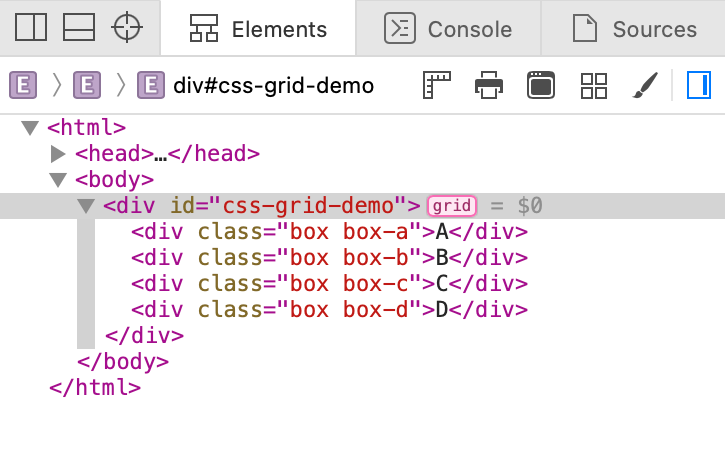
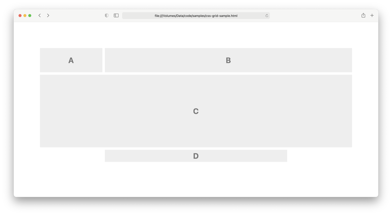
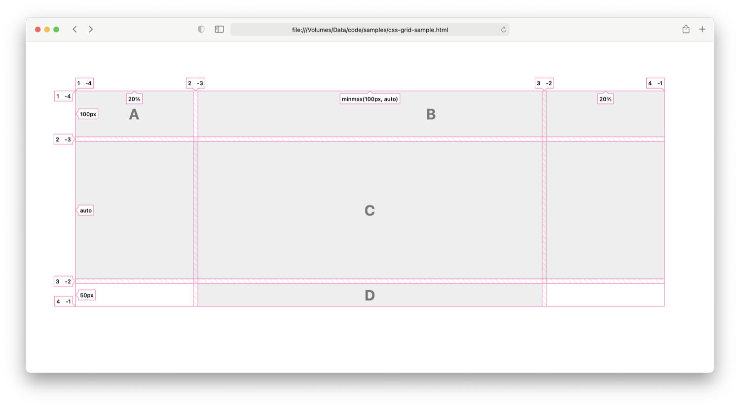
CSS Grid Inspector is a new tool in Web Inspector which helps you visualize grids defined using CSS Grid Layout notation and verify that elements are positioned as expected. It was introduced in Safari Technology Preview 123.
Visualizing grids
CSS Grid Inspector shows a page overlay on top of HTML elements which are CSS Grid containers. An element is a CSS Grid container when its display CSS property has a value of either grid or inline-grid.
You can turn on the overlay for a CSS Grid container in one of two ways:
- Click the “grid“ badge shown next to the element in the DOM Tree outline of the Elements Tab.
- Open the new Layout panel in the details sidebar of the Elements Tab, then click the checkbox next to the corresponding element in the Grid Overlays list.
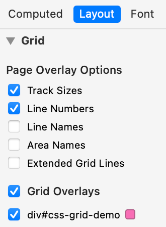
The overlay can show:
- Lines which define the grid rows, and columns (a.k.a. grid tracks)
- Spacing between grid tracks (a.k.a. grid gaps)
- Labels for line numbers and grid track sizes
- Labels for grid line names, and grid area names
Configuring the CSS Grid Inspector overlay
The CSS Grid Inspector overlay can show many properties of a grid’s components according to the CSS properties used. Showing everything all at once can be overwhelming. Depending on your workflow, you may prefer to see all or just a subset.
Use the settings in the Page Overlay Options section of the Layout panel in the details sidebar to configure the level of detail presented with the overlay. Changes are applied immediately and saved across Web Inspector sessions.
You can toggle the following options:
- Track Sizes: shows a label with the user-authored value for the track size or auto if the value is not explicitly set. This helps visual inspection by matching the user-authored value set in CSS with the corresponding grid track on the page.
- Line Numbers: shows a label with the ordinal and the reverse ordinal of explicit grid lines. The reverse ordinal is useful when referencing lines backward from the end. For example, 1 -4 means “the first and the fourth last”.
- Line Names: shows a label with the user-defined name for a grid line or the implicit grid line name derived from a grid area name. When undefined, this does nothing. Learn more about implicit grid line names on MDN.
- Area Names: shows a label with the user-defined name for a group of cells. When undefined, this does nothing.
- Extended Grid Lines: extends grid lines infinitely in their respective directions. This is useful for checking alignment with other elements on the page.
To change the overlay color, use the color swatch next to the corresponding element in the Grid Overlays list found in the Layout sidebar panel. The new color will be saved for that element on that page and is remembered across Web Inspector sessions. When you return later to inspect the same element, the overlay will use the color you picked.
Try it out
If you’re using Safari Technology Preview 123 or a later release, you can inspect the example below to try out the CSS Grid Inspector on this page. Open Web Inspector, go to the Elements Tab, switch to the Layout sidebar panel, then toggle the grid overlay for the element marked div#css-grid-demo.
If you encounter any issues, please file a report at webkit.org/new-inspector-bug.
If you want to share feedback or ideas, please send them to us on Twitter: @webkit.

CSS Color Module Level 4 introduced syntax to use Display-P3 color space on the web:
color: color(display-p3 1 0.5 0)
The previously available syntax defined colors in sRGB color space. hsl(42, 70%, 50%), rgb(3, 5, 11), #abc — all of these colors are in the sRGB color space.
Display-P3 is a superset of sRGB. It’s around 50% larger:

The white line shows the edge of sRGB. Everything on its top right is Display-P3 colors not available in sRGB. Note how greens is greatly expanded while blues aren’t nearly as much.
Browser support
WebKit has had support for Display-P3 color since 2016 (r207442). The following browsers support Display-P3 color:
- Safari on macOS Mojave and newer
- Safari on iOS 11 and newer
WebKit is the only browser engine that supports Display-P3 color as of January 2020.
Graceful degradation
One way to provide a fallback is to include the same property with the sRGB color before:
header {
    color: rgb(0, 255, 0);
    color: color(display-p3 0 1 0);
}
Browsers other than WebKit currently parse color(...) as invalid value. CSS properties with invalid values are ignored by the browsers.
Alternatively, you can use @supports feature query. This is particularly useful when defining variables with colors:
/* sRGB color. */
:root {
    --bright-green: rgb(0, 255, 0);
}

/* Display-P3 color, when supported. */
@supports (color: color(display-p3 1 1 1)) {
    :root {
        --bright-green: color(display-p3 0 1 0);
    }
}

header {
    color: var(--bright-green);
}
Hardware support
- iPhone 7 and newer
- MacBook Pro (since 2016)
- iMac (since 2015)
- iPad Pro (since 2016)
- LG UltraFine 5K Display
There are also numerous devices that support Display-P3 color space but currently have no browsers that support Display-P3 in CSS:
- Google Pixel 2 XL
- Google Pixel 3
- HTC U11+
- OnePlus 6
More devices that support Display-P3 are listed on Wikipedia.
Hardware support can be detected with a media query in CSS:
@media (color-gamut: p3) {
    /* Do colorful stuff. */
}
And JavaScript:
if (window.matchMedia("(color-gamut: p3)").matches) {
    // Do colorful stuff.
}
Web Inspector
Starting Safari Technology Preview 97, Web Inspector includes P3-capable color picker:

The white line draws the edge sRGB color space. All colors on the top right of it are only available in Display-P3 color space.
Right-clicking the color square shows an option to convert to sRGB color space:
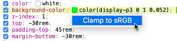
When the color is within sRGB color space, “Convert to sRGB” menu item is displayed. When it outside — “Clamp to sRGB”.
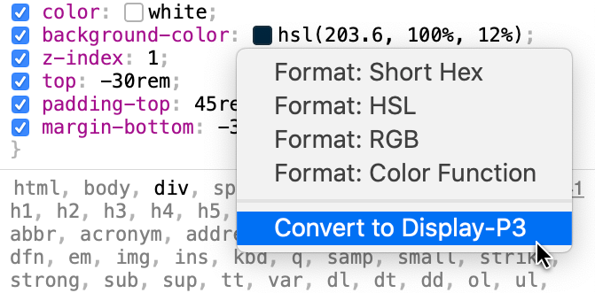
Web Inspector also includes context menus to convert sRGB colors to Display-P3:
Closing thoughts
CSS has syntax to define colors in Display-P3 color space, which includes vivid colors previously not available in sRGB. Many modern displays cover 100% of the P3 color standard. Web Inspector now includes P3-capable color picker.
You can start using Display-P3 colors on your websites and web views today. It only takes a couple of lines of code to provide a backward compatible sRGB color.
If you have any feedback, reach me out on Twitter. You can also send general comments to the @webkit Twitter account.
Further reading
- Improving Color on the Web post by Dean Jackson
- Colour management post series by Marc Edwards
<canvas> elements, was added to Web Inspector inside the Canvas Tab.
Just like WebGL shader programs, all render/compute pipelines are editable, and any changes will have an immediate effect. Compute pipelines, as they only have one shader module, are shown in a single text editor. Render pipelines, since they have both vertex and fragment shader modules, are shown in side-by-side text editors, one for each shader module. In the case that both the vertex and fragment shader modules are shared, however, they are shown as a single text editor, just like it is for a compute pipeline.
Try editing any of the WebGPU pipelines in our gallery of WebGPU samples using Web Inspector. We’ll be keeping that page updated with the latest demos. Many thanks to Austin Eng for making the demo used in the video above.
Let us know what you think! Send feedback on Twitter (@webkit, @jonathandavis, @dcrousso) or by filing a bug.
Users spend a large proportion of their online time on mobile devices, and a significant fraction of the rest is users on untethered laptop computers. For both, battery life is critical. In this post, we’ll talk about factors that affect battery life, and how you, as a web developer, can make your pages more power efficient so that users can spend more time engaged with your content.
What Draws Power?
Most of the energy on mobile devices is consumed by a few major components:
- CPU (Main processor)
- GPU (Graphics processing)
- Networking (Wi-Fi and cellular radio chips)
- Screen
Screen power consumption is relatively constant and mostly under the user’s control (via screen on-time and brightness), but the other components, the CPU, GPU and networking hardware have high dynamic range when it comes to power consumption.
The system adapts the CPU and GPU performance based on the current tasks being processed, including, of course, rendering web pages that the user is interacting with in their web browser and other apps using web content. This is done through turning some components on or off, and by changing their clock frequency. In broad terms, the more performance that is required from the chips, the lower their power-efficiency. The hardware can ramp up to high performance very quickly (but at a large power cost), then rapidly go back to a more efficient low-power state.
General Principles for Good Power Usage
To maximize battery life, you therefore want to reduce the amount of time spent in high-power states, and let the hardware go back to idle as much as possible.
For web developers, there are three states of interaction to think about:
- When the user is actively interacting with the content.
- When the page is the frontmost, but the user is not interacting with it.
- When the page is not the frontmost content.
Efficient user interaction
Obviously it’s good to expend power at times when the user is interacting with the page. You want the page to load fast and respond quickly to touch. In many cases, the same optimizations that reduce time to first paint and time to user interactive will also reduce power usage. However, be cautious about continuing to load resources and to run script after the initial page load. The goal should be to get back to idle as fast as possible. In general, the less JavaScript that runs, the more power-efficient the page will be, because script is work on top of what the browser has already done to layout and paint the page.
Once the page has loaded, user interactions like scrolling and tapping will also ramp up the hardware power (mainly the CPU and GPU), which again makes sense, but make sure to go back to idle as soon as the user stops interacting. Also, try to stay on the browser “fast paths” — for example, normal page scrolling will be much more power-efficient than custom scrolling implemented in JavaScript.
Drive idle power usage towards zero
When the user is not interacting with the page, try to make the page use as little power as possible. For example:
- Minimize the use of timers to avoid waking up the CPU. Try to coalesce timer-based work into a few, infrequent timers. Lots of uncoordinated timers which trigger frequent CPU wake-ups are much worse than gathering that work into fewer chunks.
- Minimize continually animating content, like animated images and auto-playing video. Be particularly vigilant to avoid “loading” spinner GIFs or CSS animations that continually trigger painting, even if you can’t see them. IntersectionObserver can be used to runs animations only when they are visible.
- Use declarative animations (CSS Animations and Transitions) where possible. The browser can optimize these away when the animating content is not visible, and they are more efficient than script-driven animation.
- Avoid network polling to obtain periodic updates from a server. Use WebSockets or Fetch with a persistent connection, instead of polling.
A page that is doing work when it should be idle will also be less responsive to user interaction, so minimizing background activity also improves responsiveness as well as battery life.
Zero CPU usage while in the background
There are various scenarios where a page becomes inactive (not the user’s primary focus), for instance:
- The user switches to a different tab.
- The user switches to a different app.
- The browser window is minimized.
- The browser window is visible but is not the focused window.
- The browser window is behind another window.
- The space the window is on is not the current space.
When a page becomes inactive, WebKit automatically takes steps to save power:
requestAnimationFrameis stopped.- CSS and SVG Animations are suspended.
- Timers are throttled.
In addition, WebKit takes advantage of features provided by the operating system to maximize efficiency:
- on iOS, tabs are completely suspended when possible.
- on macOS, tabs participate in App Nap, which means that the web process for a tab that is not visually updating gets lower priority and has its timers throttled.
However, pages can trigger CPU wake-ups via timers (setTimeout and setInterval), messages, network events, etc. You should avoid these when in the background as much as possible. There are two APIs that are useful for this:
- Page Visibility API provides a way to respond to a page transitioning to be in the background or foreground. This is a good way to avoid updating the UI while the page is in the background, then using the
visibilitychangeevent to update the content when the page becomes visible. blurevents are sent whenever the page is no longer focused. In that case, a page may still be visible but it is not the currently focused window. Depending on the page, it can be a good idea to stop animations.
The easiest way to find problems is Web Inspector’s Timelines. The recording should not show any event happening while the page is in the background.
Hunting Power Inefficiencies
Now that we know the main causes of power use by web pages and have given some general rules about creating power-efficient content, let’s talk about how to identify and fix issues that cause excessive power drain.
Scripting
As mentioned above, modern CPUs can ramp power use from very low, when the device is idle, to very high to meet the demands of user interaction and other tasks. Because of this, the CPU is a leading cause of battery life variance. CPU usage during page loading is a combination of work the browser engine does to load, parse and render resources, and in executing JavaScript. On many modern web pages, time spent executing JavaScript far exceeds the time spent by the browser in the rest of the loading process, so minimizing JavaScript execution time will have the biggest benefits for power.
The best way to measure CPU usage is with Web Inspector. As we showed in a previous post, the timeline now shows the CPU activity for any selected time range:

To use the CPU efficiently, WebKit distributes work over multiple cores when possible (and pages using Workers will also be able to make use of multiple cores). Web Inspector provides a breakdown of the threads running concurrently with the page’s main thread. For example, the following screenshot shows the threads while scrolling a page with complex rendering and video playback:

When looking for things to optimize, focus on the main thread, since that’s where your JavaScript is running (unless you’re using Workers), and use the “JavaScript and Events” timeline to understand what’s triggering your script. Perhaps you’re doing too much work in response to user or scroll events, or triggering updates of hidden elements from requestAnimationFrame. Be cognizant of work done by JavaScript libraries and third party scripts that you use on your page. To dig deeper, you can use Web Inspector’s JavaScript profiler to see where time is being spent.
Activity in “WebKit Threads” is mostly triggered by work related to JavaScript: JIT compilation and garbage collection, so reducing the amount of script that runs, and reducing the churn of JavaScript objects should lower this.
Various other system frameworks invoked by WebKit make use of threads, so “Other threads” include work done by those; the largest contributor to “Other thread” activity is painting, which we’ll talk about next.
Painting
Main thread CPU usage can also be triggered by lots of layout and painting; these are usually triggered by script, but a CSS animation of a property other than transform, opacity and filter can also cause them. Looking at the “Layout and Rendering” timeline will help you understand what’s causing activity.
If the “Layout and Rendering” timeline shows painting but you can’t figure out what’s changing, turn on Paint Flashing:

This will cause those paints to be briefly highlighted with a red overlay; you might have to scroll the page to see them. Be aware that WebKit keeps some “overdraw” tiles to allow for smooth scrolling, so paints that are not visible in the viewport can still be doing work to keep offscreen tiles up-to-date. If a paint shows in the timeline, it’s doing actual work.
In addition to causing power usage by the CPU, painting usually also triggers GPU work. WebKit on macOS and iOS uses the GPU for painting, and so triggering painting can cause significant increases in power. The additional CPU usage will often show under “Other threads” in the CPU Usage timeline.
The GPU is also used for <canvas> rendering, both 2D canvas and WebGL/WebGPU. To minimize drawing, don’t call into the <canvas> APIs if the canvas content isn’t changing, and try to optimize your canvas drawing commands.
Many Mac laptops have two GPUs, an “integrated” GPU which is on the same die as the CPU, and is less powerful but more power-efficient, and a more powerful, but more power-hungry “discrete” GPU. WebKit will default to using the integrated GPU by default; you can request the discrete GPU using the powerPreference context creation parameter, but only do this if you can justify the power cost.
Networking
Wireless networking can affect battery life in unexpected ways. Phones are the most affected due to their combination of powerful radios (the WiFi and cellular network chips) with a smaller battery. Unfortunately, measuring the power impact of networking is not easy outside of a lab, but can be reduced by following some simple rules.
The most direct way to reduce networking power usage is to maximize the use of the browser’s cache. All of the best practices for minimizing page load time also benefit the battery by reducing how long the radios need to be powered on.
Another important aspect is to group network requests together temporally. Any time a new request comes, the operating system needs to power on the radio, connect to the base station or cell tower, and transmit the bytes. After transmitting the packets, the radio remains powered for a small amount of time in case more packets are transmitted.
If a page transmits small amounts of data infrequently, the overhead can become larger than the energy required to transmit the data:

Such issues can be discovered from Web Inspector in the Network Requests Timeline. For example, the following screenshot shows four separate requests (probably analytics) being sent over several seconds:

Sending all the requests at the same time would improve network power efficiency.
Conclusion
Webpages can be good citizens of battery life.
It’s important to measure the battery impact in Web Inspector and drive those costs down. Doing so improves the user experience and battery life.
The most direct way to improve battery life is to minimize CPU usage. The new Web Inspector provides a tool to monitor that over time.
To achieve great battery life the goals are:
- Drive CPU usage to zero in idle
- Maximize performance during user interaction to quickly get back to idle
If you have any questions, feel free to reach me, Joseph Pecoraro, Devin Rousso, and of course Jon Davis.
If you’ve ever used Web Inspector before, chances are you’ve used (or are at least familiar with) the Develop menu. It holds action items and toggles for various settings of the browser, like whether local files (e.g. URLs beginning with file://) can be loaded or whether CSS is applied to each page.

All of these items apply to the entire browser, meaning that if you Disable Styles on one page, every other page will be affected.
Additionally, these items have no effect when using Web Inspector to inspect a remote target, like an iOS device or simulator. Checking Disable Styles in the Develop menu will not have any affect on the remote target.
In order to support this development workflow, Web Inspector has added a device settings menu that allows these settings to be toggled per-page when being remotely inspected.
Clicking on the device settings menu icon will show a popover with many of the same settings as the Develop menu.

Since these settings apply per-page and only on the remote target, the corresponding actions in the Develop menu are disabled, as they have no effect on a remote target:
- Disable Images
- Disable Styles
- Disable JavaScript
- Disable Site-specific Hacks
- Disable Cross-Origin Restrictions
- WebRTC
- Allow Media Capture on Insecure Sites
- Disable ICE Candidate Restrictions
- Use Mock Capture Devices
Along these lines, the device settings menu is only shown when using Web Inspector to inspect a remote target.
Device settings are not preserved between Web Inspector sessions. Closing Web Inspector (or disconnecting the inspected device) will cause all previously set device settings for the inspected page to reset.
Device settings are preserved across navigations, however, so long as Web Inspector stays open/connected.
User Agent
The first item in the device settings menu is the User Agent editor. It contains a list of common user agents, as well as an option to input a custom user agent (Other…).
Each time the User Agent is modified, the inspected page will automatically reload so that the new User Agent is applied.
Disable Toggles
Each of these toggles, when checked, disables a specific piece of functionality in the inspected page.
- Images will prevent any not-yet loaded images from loading, but will have no effect on any already loaded images.
- Styles will immediately disable all CSS on the page, including inline
<style>s and anystyleDOM attributes. - JavaScript will cause the page to ignore any future JavaScript from being run, including new
<script>elements (the underlying resource isn’t even requested) and callbacks for previously added event listeners. - Site-specific Hacks controls whether workarounds are made by WebKit to support compatibility on certain sites.
- A list of these sites can be found in Source/WebCore/page/Quirks.cpp.
- If you develop a site that is found in that list, we strongly encourage developing and testing with Site-specific Hacks disabled.
- Cross-Origin Restrictions controls whether CORS rules/restrictions are active for any future network requests.
WebRTC Toggles
These toggles focus specifically on functionality related to WebRTC.
- Allow Media Capture on Insecure Sites will allow WebRTC media capture to be used/tested on insecure (e.g. non-https) pages for any future calls of
getUserMedia. - Disable ICE Candidate Restrictions will prevent host ICE candidates from being filtered for new connection attempts.
- Use Mock Capture Devices will replace all capture devices with a mock “Bip-Bop” device for any future calls of
getUserMedia.

- Disable Encryption will cause future connections to be established and future streams (from those connections) to be transmitted without any form of encryption.
Feedback
You can try out changing device settings with iOS 12.2 or later. Let us know how it works for you. Send feedback on Twitter (@webkit, @dcrousso) or by filing a bug.